Factor analysis sits in a different corner of the statistical modeling world than regression, but the core logic of visualization is the same: we have a model that makes predictions about data, and we want to see how well those predictions match reality.
In regression, the model predicts values of an outcome variable. In factor analysis, the model predicts the pattern of correlations among a set of observed variables. The “predictions” are the correlations implied by the factor solution, and “misfit” shows up as residual correlations — observed relationships that the factors cannot explain.
This walkthrough covers:
Pre-analysis visualization — examining the correlation structure before fitting a model.
Determining the number of factors — scree plots and parallel analysis.
Interpreting the factor solution — loading heatmaps and path diagrams.
Visualizing fit and misfit — residual correlation matrices that reveal what the model misses.
Using factor scores — connecting latent variables back to observable data.
Learning goals
After working through this document, you should be able to:
Create and interpret a correlation heatmap for a set of questionnaire items.
Use scree plots and parallel analysis to decide on the number of factors.
Build a loading heatmap in ggplot2 that reveals simple structure.
Compute and visualize residual correlations to assess model fit.
Extract factor scores and use them in downstream analyses.
Packages
Code
# Install any missing packages (uncomment if needed):# install.packages(c(# "ggplot2", "dplyr", "tidyr", "psych",# "patchwork", "scales"# ))library(ggplot2)library(dplyr)library(tidyr)library(tibble)library(psych)library(patchwork)library(scales)
Data: The Big Five Inventory
We use the bfi dataset from the psych package. This dataset contains responses from 2,800 individuals to 25 personality items, with 5 items per Big Five trait: Agreeableness (A1–A5), Conscientiousness (C1–C5), Extraversion (E1–E5), Neuroticism (N1–N5), and Openness (O1–O5).
The BFI is ideal for demonstrating factor analysis because the factor structure is well established and psychologically interpretable.
Code
data(bfi, package ="psychTools")raw_items <- bfi %>%select(matches("^[ACENO][0-9]+$"))trait_labels <-c(A ="Agreeableness",C ="Conscientiousness",E ="Extraversion",N ="Neuroticism",O ="Openness")score_keys <- psychTools::bfi.keysnames(score_keys) <-unname(trait_labels[c("A", "C", "E", "N", "O")])reverse_key <-unlist(score_keys)reverse_multiplier <-ifelse(grepl("^-", reverse_key), -1, 1)names(reverse_multiplier) <-sub("^-", "", reverse_key)# 1. Reverse negative items upfront# This aligns all items positively with their trait label.bfi_items <- psych::reverse.code(keys = reverse_multiplier[names(raw_items)],items = raw_items,mini =1,maxi =6) %>%as.data.frame() %>%setNames(names(raw_items)) %>%as_tibble()# 2. Re-attach demographics# Notice we DO NOT drop_na(). We preserve all 2,800 rows.bfi_data <-bind_cols( bfi_items, bfi %>%select(gender, age, education) %>%mutate(gender_f =factor(gender, levels =1:2, labels =c("Male", "Female"))))cat("Total observations:", nrow(bfi_data), "\n")
Total observations: 2800
Code
cat("Items:", ncol(bfi_items), "\n")
Items: 25
Pre-analysis: Examining the correlation structure
Before we fit any factor model, we should look at the correlation matrix. If items within the same trait cluster together, there is reason to expect that a factor model can capture that structure.
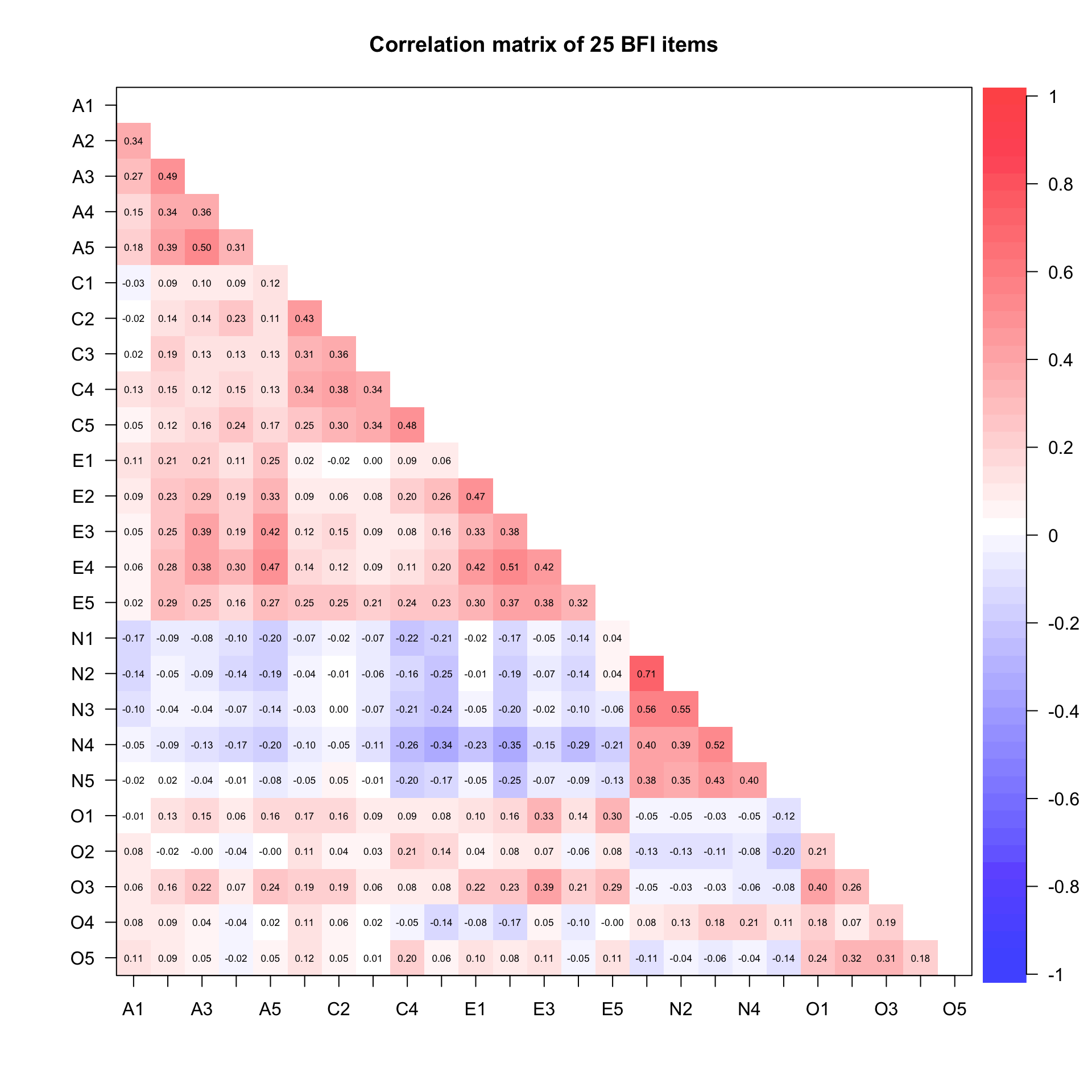
Correlation heatmap with psych::corPlot()
The psych package offers a quick way to visualize correlation matrices. Items are ordered by their position in the questionnaire, which corresponds to the Big Five groupings:
Code
corPlot(bfi_items, upper =FALSE, diag =FALSE, main ="Correlation matrix of 25 BFI items", gr =colorRampPalette(c("blue", "white", "red")), scale =FALSE)
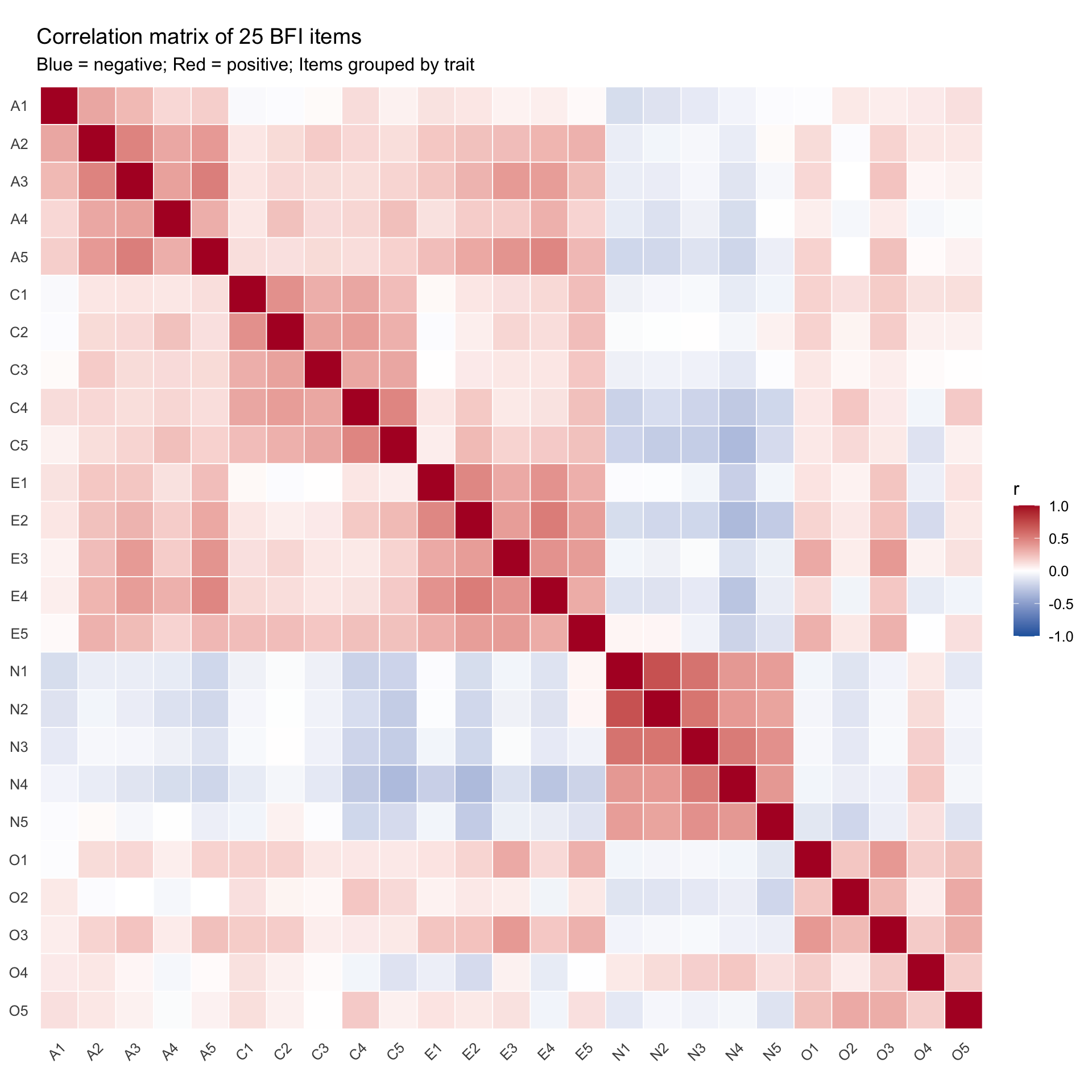
You should see blocks of stronger positive correlations (red) along the diagonal — these correspond to items within the same trait. Because we reverse-coded all negatively keyed items in the step above, there are no longer any dark blue (negative) blocks within traits. Off-diagonal correlations between traits should be weaker (though not zero, because the Big Five are not perfectly orthogonal).
Custom ggplot heatmap
For more control over the display, we can build a correlation heatmap in ggplot2:
Code
cor_mat <-cor(bfi_items, use ="pairwise.complete.obs")# Convert to long format for ggplotcor_long <- cor_mat %>%as.data.frame() %>%mutate(item1 =rownames(.)) %>%pivot_longer(-item1, names_to ="item2", values_to ="r") %>%# Create ordered factors so items appear in questionnaire ordermutate(item1 =factor(item1, levels =colnames(cor_mat)),item2 =factor(item2, levels =rev(colnames(cor_mat))) )ggplot(cor_long, aes(x = item1, y = item2, fill = r)) +geom_tile(color ="white", linewidth =0.3) +scale_fill_gradient2(low ="#2166ac", mid ="white", high ="#b2182b",midpoint =0, limits =c(-1, 1),name ="r" ) +labs(title ="Correlation matrix of 25 BFI items",subtitle ="Blue = negative; Red = positive; Items grouped by trait",x =NULL, y =NULL ) +theme_minimal(base_size =12) +theme(axis.text.x =element_text(angle =45, hjust =1),panel.grid =element_blank() ) +coord_fixed()
Determining the number of factors
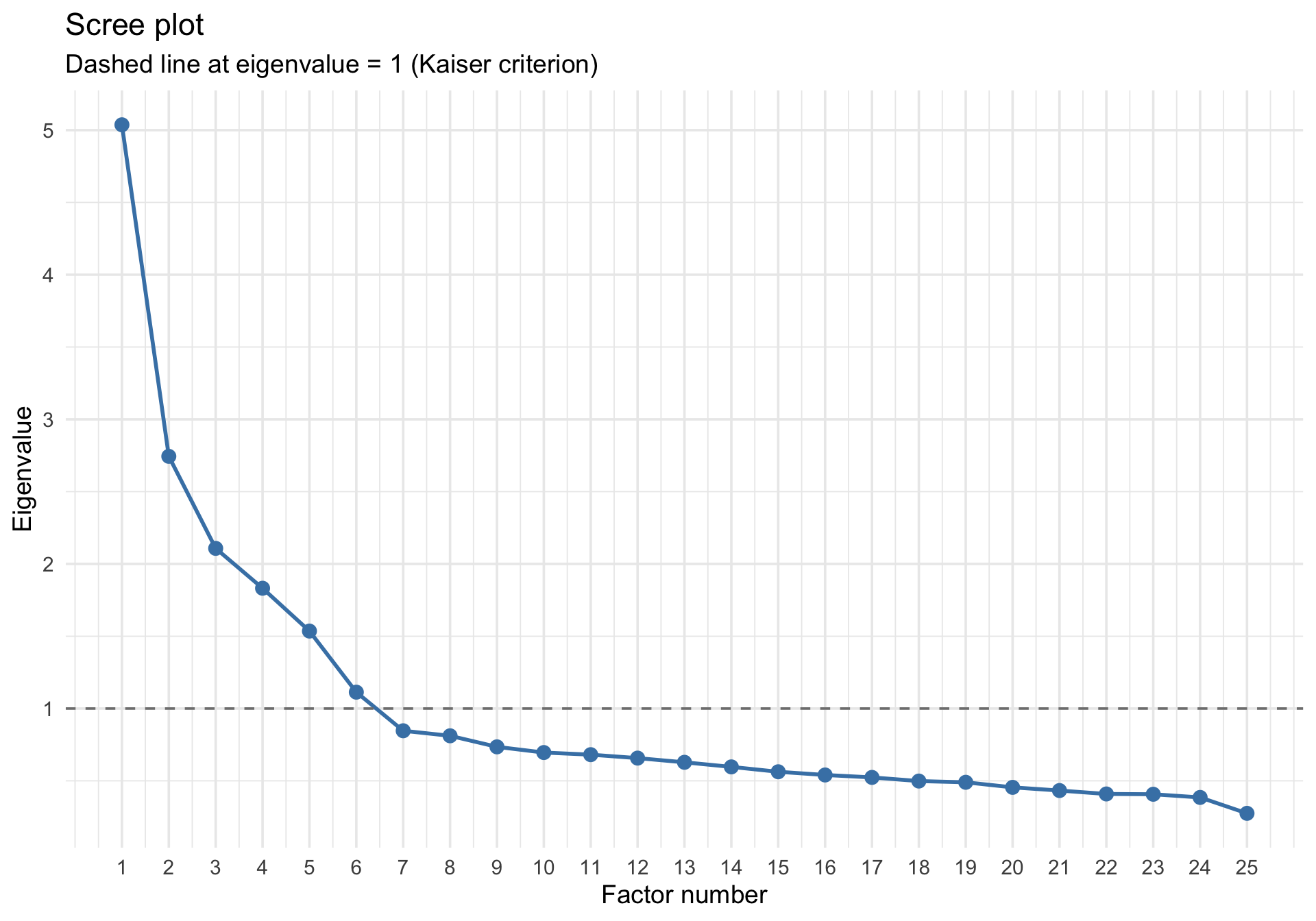
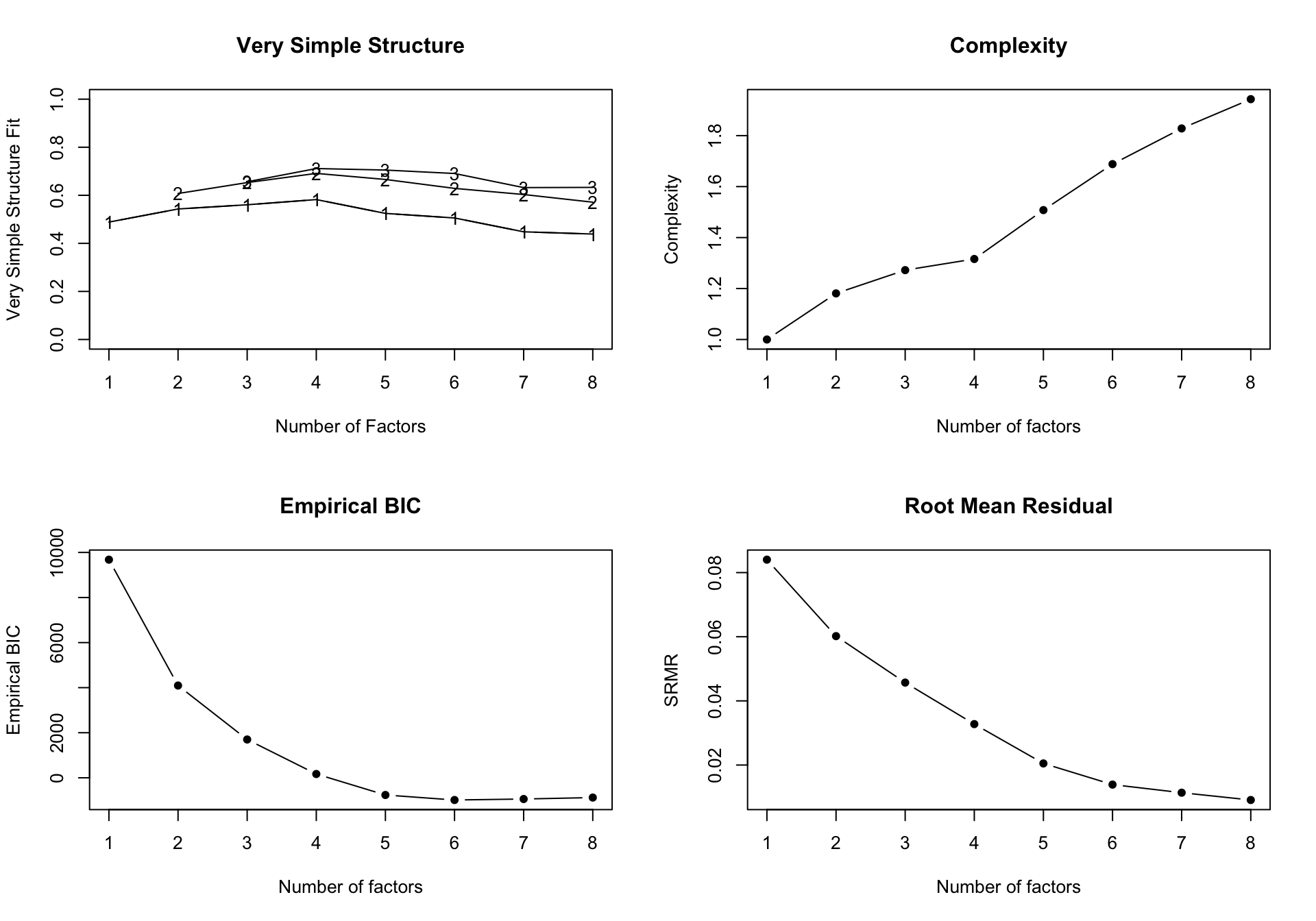
Scree plot
A scree plot shows the eigenvalues of the correlation matrix in descending order. The idea is to look for an “elbow” — a point where eigenvalues drop off sharply. Factors before the elbow capture substantial shared variance; factors after it capture noise.
The Kaiser criterion (eigenvalue > 1) and the scree plot often suggest slightly different numbers. Horn’s parallel analysis provides a more rigorous approach.
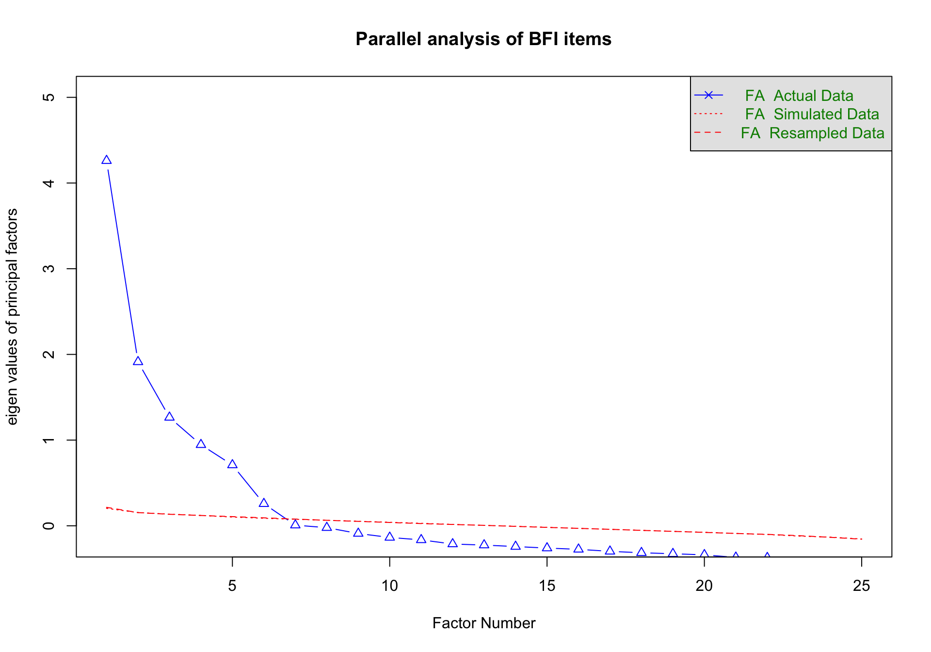
Parallel analysis
The standard scree plot has a major limitation: even a matrix of completely random noise will produce some factors with eigenvalues greater than 1 simply due to chance sampling fluctuations.
Parallel analysis solves this by simulating completely random datasets that have the exact same number of participants and items as your real data. It calculates the eigenvalues for these random datasets, allowing us to ask: Is the variance captured by our real factor larger than the variance we would expect just by chance?
Code
fa_parallel <-fa.parallel(bfi_items, fa ="fa", fm ="minres", main ="Parallel analysis of BFI items")
Parallel analysis suggests that the number of factors = 6 and the number of components = NA
How to interpret the graph
The plot produced by fa.parallel() contains three types of lines:
Actual Data (solid blue line, triangles): These are the true eigenvalues extracted from your dataset. They represent the actual variance captured by each successive factor.
FA Simulated Data (dashed red line): These are the average eigenvalues extracted from many simulated datasets of pure random noise (where the true correlation between all items is exactly zero).
FA Resampled Data (dotted red line): These are eigenvalues generated by randomly shuffling your actual data across participants. This preserves the individual distributions of your items while destroying any correlations between them.
The decision rule: You retain only the factors where the solid blue line (Actual Data) is above the red lines (Simulated and Resampled data). Once the blue line drops below the red lines, the remaining “factors” in your real data are capturing less variance than factors extracted from literal random noise.
In this plot, the blue line drops below the red lines after the 6th factor. However, parallel analysis can sometimes slightly over-extract.
A consensus approach: MAP and VSS
No single test for the number of factors is perfect. As psychometricians often note, parallel analysis can slightly over-extract, while Velicer’s MAP (Minimum Average Partial) test can sometimes under-extract. The VSS (Very Simple Structure) criterion assesses how well the data are fit by factors of varying complexity.
Rather than relying purely on parallel analysis, the most sensible approach is to look for consensus across multiple indices. The psych::nfactors() function runs all of these tests at once:
Code
# Run multiple criteria (MAP, VSS, and eigenvalue tests)n_factors_check <-nfactors(bfi_items, n =8, rotate ="oblimin", fm ="minres")
Code
n_factors_check
Number of factors
Call: vss(x = x, n = n, rotate = rotate, diagonal = diagonal, fm = fm,
    n.obs = n.obs, plot = FALSE, title = title, use = use, cor = cor)
VSS complexity 1 achieves a maximimum of 0.58  with  4  factors
VSS complexity 2 achieves a maximimum of 0.69  with  4  factors
The Velicer MAP achieves a minimum of 0.01  with  5  factors
Empirical BIC achieves a minimum of  -985.14  with  6  factors
Sample Size adjusted BIC achieves a minimum of  -106.39  with  8  factors

Statistics by number of factors
  vss1 vss2   map dof chisq     prob sqresid  fit RMSEA  BIC SABIC complex
1 0.49 0.00 0.024 275 11863  0.0e+00      26 0.49 0.123 9680 10554     1.0
2 0.54 0.61 0.018 251  7362  0.0e+00      20 0.61 0.101 5370  6168     1.2
3 0.56 0.65 0.017 228  5096  0.0e+00      17 0.66 0.087 3286  4010     1.3
4 0.58 0.69 0.015 206  3422  0.0e+00      15 0.71 0.075 1787  2441     1.3
5 0.52 0.67 0.015 185  1809 4.3e-264      14 0.72 0.056  341   928     1.5
6 0.51 0.63 0.016 165  1032 1.8e-125      14 0.73 0.043 -277   247     1.7
7 0.45 0.60 0.019 146   708  1.2e-74      15 0.71 0.037 -451    13     1.8
8 0.44 0.57 0.022 128   503  7.1e-46      15 0.71 0.032 -513  -106     1.9
  eChisq   SRMR eCRMS eBIC
1  11862 0.0840 0.088 9680
2   6086 0.0602 0.066 4094
3   3509 0.0457 0.052 1700
4   1803 0.0328 0.040  168
5    706 0.0205 0.026 -763
6    325 0.0139 0.019 -985
7    217 0.0114 0.016 -941
8    139 0.0091 0.014 -877
Interpreting the nfactors plot
When you run nfactors(), it generates a four-panel diagnostic plot summarizing the fit across different numbers of factors:
Very Simple Structure (VSS): Shows the VSS fit for solutions restricted to a complexity of 1 (each item loads on only one factor) or 2. You are looking for the peak—the number of factors where the VSS fit is maximized.
Complexity: Shows Hoffman’s index of complexity. A lower value indicates a “cleaner”, simpler structure where items don’t cross-load heavily onto multiple factors.
Empirical BIC: The Bayesian Information Criterion balances model fit against complexity (penalizing for too many factors). You are looking for the minimum (lowest overall point) on the curve.
Root Mean Residual (RMSR): Shows the average magnitude of the residual correlations (the model deviations). Lower values mean the model reproduces the observed data more accurately.
By examining the output and the plots, you can see if MAP, empirical BIC, and VSS converge with parallel analysis and traditional scree rules. If they point to different numbers (e.g., MAP suggests 5, parallel suggests 6), you must use theoretical knowledge and model residuals to make the final choice. Given the strong theoretical support for the Big Five, and since the BFI dataset was designed explicitly around 5 traits, we will proceed with the 5-factor solution.
Fitting the factor model
We use psych::fa() with oblimin rotation (which allows factors to correlate — appropriate for personality traits, which are not independent).
Factor Analysis using method =  minres
Call: fa(r = bfi_items, nfactors = 5, rotate = "oblimin", fm = "minres")
Standardized loadings (pattern matrix) based upon correlation matrix
   item   MR2   MR1   MR3   MR5   MR4   h2   u2 com
N1   16  0.81                         0.65 0.35 1.1
N2   17  0.78                         0.60 0.40 1.0
N3   18  0.71                         0.55 0.45 1.1
N5   20  0.49                         0.35 0.65 2.0
N4   19  0.47 -0.39                   0.49 0.51 2.3
E2   12        0.68                   0.54 0.46 1.1
E4   14        0.59                   0.53 0.47 1.5
E1   11        0.56                   0.35 0.65 1.2
E5   15        0.42                   0.40 0.60 2.6
E3   13        0.42                   0.44 0.56 2.6
C2    7              0.67             0.45 0.55 1.2
C4    9              0.61             0.45 0.55 1.2
C3    8              0.57             0.32 0.68 1.1
C5   10              0.55             0.43 0.57 1.4
C1    6              0.55             0.33 0.67 1.2
A3    3                    0.66       0.52 0.48 1.1
A2    2                    0.64       0.45 0.55 1.0
A5    5                    0.53       0.46 0.54 1.5
A4    4                    0.43       0.28 0.72 1.7
A1    1                    0.41       0.19 0.81 2.0
O3   23                          0.61 0.46 0.54 1.2
O5   25                          0.54 0.30 0.70 1.2
O1   21                          0.51 0.31 0.69 1.1
O2   22                          0.46 0.26 0.74 1.7
O4   24       -0.32              0.37 0.25 0.75 2.7

                       MR2  MR1  MR3  MR5  MR4
SS loadings           2.57 2.20 2.03 1.99 1.59
Proportion Var        0.10 0.09 0.08 0.08 0.06
Cumulative Var        0.10 0.19 0.27 0.35 0.41
Proportion Explained  0.25 0.21 0.20 0.19 0.15
Cumulative Proportion 0.25 0.46 0.66 0.85 1.00

 With factor correlations of
      MR2   MR1   MR3   MR5   MR4
MR2  1.00 -0.21 -0.19 -0.04 -0.01
MR1 -0.21  1.00  0.23  0.33  0.17
MR3 -0.19  0.23  1.00  0.20  0.19
MR5 -0.04  0.33  0.20  1.00  0.19
MR4 -0.01  0.17  0.19  0.19  1.00

Mean item complexity =  1.5
Test of the hypothesis that 5 factors are sufficient.

df null model =  300  with the objective function =  7.23 with Chi Square =  20163.79
df of  the model are 185  and the objective function was  0.65

The root mean square of the residuals (RMSR) is  0.03
The df corrected root mean square of the residuals is  0.04

The harmonic n.obs is  2762 with the empirical chi square  696.08  with prob <  2.7e-60
The total n.obs was  2800  with Likelihood Chi Square =  1808.94  with prob <  4.3e-264

Tucker Lewis Index of factoring reliability =  0.867
RMSEA index =  0.056  and the 90 % confidence intervals are  0.054 0.058
BIC =  340.53
Fit based upon off diagonal values = 0.98
Measures of factor score adequacy
                                                   MR2  MR1  MR3  MR5  MR4
Correlation of (regression) scores with factors   0.91 0.82 0.84 0.82 0.81
Multiple R square of scores with factors          0.83 0.67 0.70 0.67 0.66
Minimum correlation of possible factor scores     0.65 0.34 0.41 0.34 0.31
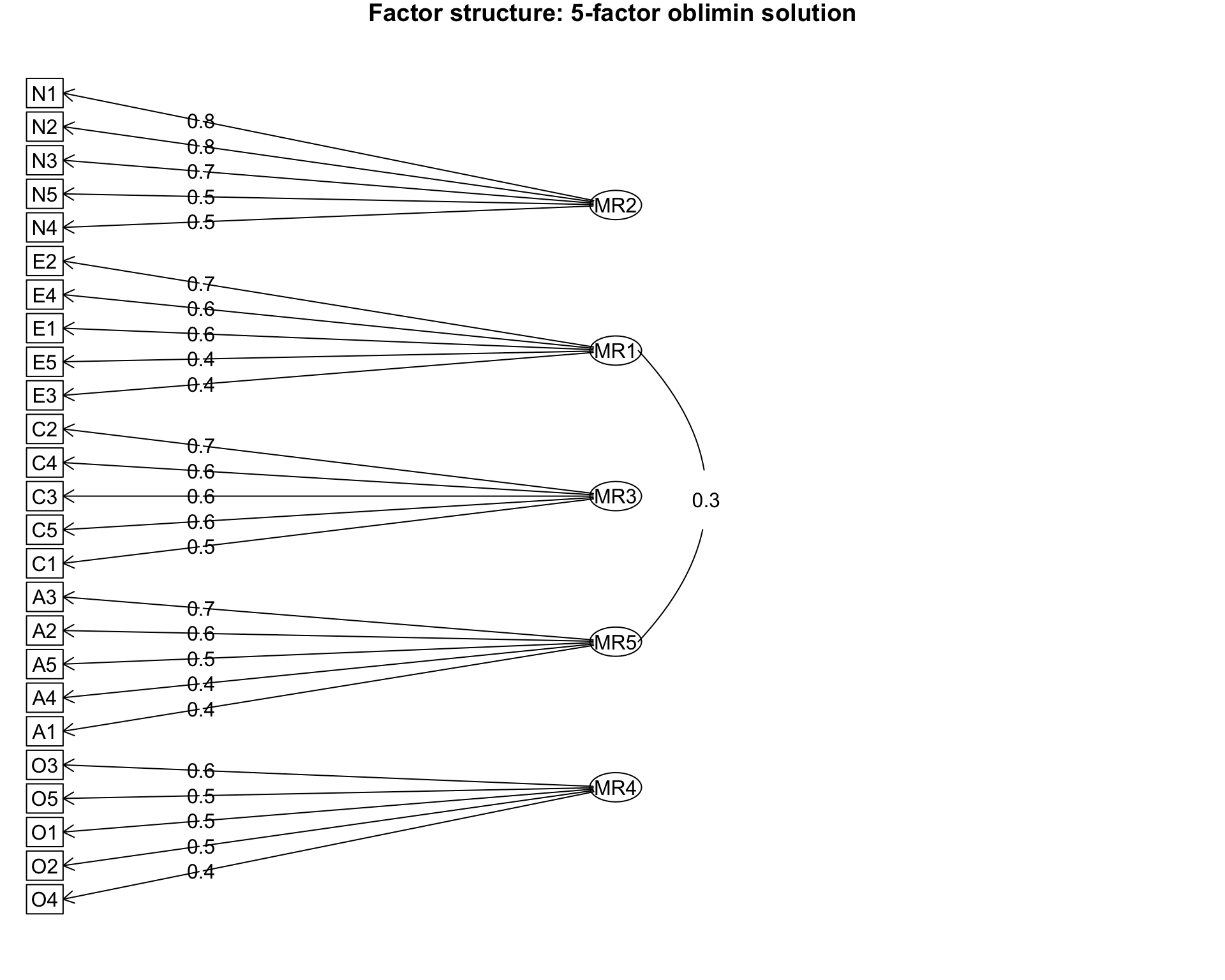
Path diagram
psych::fa.diagram() produces a path diagram showing which items load on which factors:
Code
fa.diagram(fa_5, main ="Factor structure: 5-factor oblimin solution")
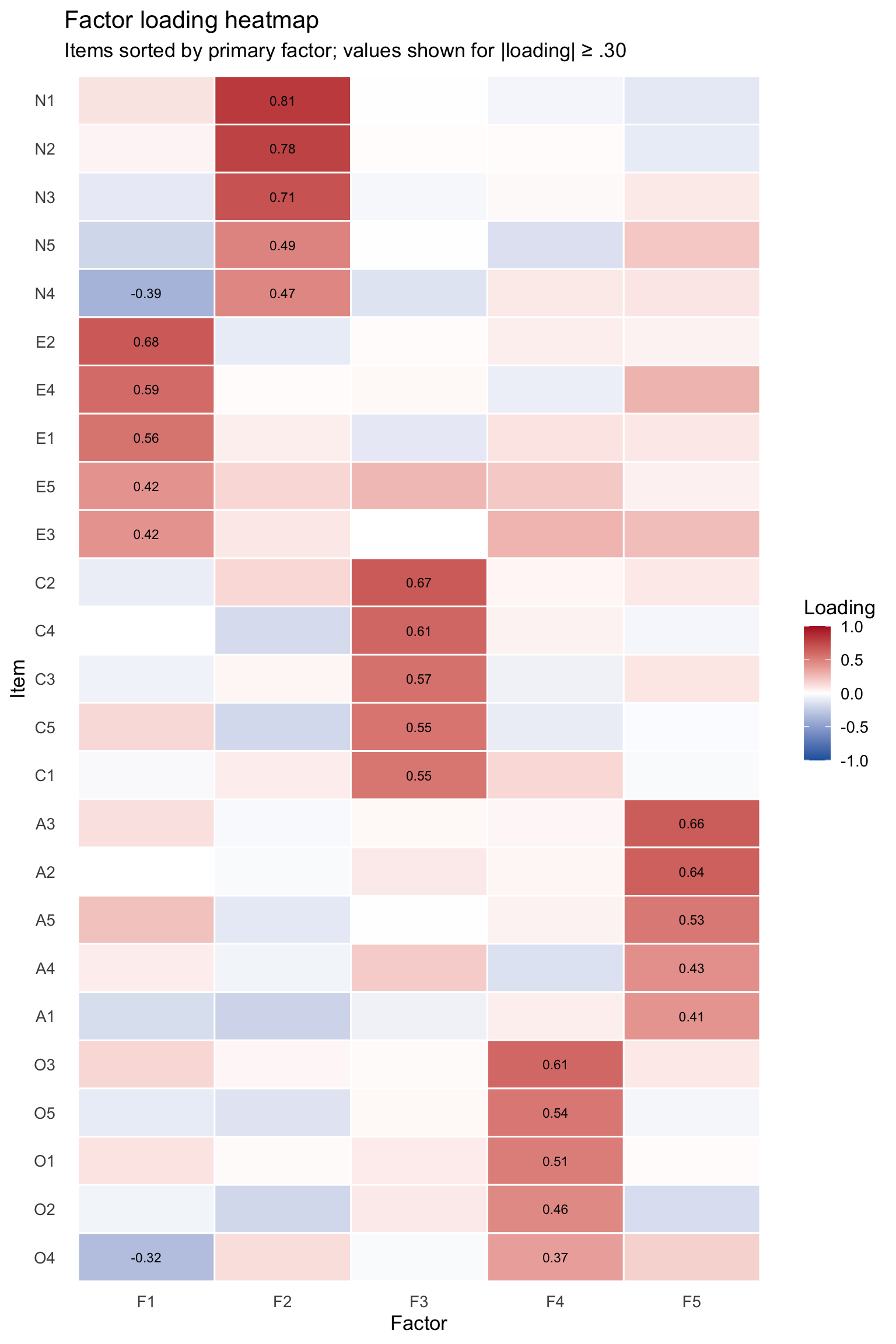
Loading heatmap in ggplot
A custom heatmap of factor loadings gives us more control and a cleaner display. We want items sorted by their primary loading so that simple structure is visually apparent.
Code
# Extract loadings matrixloadings_mat <-as.data.frame(unclass(fa_5$loadings))loadings_mat$item <-rownames(loadings_mat)# Determine each item's primary factor (highest absolute loading)loadings_mat$primary_factor <-apply(abs(loadings_mat %>%select(-item)), 1, which.max)loadings_mat$max_loading <-apply(abs(loadings_mat %>%select(-item, -primary_factor)), 1, max)# Sort items: first by primary factor, then by loading magnitude within factorloadings_mat <- loadings_mat %>%arrange(primary_factor, desc(max_loading))# Convert to long formatloadings_long <- loadings_mat %>%select(-primary_factor, -max_loading) %>%pivot_longer(-item, names_to ="factor", values_to ="loading") %>%mutate(item =factor(item, levels =rev(loadings_mat$item)))# Rename factors for interpretabilityfactor_labels <-c("MR1"="F1", "MR2"="F2", "MR3"="F3","MR4"="F4", "MR5"="F5")loadings_long$factor <- factor_labels[loadings_long$factor]ggplot(loadings_long, aes(x = factor, y = item, fill = loading)) +geom_tile(color ="white", linewidth =0.5) +geom_text(aes(label =ifelse(abs(loading) >=0.3, sprintf("%.2f", loading), "")),size =3, color ="black" ) +scale_fill_gradient2(low ="#2166ac", mid ="white", high ="#b2182b",midpoint =0, limits =c(-1, 1),name ="Loading" ) +labs(title ="Factor loading heatmap",subtitle ="Items sorted by primary factor; values shown for |loading| ≥ .30",x ="Factor",y ="Item" ) +theme_minimal(base_size =13) +theme(panel.grid =element_blank())
A well-fitting factor model will show simple structure: each item loads strongly on one factor and weakly on the others. Items with strong cross-loadings suggest measurement problems or factors that are not cleanly separated.
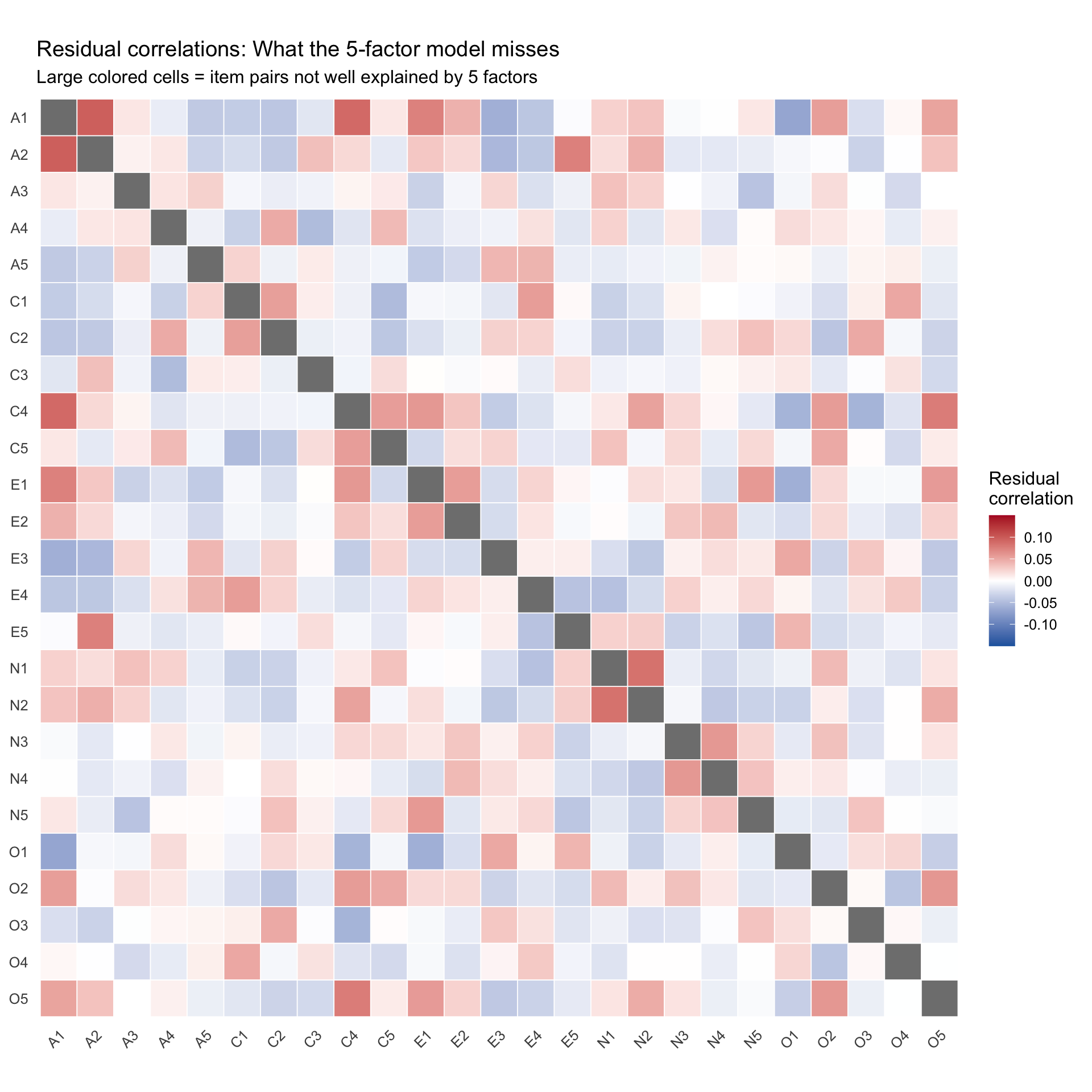
Visualizing fit and misfit
The logic of residual correlations
A factor model’s fundamental prediction is about the correlation matrix. The model says:
where \(\hat{\mathbf{R}}\) is the model-implied correlation matrix, \(\mathbf{\Lambda}\) is the loading matrix, \(\mathbf{\Phi}\) is the factor correlation matrix, and \(\mathbf{\Psi}\) is the uniqueness (residual variance) diagonal.
Large residual correlations flag item pairs whose relationship the factor model does not explain. These are the places where the model is wrong.
Computing and plotting residual correlations
Code
# Extract residual correlation matrix from the fa objectresid_mat <- fa_5$residual# Zero out the diagonal (residual variances are not interesting here)diag(resid_mat) <-NA# Convert to long formatresid_long <- resid_mat %>%as.data.frame() %>%mutate(item1 =rownames(.)) %>%pivot_longer(-item1, names_to ="item2", values_to ="residual") %>%mutate(item1 =factor(item1, levels =colnames(resid_mat)),item2 =factor(item2, levels =rev(colnames(resid_mat))) )ggplot(resid_long, aes(x = item1, y = item2, fill = residual)) +geom_tile(color ="white", linewidth =0.3) +scale_fill_gradient2(low ="#2166ac", mid ="white", high ="#b2182b",midpoint =0, limits =c(-0.15, 0.15), oob = squish,name ="Residual\ncorrelation" ) +labs(title ="Residual correlations: What the 5-factor model misses",subtitle ="Large colored cells = item pairs not well explained by 5 factors",x =NULL, y =NULL ) +theme_minimal(base_size =12) +theme(axis.text.x =element_text(angle =45, hjust =1),panel.grid =element_blank() ) +coord_fixed()
In a well-fitting model, the residual correlation matrix should be mostly pale (near zero). Pockets of strong colour indicate item pairs whose relationship exceeds what the factors predict.
Fit indices
The numeric fit indices connect directly to the visual residuals:
Code
cat("Root Mean Square Residual (RMSR):", round(fa_5$rms, 4), "\n")
Conventional guidelines (which should be interpreted cautiously):
RMSR: Should be close to the expected value for your sample size (printed by fa()). Lower is better.
RMSEA: < .05 is “good,” .05–.08 is “acceptable.” Higher indicates misfit.
TLI: > .90 is “acceptable,” > .95 is “good.”
Comparing factor solutions
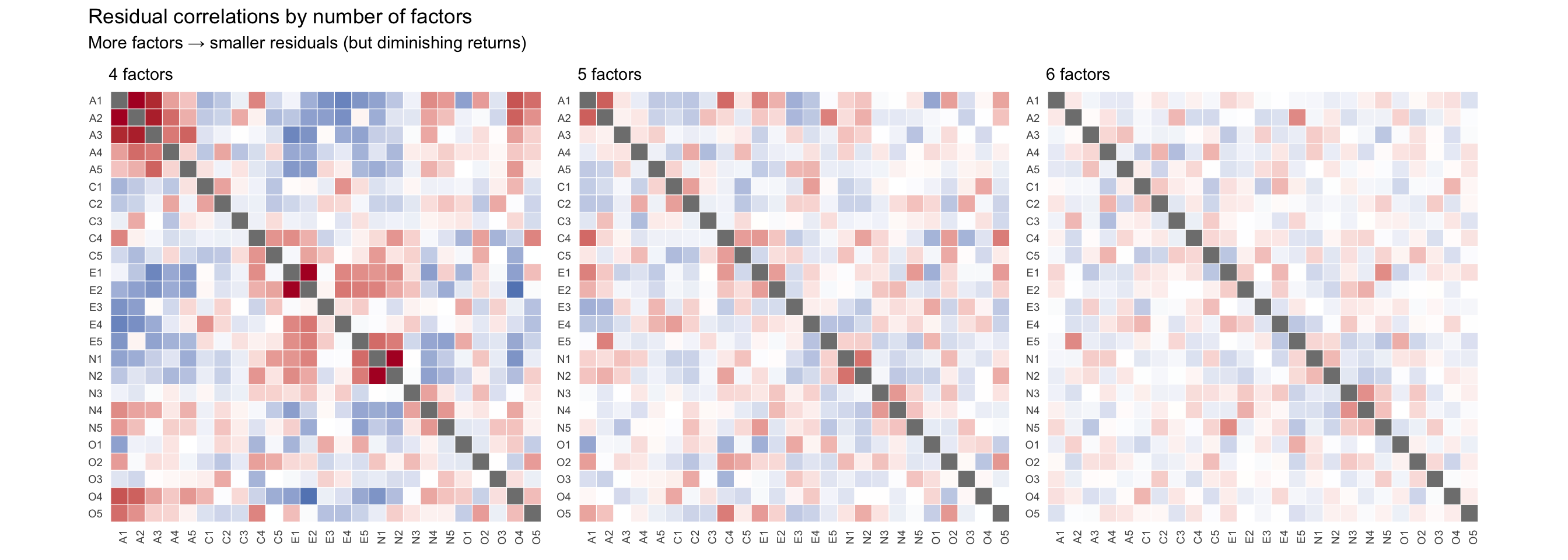
One powerful diagnostic is to compare the residual correlations across different numbers of factors. If adding a factor eliminates a block of residual correlations, it was capturing real covariance.
Code
fa_4 <-fa(bfi_items, nfactors =4, rotate ="oblimin", fm ="minres")fa_6 <-fa(bfi_items, nfactors =6, rotate ="oblimin", fm ="minres")
# Helper function to create a residual heatmapmake_resid_heatmap <-function(fa_obj, title_label) { resid_m <- fa_obj$residualdiag(resid_m) <-NA resid_m %>%as.data.frame() %>%mutate(item1 =rownames(.)) %>%pivot_longer(-item1, names_to ="item2", values_to ="residual") %>%mutate(item1 =factor(item1, levels =colnames(resid_m)),item2 =factor(item2, levels =rev(colnames(resid_m))) ) %>%ggplot(aes(x = item1, y = item2, fill = residual)) +geom_tile(color ="white", linewidth =0.2) +scale_fill_gradient2(low ="#2166ac", mid ="white", high ="#b2182b",midpoint =0, limits =c(-0.15, 0.15), oob = squish ) +labs(title = title_label, x =NULL, y =NULL) +theme_minimal(base_size =9) +theme(axis.text.x =element_text(angle =90, hjust =1, size =7),axis.text.y =element_text(size =7),panel.grid =element_blank(),legend.position ="none" ) +coord_fixed()}p4 <-make_resid_heatmap(fa_4, "4 factors")p5 <-make_resid_heatmap(fa_5, "5 factors")p6 <-make_resid_heatmap(fa_6, "6 factors")p4 + p5 + p6 +plot_annotation(title ="Residual correlations by number of factors",subtitle ="More factors → smaller residuals (but diminishing returns)" )
As the number of factors increases, the residual correlation matrix should become increasingly pale. But there are diminishing returns: if adding a 6th factor only eliminates a tiny pocket of residual color, it may not be worth the added complexity.
Factor scores
Once we are satisfied with the factor solution, we can extract factor scores — each person’s estimated standing on each latent factor. Alternatively, we can use classical test theory to compute simple sum or mean scores across the items that make up each factor.
1. Classical unit-weighted scores (scoreItems)
A common alternative to EFA-derived factor scores is to simply average the raw items that belong to each trait. The psych::scoreItems() function does this automatically. Crucially, if we specify impute = "median", it will handle missing data by substituting the median response for that person’s missing item, allowing us to keep all 2,800 participants.
Code
# Since we already reverse-scored the items upfront, our keys just point # to the existing positive columns for each trait.scale_keys <-list(Agreeableness =paste0("A", 1:5),Conscientiousness =paste0("C", 1:5),Extraversion =paste0("E", 1:5),Neuroticism =paste0("N", 1:5),Openness =paste0("O", 1:5))classic_scores <-scoreItems(keys = scale_keys, items = bfi_items, impute ="median")# Extract the scores matrix into a data framescores_classic <-as.data.frame(classic_scores$scores) %>%rename_with(~paste0(.x, "_classic"))
2. EFA factor scores (factor.scores)
We can also extract the mathematically derived factor scores from the EFA model. We use the tenBerge method because it guarantees that the extracted scores will have the exact same correlations as the latent factors. We also pass impute = "median" so that individuals with missing item data are retained rather than dropped via listwise deletion.
Code
fs_results <-factor.scores(bfi_items, fa_5, method ="tenBerge", impute ="median")scores_efa <-as.data.frame(fs_results$scores)# Rename the columns to match their psychological traits based on item loadings# (Check the loading matrix: MR2=Neuroticism, MR1=Extraversion, etc.)colnames(scores_efa) <-c("Neuroticism_efa", "Extraversion_efa", "Conscientiousness_efa", "Agreeableness_efa", "Openness_efa")# Bind both score types back to our original datasetbfi_scored <-bind_cols(bfi_data, scores_classic, scores_efa)
Identifying the factors: Notice that fa() output calls the factors MR1, MR2, etc. These numbers are arbitrary and depend on the extraction math, not psychological theory. To figure out “Which factor is which?”, look at the heatmaps or the path diagram to see which items load highest. For example, if the Agreeableness items (A1-A5) all load strongly on MR2, then MR2 is the Agreeableness factor. It’s a best practice to rename factors so they are interpretable.
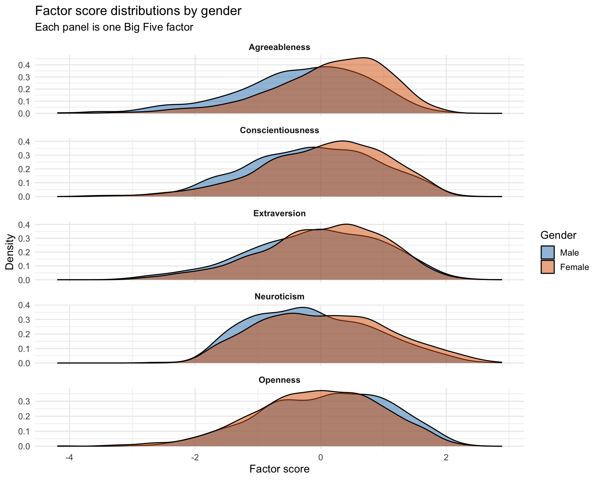
Factor score distributions by gender
Code
scores_long <- bfi_scored %>%filter(!is.na(gender_f)) %>%pivot_longer(ends_with("_efa"), names_to ="factor", values_to ="score") %>%mutate(factor =sub("_efa", "", factor))ggplot(scores_long, aes(x = score, fill = gender_f)) +geom_density(alpha =0.5) +facet_wrap(~factor, scales ="free_y", ncol =1) +scale_fill_manual(values =c("Male"="#2c7fb8", "Female"="#d95f02"),name ="Gender" ) +labs(title ="Factor score distributions by gender",subtitle ="Each panel is one Big Five factor",x ="Factor score",y ="Density" ) +theme_minimal(base_size =13) +theme(strip.text =element_text(face ="bold"))
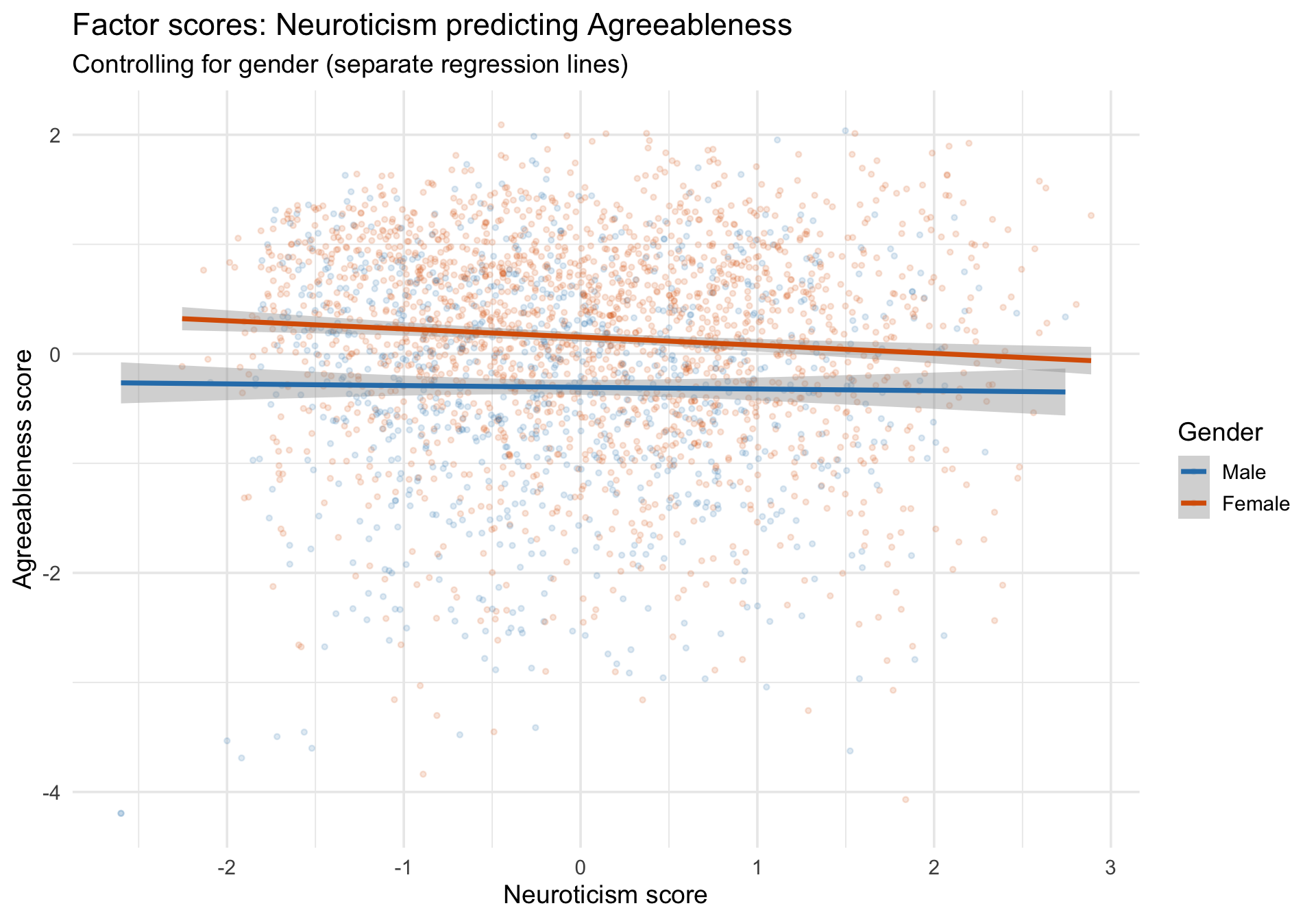
Factor scores as regression predictors
Factor scores can be used as predictors or outcomes in subsequent analyses, connecting the latent measurement model back to the regression framework covered in the first walkthrough.
Code
# Example: does neuroticism predict agreeableness?m_fs <-lm(Agreeableness_efa ~ Neuroticism_efa + age + gender_f, data = bfi_scored)summary(m_fs)
Call:
lm(formula = Agreeableness_efa ~ Neuroticism_efa + age + gender_f,
    data = bfi_scored)

Residuals:
    Min      1Q  Median      3Q     Max
-4.1746 -0.5558  0.1293  0.6800  2.3104

Coefficients:
                 Estimate Std. Error t value Pr(>|t|)
(Intercept)     -0.555301   0.056426  -9.841  < 2e-16 ***
Neuroticism_efa -0.043235   0.018608  -2.323   0.0202 *
age              0.008785   0.001667   5.270 1.47e-07 ***
gender_fFemale   0.450198   0.039333  11.446  < 2e-16 ***
---
Signif. codes:  0 '***' 0.001 '**' 0.01 '*' 0.05 '.' 0.1 ' ' 1

Residual standard error: 0.9713 on 2796 degrees of freedom
Multiple R-squared:  0.05751,   Adjusted R-squared:  0.0565
F-statistic: 56.87 on 3 and 2796 DF,  p-value: < 2.2e-16
Before fitting: Examine the correlation matrix with a heatmap. Look for blocks of correlated items that suggest latent factors. Use parallel analysis to determine the number of factors.
After fitting: Visualize the loading matrix as a heatmap. Look for simple structure: each item loading strongly on one factor. Use fa.diagram() for a quick structural overview.
Diagnosing misfit: Compute the residual correlation matrix (observed minus model-implied). Large residual correlations reveal item pairs that the model fails to explain. Compare residual matrices across different numbers of factors.
Using the results: Extract factor scores and visualize their distributions. Factor scores can then be used in regression models, group comparisons, or other analyses.