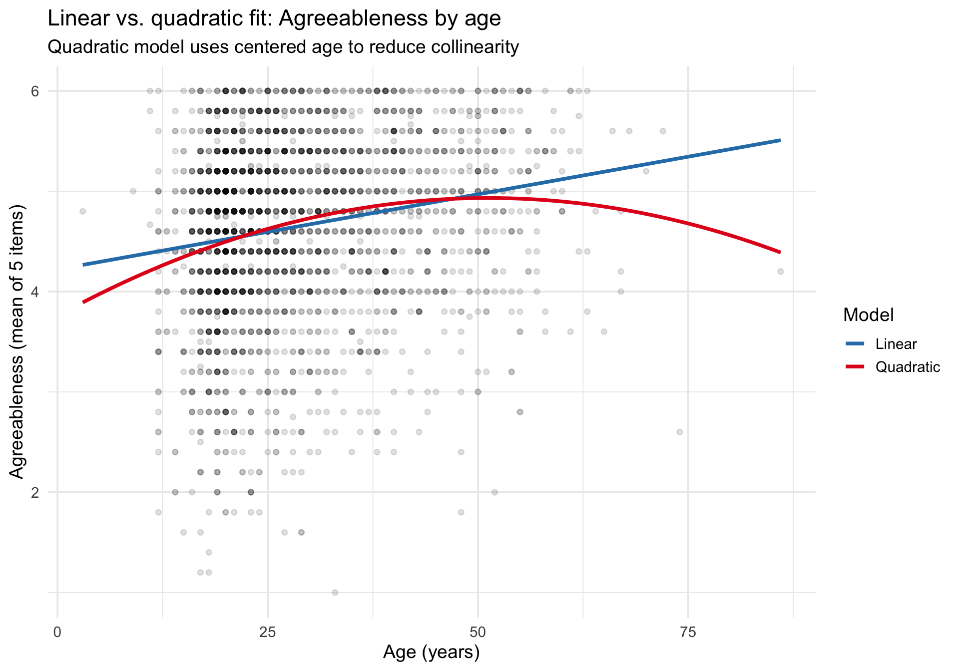
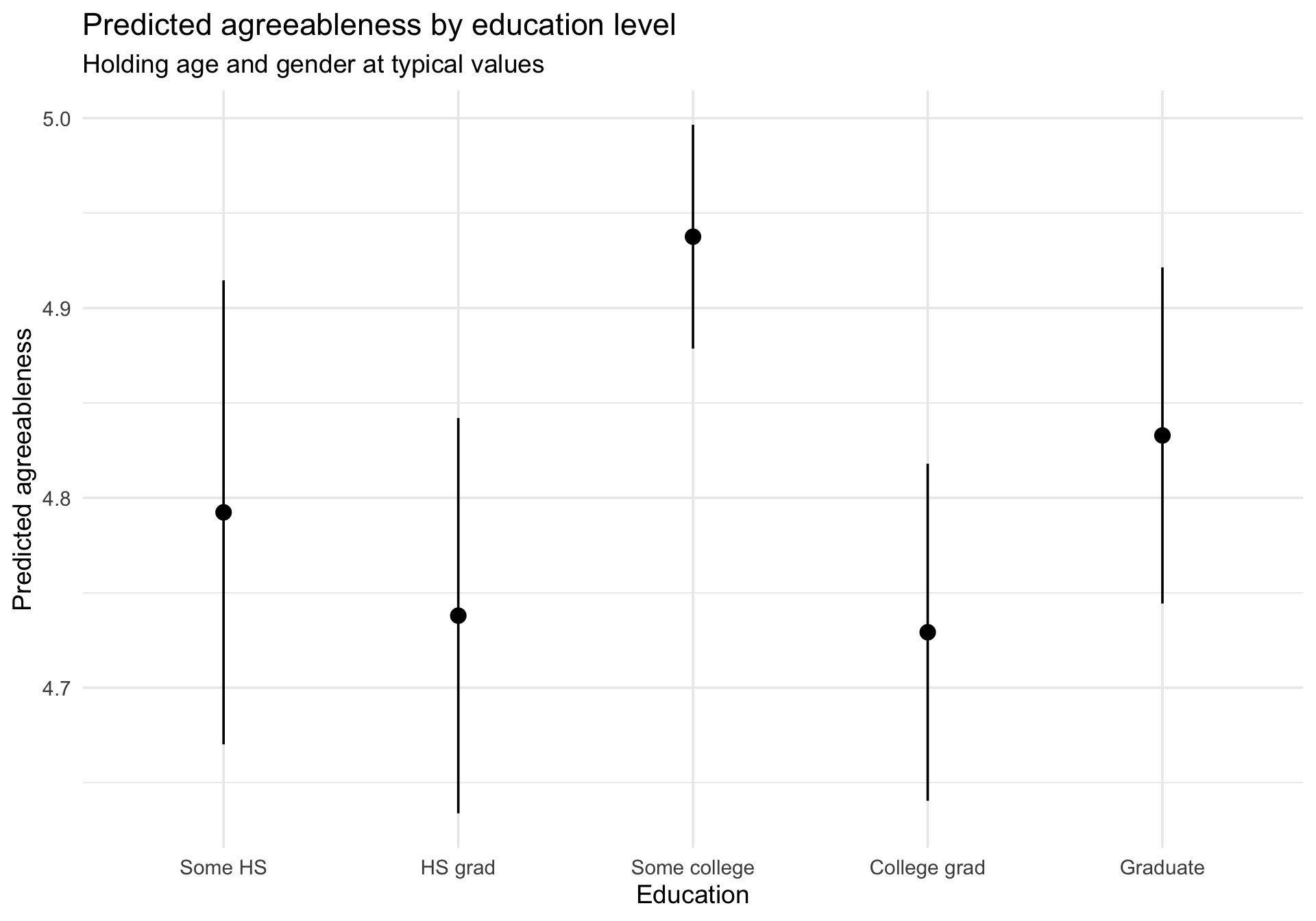
Visualizing Linear Models and Mean Comparisons

Author

Michael Hallquist, PSYC 859

Published

April 9, 2026

Overview

Statistical models are tools for summarizing data: they use parameters to capture the processes and individual differences that give rise to observed values. But a table of coefficients and p-values is only part of the story. Graphical methods let us see what a model predicts, compare those predictions to the observed data, and spot places where the model breaks down.

A useful rule of thumb from the class slides: If you don’t know how to visualize the fit and misfit of a statistical model, you shouldn’t move ahead with interpretation.

This walkthrough demonstrates how to visualize predictions, coefficients, and diagnostics for the models that appear most frequently in psychology: linear regression, t-tests, and ANOVA. We use three complementary R packages that each address a different part of the visualization problem:

Package What it does Key functions
marginaleffects Model predictions, comparisons, and slopes on the response scale predictions(), plot_predictions(), comparisons(), plot_slopes()
sjPlot Publication-ready coefficient plots and model tables plot_model(), tab_model()
performance Assumption diagnostics in a single dashboard check_model(), check_normality(), check_heteroscedasticity()

Learning goals

After working through this document, you should be able to:

  1. Explain why visualizing model predictions alongside raw data is essential for interpretation.
  2. Use marginaleffects to generate and plot predicted values, contrasts, and marginal effects.
  3. Use sjPlot to create forest plots of coefficients and publication-quality model tables.
  4. Use performance::check_model() to produce a multi-panel diagnostic dashboard for any lm object.
  5. Recognize common violations (nonlinearity, heteroscedasticity, influential observations) in diagnostic plots.

Packages

Code
# Install any missing packages (uncomment if needed):
# install.packages(c(
#   "ggplot2", "dplyr", "tidyr", "psych", "MASS",
#   "marginaleffects", "sjPlot", "performance", "see",
#   "car", "patchwork"
# ))

library(ggplot2)
library(dplyr)
library(tidyr)
library(psych)
library(MASS)
library(marginaleffects)
library(sjPlot)
library(performance)
library(see) # required for performance plot methods
library(car)
library(patchwork)

Data preparation: The Big Five Inventory

The bfi dataset from the psych package contains 2,800 responses to 25 personality items measuring the Big Five traits: Agreeableness (A1–A5), Conscientiousness (C1–C5), Extraversion (E1–E5), Neuroticism (N1–N5), and Openness (O1–O5). It also includes gender (1 = Male, 2 = Female), education (1–5), and age.

We will score the Agreeableness and Neuroticism scales and use them as outcomes.

Code
data(bfi, package = "psych")

# Score agreeableness and neuroticism.
# Some items are reverse-keyed; the psych package documents which ones.
# A1 is reverse-keyed; so are E1, E2, O2, O5, C4, C5.
bfi_scored <- bfi %>%
  mutate(
    # Reverse-key relevant items (on 1-6 scale)
    A1r = 7 - A1,
    # Score agreeableness as the mean of the 5 items
    agreeableness = rowMeans(pick(A1r, A2, A3, A4, A5), na.rm = TRUE),
    neuroticism = rowMeans(pick(N1, N2, N3, N4, N5), na.rm = TRUE),
    gender_f = factor(gender, levels = 1:2, labels = c("Male", "Female")),
    education_f = factor(education, levels = 1:5, labels = c(
      "Some HS", "HS grad", "Some college", "College grad", "Graduate"
    ))
  ) %>%
  filter(!is.na(agreeableness), !is.na(age), !is.na(gender_f))

glimpse(bfi_scored)
Rows: 2,800
Columns: 33
$ A1            <int> 2, 2, 5, 4, 2, 6, 2, 4, 4, 2, 4, 2, 5, 5, 4, 4, 4, 5, 4,…
$ A2            <int> 4, 4, 4, 4, 3, 6, 5, 3, 3, 5, 4, 5, 5, 5, 5, 3, 6, 5, 4,…
$ A3            <int> 3, 5, 5, 6, 3, 5, 5, 1, 6, 6, 5, 5, 5, 5, 2, 6, 6, 5, 5,…
$ A4            <int> 4, 2, 4, 5, 4, 6, 3, 5, 3, 6, 6, 5, 6, 6, 2, 6, 2, 4, 4,…
$ A5            <int> 4, 5, 4, 5, 5, 5, 5, 1, 3, 5, 5, 5, 4, 6, 1, 3, 5, 5, 3,…
$ C1            <int> 2, 5, 4, 4, 4, 6, 5, 3, 6, 6, 4, 5, 5, 4, 5, 5, 4, 5, 5,…
$ C2            <int> 3, 4, 5, 4, 4, 6, 4, 2, 6, 5, 3, 4, 4, 4, 5, 5, 4, 5, 4,…
$ C3            <int> 3, 4, 4, 3, 5, 6, 4, 4, 3, 6, 5, 5, 3, 4, 5, 5, 4, 5, 5,…
$ C4            <int> 4, 3, 2, 5, 3, 1, 2, 2, 4, 2, 3, 4, 2, 2, 2, 3, 4, 4, 4,…
$ C5            <int> 4, 4, 5, 5, 2, 3, 3, 4, 5, 1, 2, 5, 2, 1, 2, 5, 4, 3, 6,…
$ E1            <int> 3, 1, 2, 5, 2, 2, 4, 3, 5, 2, 1, 3, 3, 2, 3, 1, 1, 2, 1,…
$ E2            <int> 3, 1, 4, 3, 2, 1, 3, 6, 3, 2, 3, 3, 3, 2, 4, 1, 2, 2, 2,…
$ E3            <int> 3, 6, 4, 4, 5, 6, 4, 4, NA, 4, 2, 4, 3, 4, 3, 6, 5, 4, 4…
$ E4            <int> 4, 4, 4, 4, 4, 5, 5, 2, 4, 5, 5, 5, 2, 6, 6, 6, 5, 6, 5,…
$ E5            <int> 4, 3, 5, 4, 5, 6, 5, 1, 3, 5, 4, 4, 4, 5, 5, 4, 5, 6, 5,…
$ N1            <int> 3, 3, 4, 2, 2, 3, 1, 6, 5, 5, 3, 4, 1, 1, 2, 4, 4, 6, 5,…
$ N2            <int> 4, 3, 5, 5, 3, 5, 2, 3, 5, 5, 3, 5, 2, 1, 4, 5, 4, 5, 6,…
$ N3            <int> 2, 3, 4, 2, 4, 2, 2, 2, 2, 5, 4, 3, 2, 1, 2, 4, 4, 5, 5,…
$ N4            <int> 2, 5, 2, 4, 4, 2, 1, 6, 3, 2, 2, 2, 2, 2, 2, 5, 4, 4, 5,…
$ N5            <int> 3, 5, 3, 1, 3, 3, 1, 4, 3, 4, 3, NA, 2, 1, 3, 5, 5, 4, 2…
$ O1            <int> 3, 4, 4, 3, 3, 4, 5, 3, 6, 5, 5, 4, 4, 5, 5, 6, 5, 5, 4,…
$ O2            <int> 6, 2, 2, 3, 3, 3, 2, 2, 6, 1, 3, 6, 2, 3, 2, 6, 1, 1, 2,…
$ O3            <int> 3, 4, 5, 4, 4, 5, 5, 4, 6, 5, 5, 4, 4, 4, 5, 6, 5, 4, 2,…
$ O4            <int> 4, 3, 5, 3, 3, 6, 6, 5, 6, 5, 6, 5, 5, 4, 5, 3, 6, 5, 4,…
$ O5            <int> 3, 3, 2, 5, 3, 1, 1, 3, 1, 2, 3, 4, 2, 4, 5, 2, 3, 4, 2,…
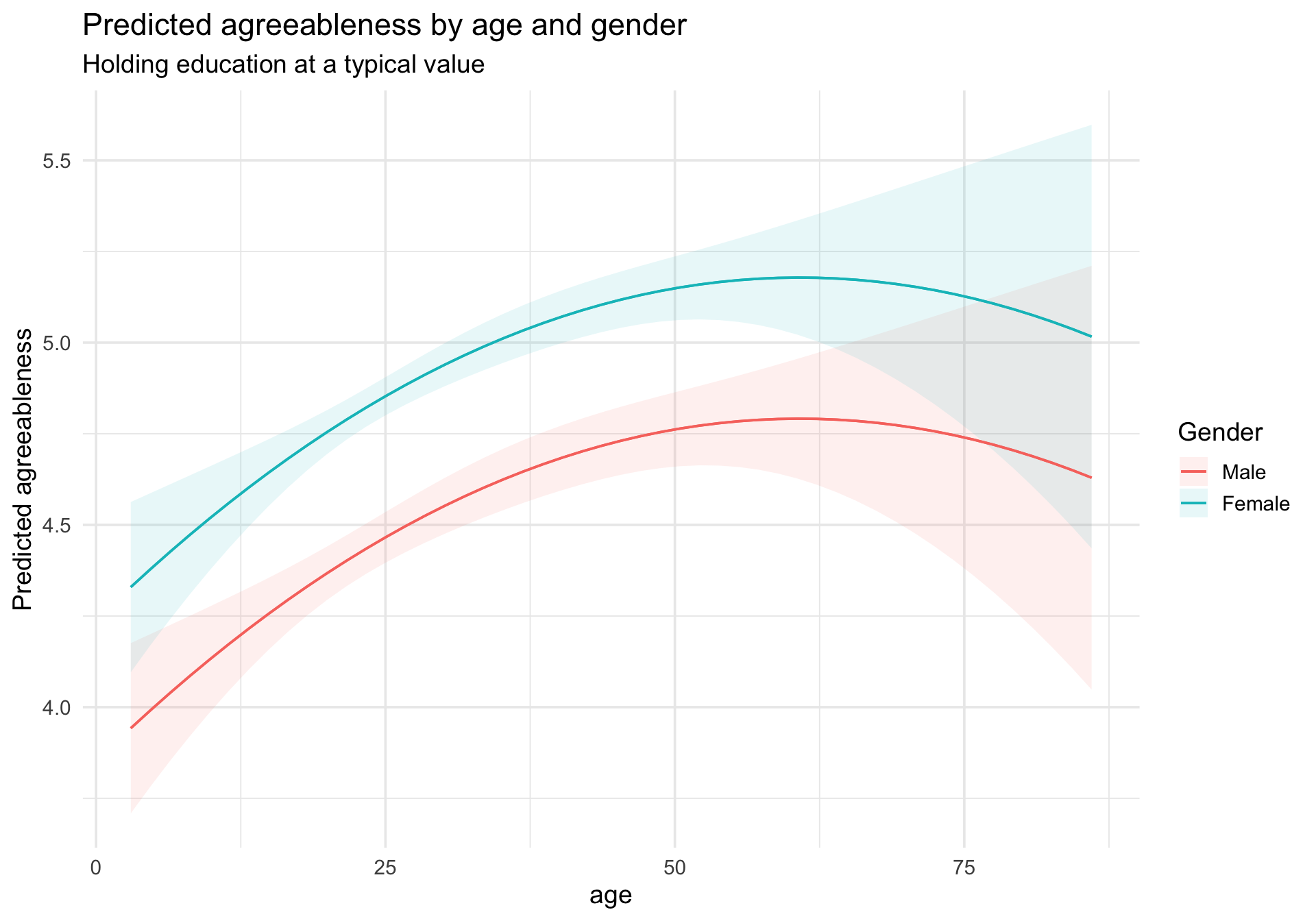
$ gender        <int> 1, 2, 2, 2, 1, 2, 1, 1, 1, 2, 1, 1, 2, 1, 1, 1, 2, 1, 2,…
$ education     <int> NA, NA, NA, NA, NA, 3, NA, 2, 1, NA, 1, NA, NA, NA, 1, N…
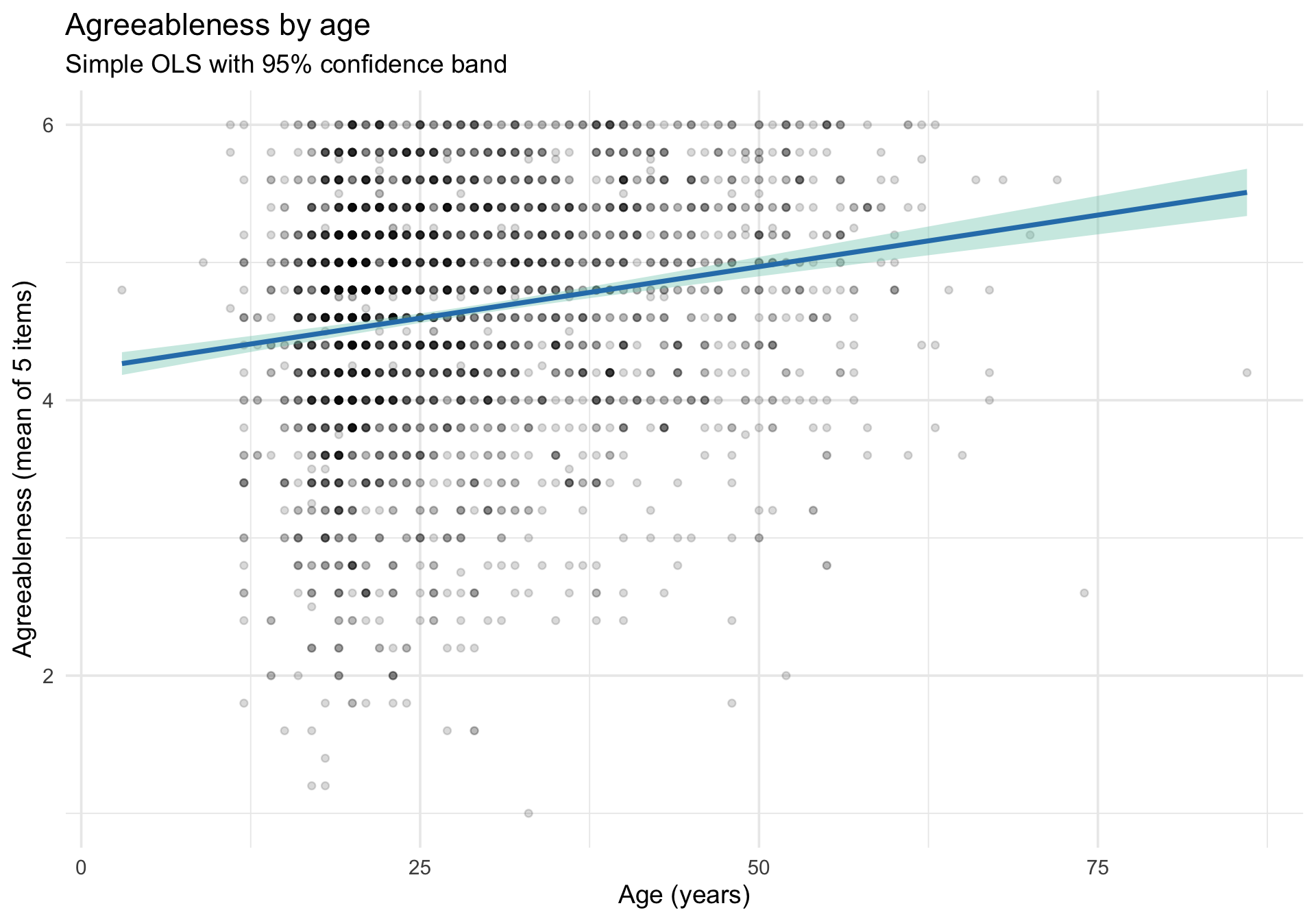
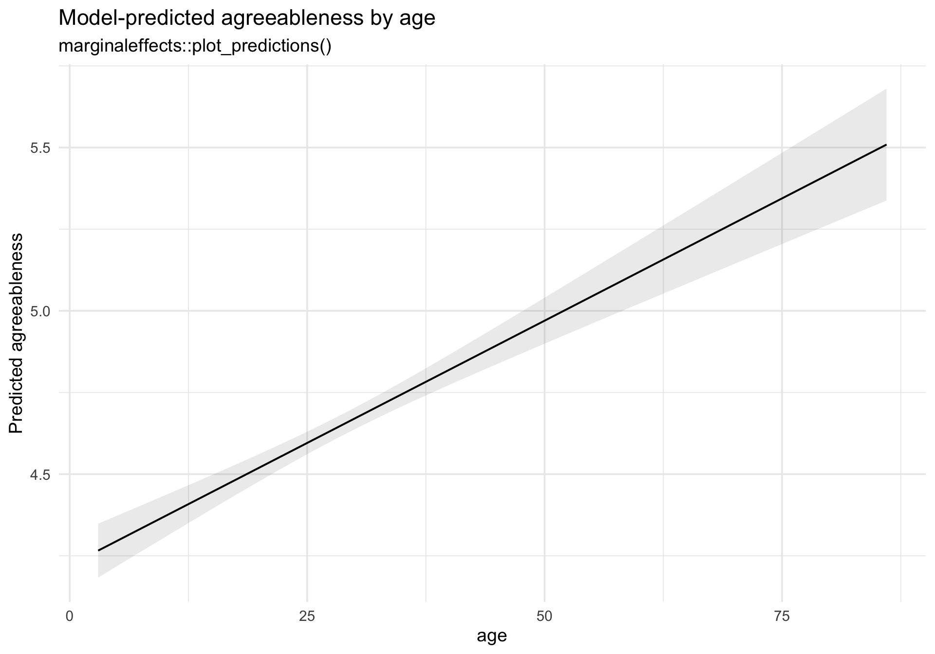
$ age           <int> 16, 18, 17, 17, 17, 21, 18, 19, 19, 17, 21, 16, 16, 16, …
$ A1r           <dbl> 5, 5, 2, 3, 5, 1, 5, 3, 3, 5, 3, 5, 2, 2, 3, 3, 3, 2, 3,…
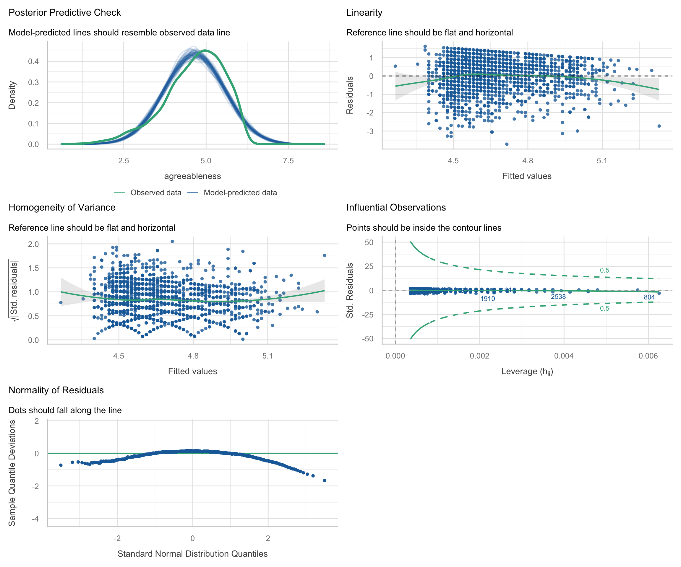
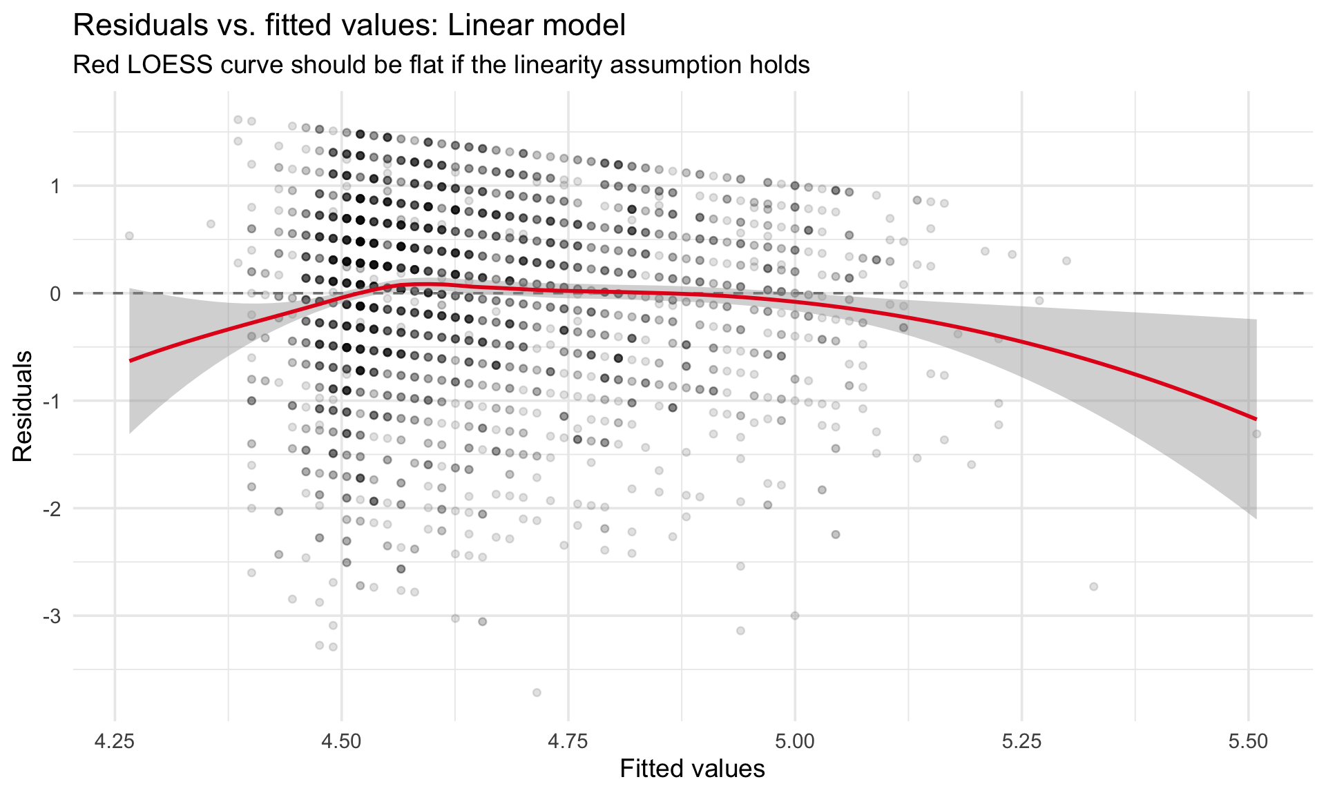
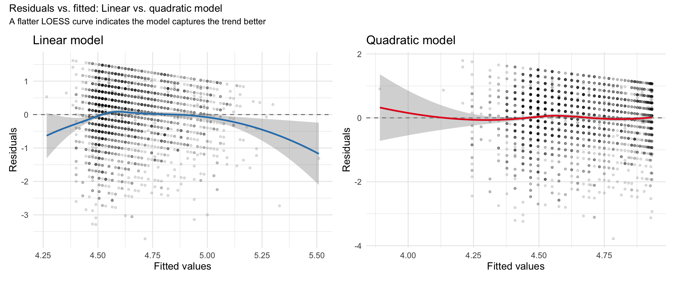
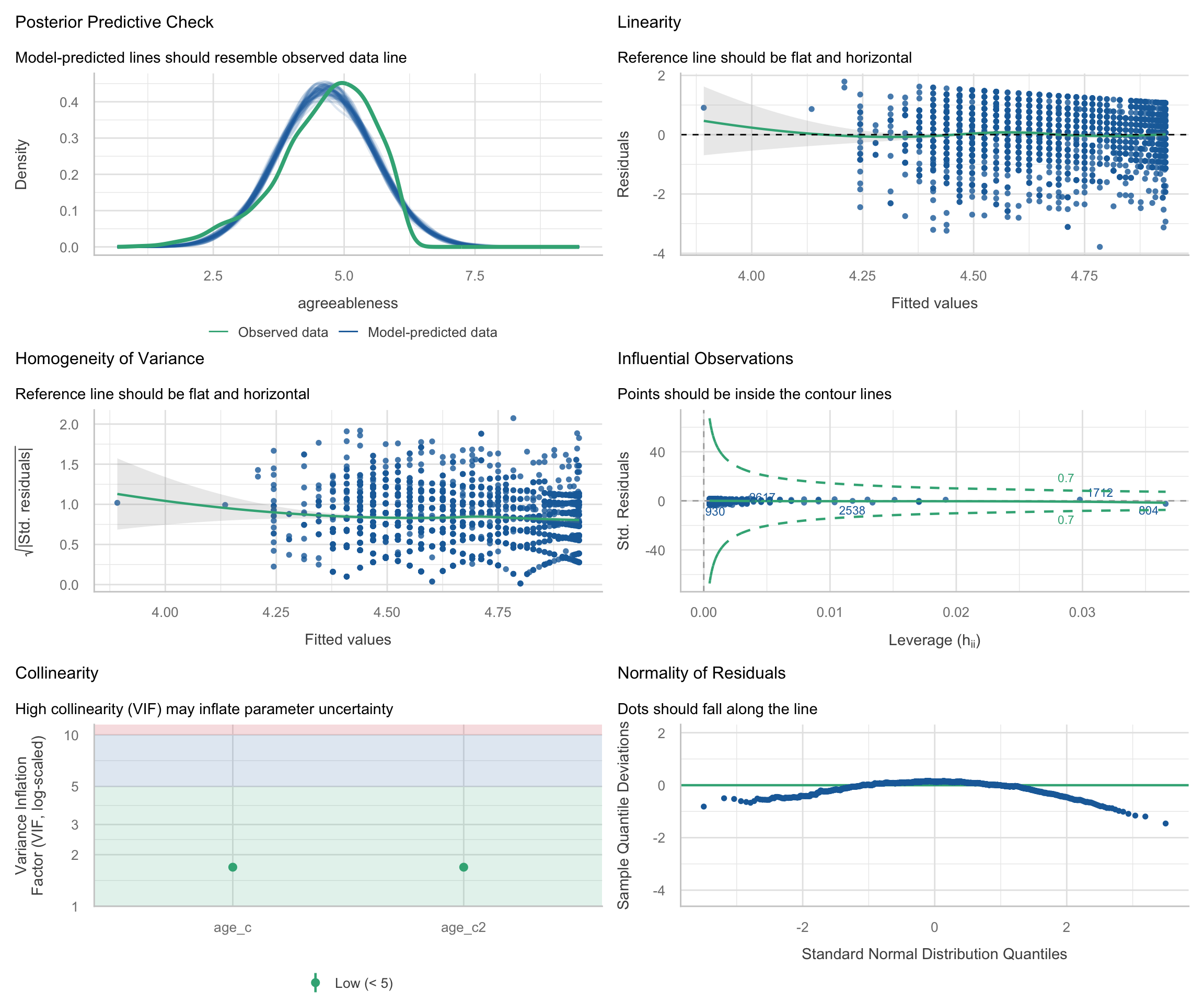
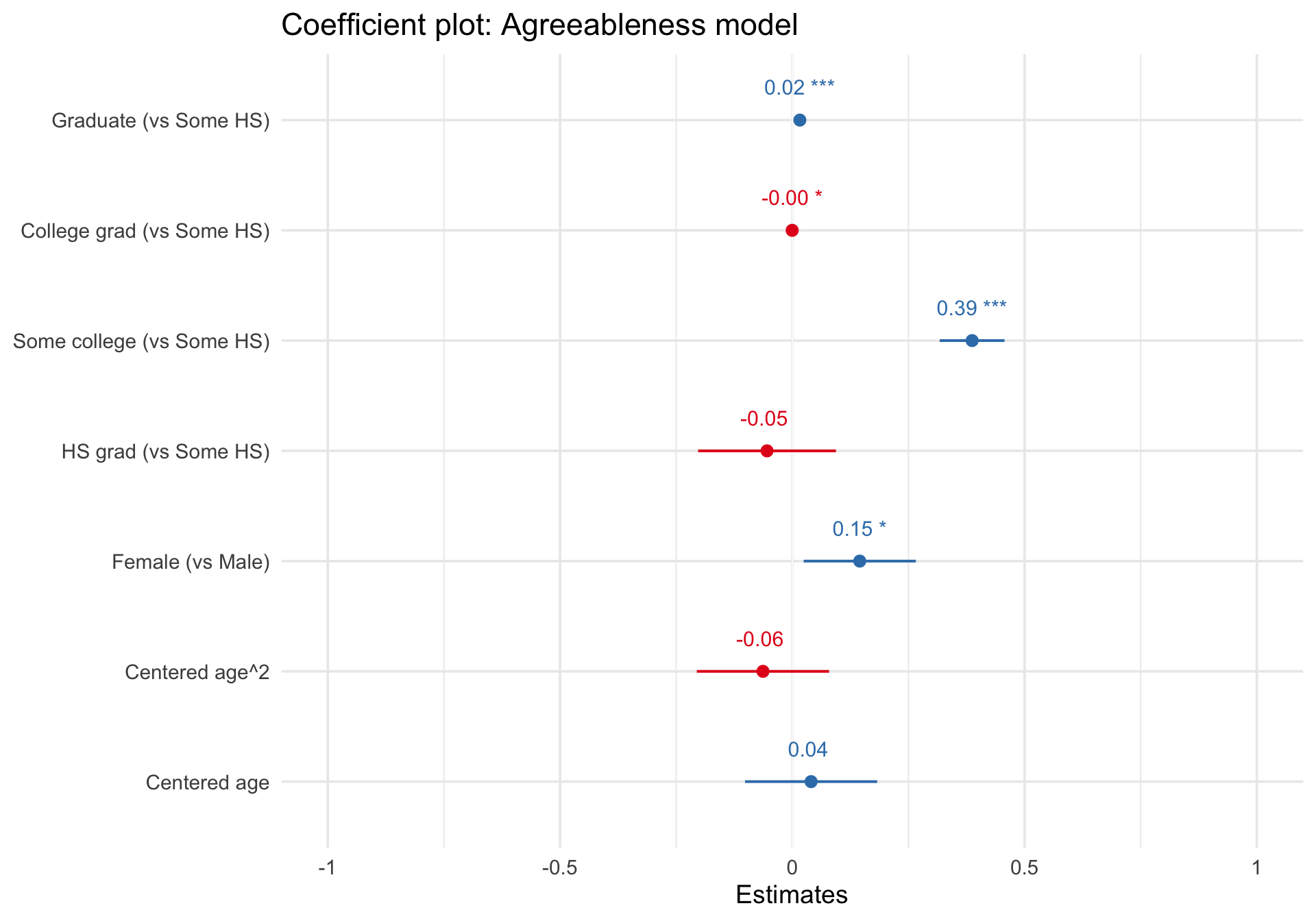
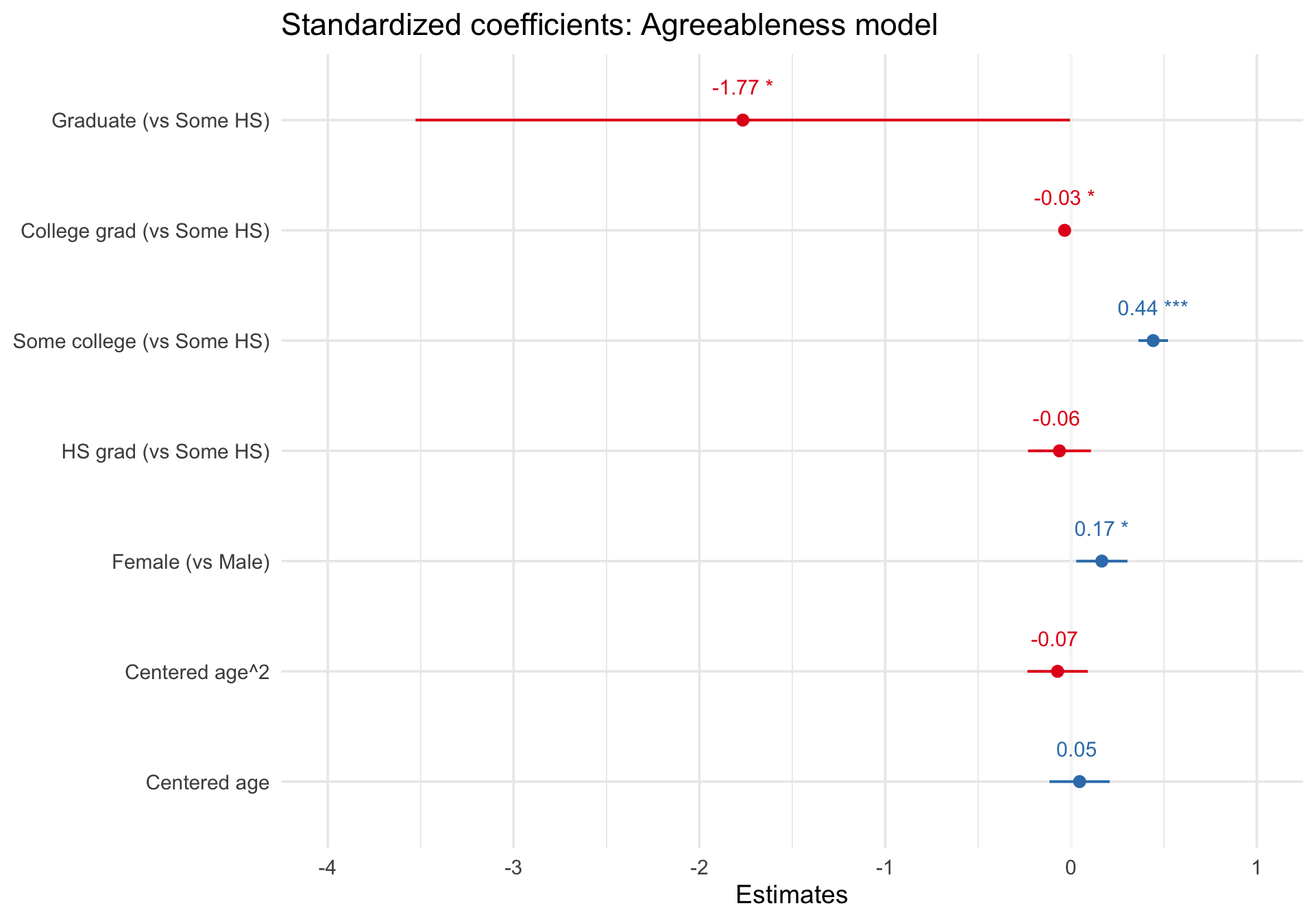
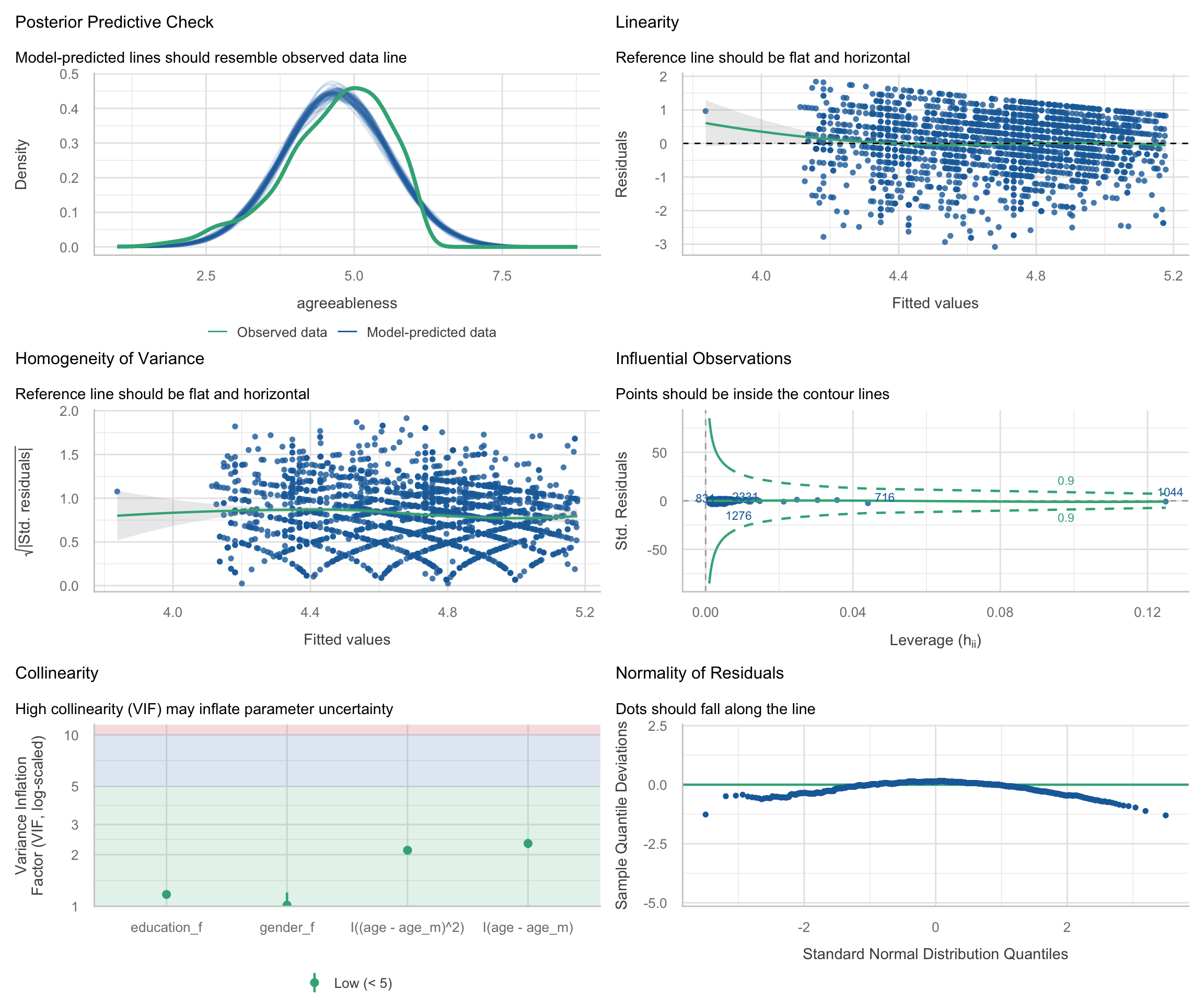
$ agreeableness <dbl> 4.0, 4.2, 3.8, 4.6, 4.0, 4.6, 4.6, 2.6, 3.6, 5.4, 4.6, 5…
$ neuroticism   <dbl> 2.8, 3.8, 3.6, 2.8, 3.2, 3.0, 1.4, 4.2, 3.6, 4.2, 3.0, 3…
$ gender_f      <fct> Male, Female, Female, Female, Male, Female, Male, Male, …
$ education_f   <fct> NA, NA, NA, NA, NA, Some college, NA, HS grad, Some HS, …

Simple linear regression

We start with the simplest possible model: does agreeableness change with age?

Fit the model

Code
m_simple <- lm(agreeableness ~ age, data = bfi_scored)
summary(m_simple)

Call:
lm(formula = agreeableness ~ age, data = bfi_scored)

Residuals:
    Min      1Q  Median      3Q     Max 
-3.7153 -0.5206  0.1244  0.6645  1.6142 

Coefficients:
            Estimate Std. Error t value Pr(>|t|)    
(Intercept)  4.22101    0.04628  91.204   <2e-16 ***
age          0.01498    0.00150   9.986   <2e-16 ***
---
Signif. codes:  0 '***' 0.001 '**' 0.01 '*' 0.05 '.' 0.1 ' ' 1

Residual standard error: 0.883 on 2798 degrees of freedom
Multiple R-squared:  0.03441,   Adjusted R-squared:  0.03407 
F-statistic: 99.72 on 1 and 2798 DF,  p-value: < 2.2e-16

Using ggplot to plot the linear relationship

Most people start here: geom_smooth(method = "lm") draws a regression line directly from the data, while geom_point() shows the raw data for comparison.

Code
ggplot(bfi_scored, aes(x = age, y = agreeableness)) +
  geom_point(alpha = 0.15, size = 1.5) +
  geom_smooth(method = "lm", color = "#2c7fb8", fill = "#7fcdbb") +
  labs(
    title = "Agreeableness by age",
    subtitle = "Simple OLS with 95% confidence band",
    x = "Age (years)",
    y = "Agreeableness (mean of 5 items)"
  ) +
  theme_minimal(base_size = 14)

This is quick and useful, but it has limits. The band shows uncertainty about the regression line (mean prediction), not about individual data points. And as the model gets more complex — multiple predictors, interactions — geom_smooth can’t keep up.

Using marginaleffects::plot_predictions()

The marginaleffects package provides a general-purpose approach that works for any model:

Code
plot_predictions(m_simple, condition = "age") +
  labs(
    title = "Model-predicted agreeableness by age",
    subtitle = "marginaleffects::plot_predictions()",
    y = "Predicted agreeableness"
  ) +
  theme_minimal(base_size = 14)

The strength of plot_predictions() is that it works identically whether the model is a simple lm, a generalized linear model, or a multilevel model. The same code, the same logic.

Residual diagnostics with performance::check_model()

The check_model() function produces a multi-panel dashboard of the most important diagnostic plots for any regression model. It replaces the need to remember which base R plot() panel is which.

Code
check_model(m_simple)

What to look for in each panel:

Even for ordinary least squares models, performance includes a posterior predictive-style panel by simulating replicated outcome data from the fitted model and comparing those simulated outcomes to the observed outcome distribution.

  1. Posterior predictive check: Do simulated datasets from the model look like the observed data?
  2. Linearity: Are residuals scattered randomly around zero, or is there a pattern (e.g., curve)?
  3. Homogeneity of variance (scale-location): Does the spread of residuals change as fitted values increase?
  4. Influential observations: In this plot, the x-axis shows leverage (how unusual an observation’s predictor values are) and the y-axis shows standardized residuals (how far the observed outcome is from the model’s prediction, in standard deviation units). Observations with both high leverage (far right) and large standardized residuals (far from zero) are potentially influential because they can disproportionately affect the fitted model. The dashed lines indicate Cook’s distance thresholds; observations beyond these lines may be unduly influential on the model estimates.
  5. Normality of residuals (flattened QQ plot): This plot checks the normality of the residuals. The points should tightly hug the horizontal line. The x-axis shows the theoretical quantiles of a standard normal distribution, and the y-axis shows the deviations of the sample residual quantiles from those theoretical values. Departures at the tails are common, but systematic deviations from the line (e.g., curvature) may indicate that the model does not conform to the normal residuals assumption.

Look carefully at the Linearity panel. There seems to be a slight curve in the reference line (rather than a flat horizontal line at zero), which suggests the relationship between age and agreeableness may not be purely linear. Let’s investigate.

Diagnosing and addressing curvilinearity

Zooming into the residuals-vs-fitted plot

The check_model() dashboard packs a lot into a small space. Let’s isolate the residuals-vs-fitted panel so we can examine the pattern more clearly:

Code
# Extract residuals and fitted values from the linear model
diag_simple <- data.frame(
  fitted = fitted(m_simple),
  residuals = residuals(m_simple)
)

ggplot(diag_simple, aes(x = fitted, y = residuals)) +
  geom_point(alpha = 0.12, size = 1.5) +
  geom_hline(yintercept = 0, linetype = "dashed", color = "gray50") +
  geom_smooth(method = "loess", se = TRUE, color = "#e41a1c", linewidth = 1) +
  labs(
    title = "Residuals vs. fitted values: Linear model",
    subtitle = "Red LOESS curve should be flat if the linearity assumption holds",
    x = "Fitted values",
    y = "Residuals"
  ) +
  theme_minimal(base_size = 14)

If the red LOESS curve deviates from the dashed zero line — especially showing a U-shape or inverted-U — then a linear specification is missing curvature in the data.

Centering age and fitting a polynomial model

The standard remedy for mild curvilinearity is to add a quadratic (squared) term. We center age before squaring it to reduce nonessential collinearity between the linear and quadratic terms. Centering means subtracting the mean, so that \(\text{age\_c} = \text{age} - \overline{\text{age}}\). Without centering, age and age^2 are highly correlated simply because squaring a variable that is far from zero inflates shared variance.

Code
# Center age
bfi_scored <- bfi_scored %>%
  mutate(
    age_c = age - mean(age, na.rm = TRUE),
    age_c2 = age_c^2
  )

# Fit the polynomial model
m_quad <- lm(agreeableness ~ age_c + age_c2, data = bfi_scored)
summary(m_quad)

Call:
lm(formula = agreeableness ~ age_c + age_c2, data = bfi_scored)

Residuals:
    Min      1Q  Median      3Q     Max 
-3.7843 -0.5227  0.1296  0.6686  1.7913 

Coefficients:
              Estimate Std. Error t value Pr(>|t|)    
(Intercept)  4.7075678  0.0214288 219.685  < 2e-16 ***
age_c        0.0200840  0.0019447  10.327  < 2e-16 ***
age_c2      -0.0004482  0.0001091  -4.108  4.1e-05 ***
---
Signif. codes:  0 '***' 0.001 '**' 0.01 '*' 0.05 '.' 0.1 ' ' 1

Residual standard error: 0.8805 on 2797 degrees of freedom
Multiple R-squared:  0.04021,   Adjusted R-squared:  0.03952 
F-statistic: 58.58 on 2 and 2797 DF,  p-value: < 2.2e-16

The coefficient for age_c2 tells us whether there is significant curvature. A positive coefficient means the relationship is U-shaped (agreeableness accelerates at older ages); a negative one means the curve flattens or turns over.

Why centering matters

To see the effect of centering on collinearity, compare the correlation between the linear and quadratic terms with and without centering:

Code
cat("Correlation WITHOUT centering (age, age²):",
    round(cor(bfi_scored$age, bfi_scored$age^2), 3), "\n")
Correlation WITHOUT centering (age, age²): 0.981 
Code
cat("Correlation WITH centering (age_c, age_c²):",
    round(cor(bfi_scored$age_c, bfi_scored$age_c2), 3), "\n")
Correlation WITH centering (age_c, age_c²): 0.639 

Centering dramatically reduces the correlation, which makes the coefficient estimates for the linear and quadratic terms more stable and interpretable.

Formal model comparison: F-test

Is the quadratic model significantly better than the linear one? The anova() function compares nested models using an incremental F-test:

Code
# Refit the linear model using centered age for a fair comparison
m_linear_c <- lm(agreeableness ~ age_c, data = bfi_scored)

anova(m_linear_c, m_quad)
Res.Df RSS Df Sum of Sq F Pr(>F)
2798 2181.400 NA NA NA NA
2797 2168.316 1 13.08406 16.87766 4.1e-05

This tests the null hypothesis that the quadratic term adds no explanatory power. A significant p-value (typically p < .05) indicates that the curved model fits the data better than the straight line.

Visualizing the quadratic prediction

Let’s overlay both the linear and quadratic predictions on the raw data to see the practical difference:

Code
# Generate predictions from both models
pred_grid <- data.frame(
  age = seq(min(bfi_scored$age), max(bfi_scored$age), length.out = 200)
) %>%
  mutate(
    age_c = age - mean(bfi_scored$age),
    age_c2 = age_c^2
  )

pred_grid$pred_linear <- predict(m_linear_c, newdata = pred_grid)
pred_grid$pred_quad <- predict(m_quad, newdata = pred_grid)

pred_long <- pred_grid %>%
  pivot_longer(
    cols = c(pred_linear, pred_quad),
    names_to = "model",
    values_to = "predicted"
  ) %>%
  mutate(model = ifelse(model == "pred_linear", "Linear", "Quadratic"))

ggplot() +
  geom_point(
    data = bfi_scored, aes(x = age, y = agreeableness),
    alpha = 0.12, size = 1.5
  ) +
  geom_line(
    data = pred_long, aes(x = age, y = predicted, color = model),
    linewidth = 1.3
  ) +
  scale_color_manual(
    values = c("Linear" = "#2c7fb8", "Quadratic" = "#e41a1c"),
    name = "Model"
  ) +
  labs(
    title = "Linear vs. quadratic fit: Agreeableness by age",
    subtitle = "Quadratic model uses centered age to reduce collinearity",
    x = "Age (years)",
    y = "Agreeableness (mean of 5 items)"
  ) +
  theme_minimal(base_size = 14)

Comparing residual diagnostics

The real test of improvement is whether the residual plots look better. Here we compare the residuals-vs-fitted plots side by side:

Code
diag_quad <- data.frame(
  fitted = fitted(m_quad),
  residuals = residuals(m_quad)
)

p_resid_linear <- ggplot(diag_simple, aes(x = fitted, y = residuals)) +
  geom_point(alpha = 0.12, size = 1) +
  geom_hline(yintercept = 0, linetype = "dashed", color = "gray50") +
  geom_smooth(method = "loess", se = TRUE, color = "#2c7fb8", linewidth = 1) +
  labs(
    title = "Linear model",
    x = "Fitted values",
    y = "Residuals"
  ) +
  theme_minimal(base_size = 13)

p_resid_quad <- ggplot(diag_quad, aes(x = fitted, y = residuals)) +
  geom_point(alpha = 0.12, size = 1) +
  geom_hline(yintercept = 0, linetype = "dashed", color = "gray50") +
  geom_smooth(method = "loess", se = TRUE, color = "#e41a1c", linewidth = 1) +
  labs(
    title = "Quadratic model",
    x = "Fitted values",
    y = "Residuals"
  ) +
  theme_minimal(base_size = 13)

p_resid_linear + p_resid_quad +
  plot_annotation(
    title = "Residuals vs. fitted: Linear vs. quadratic model",
    subtitle = "A flatter LOESS curve indicates the model captures the trend better"
  )

The quadratic model seems to have addressed the curvilinearity: its LOESS curve should be closer to the dashed zero line than the linear model’s curve. That said, notice how few observations there are of lower Agreeableness individuals. Likewise, the curvilinearity seems like it may rely on a few older people – the dataset does not have many people above age 60. Thus, in the full diagnostic dashboard, we should ensure that there are no unduly influential observations (points outside the Cook’s distance reference lines).

Full diagnostic dashboard for the quadratic model

Code
check_model(m_quad)

Model comparison summary

Code
tab_model(m_linear_c, m_quad,
  dv.labels = c("Linear (age only)", "Quadratic (age + age²)"),
  show.ci = 0.95, show.aic = TRUE
)
  Linear (age only) Quadratic (age + age²)
Predictors Estimates CI p Estimates CI p
(Intercept) 4.65 4.62 – 4.68 <0.001 4.71 4.67 – 4.75 <0.001
age c 0.01 0.01 – 0.02 <0.001 0.02 0.02 – 0.02 <0.001
age c2 -0.00 -0.00 – -0.00 <0.001
Observations 2800 2800
R2 / R2 adjusted 0.034 / 0.034 0.040 / 0.040
AIC 7253.029 7238.184

The take-away: when diagnostic plots suggest nonlinearity, adding a polynomial term is a simple and interpretable remedy. Centering the predictor before squaring ensures that the linear and quadratic terms are not artificially correlated, producing more stable estimates and cleaner interpretation.

Multiple regression

Because the earlier diagnostics suggested that age is better modeled with a quadratic term, we will carry forward the centered linear and quadratic age terms and now add gender and education as predictors.

Fit the model

Code
age_m <- mean(bfi_scored$age, na.rm = TRUE)

m_multi <- lm(
  agreeableness ~ I(age - age_m) + I((age - age_m)^2) +
    gender_f + education_f,
  data = bfi_scored
)
summary(m_multi)

Call:
lm(formula = agreeableness ~ I(age - age_m) + I((age - age_m)^2) + 
    gender_f + education_f, data = bfi_scored)

Residuals:
    Min      1Q  Median      3Q     Max 
-3.9822 -0.5345  0.1117  0.6164  1.8413 

Coefficients:
                          Estimate Std. Error t value Pr(>|t|)    
(Intercept)              4.3857852  0.0640156  68.511  < 2e-16 ***
I(age - age_m)           0.0162772  0.0023313   6.982 3.69e-12 ***
I((age - age_m)^2)      -0.0002544  0.0001188  -2.141   0.0323 *  
gender_fFemale           0.3871241  0.0356114  10.871  < 2e-16 ***
education_fHS grad      -0.0544066  0.0756350  -0.719   0.4720    
education_fSome college  0.1452061  0.0616086   2.357   0.0185 *  
education_fCollege grad -0.0631470  0.0725969  -0.870   0.3845    
education_fGraduate      0.0405020  0.0725085   0.559   0.5765    
---
Signif. codes:  0 '***' 0.001 '**' 0.01 '*' 0.05 '.' 0.1 ' ' 1

Residual standard error: 0.8404 on 2569 degrees of freedom
  (223 observations deleted due to missingness)
Multiple R-squared:  0.0807,    Adjusted R-squared:  0.07819 
F-statistic: 32.22 on 7 and 2569 DF,  p-value: < 2.2e-16

Visualizing predictions across predictors

With multiple predictors, we need to think about which variable(s) to display on the x-axis and which to condition on. plot_predictions() makes this straightforward.

Predicted agreeableness by age, separated by gender

Code
plot_predictions(m_multi, condition = c("age", "gender_f")) +
  labs(
    title = "Predicted agreeableness by age and gender",
    subtitle = "Holding education at a typical value",
    y = "Predicted agreeableness",
    color = "Gender",
    fill = "Gender"
  ) +
  theme_minimal(base_size = 14)

Notice the matching curvature: Because we fit an additive model with centered linear and quadratic age terms plus gender_f, the model assumes the age trajectory has the same shape for males and females. The curves can be shifted up or down, but they cannot bend differently by gender. If we wanted to allow the age pattern to differ by gender, we would need to add interaction terms between gender and the age terms. Visualizing predictions makes the model’s structural assumptions instantly visible.

Predicted agreeableness by education level

Code
plot_predictions(m_multi, condition = "education_f") +
  labs(
    title = "Predicted agreeableness by education level",
    subtitle = "Holding age and gender at typical values",
    y = "Predicted agreeableness",
    x = "Education"
  ) +
  theme_minimal(base_size = 14)

Coefficient forest plot with sjPlot

A forest plot shows each coefficient as a point estimate with a confidence interval. This is a much more informative summary than a table of numbers, because it makes the relative magnitude and precision of effects immediately visible.

Code
plot_model(
  m_multi,
  show.values = TRUE,
  value.offset = 0.3,
  axis.labels = c(
    "Centered age",
    "Centered age^2",
    "Female (vs Male)",
    "HS grad (vs Some HS)",
    "Some college (vs Some HS)",
    "College grad (vs Some HS)",
    "Graduate (vs Some HS)"
  )
) +
  labs(title = "Coefficient plot: Agreeableness model") +
  theme_minimal(base_size = 14)

The coefficients are on the unstandardized scale by default. To see standardized coefficients (useful for comparing the relative importance of predictors), use type = "std":

Code
plot_model(
  m_multi,
  type = "std",
  show.values = TRUE,
  value.offset = 0.3,
  axis.labels = c(
    "Centered age",
    "Centered age^2",
    "Female (vs Male)",
    "HS grad (vs Some HS)",
    "Some college (vs Some HS)",
    "College grad (vs Some HS)",
    "Graduate (vs Some HS)"
  )
) +
  labs(title = "Standardized coefficients: Agreeableness model") +
  theme_minimal(base_size = 14)

Publication-quality table with sjPlot

Code
tab_model(
  m_multi,
  show.intercept = FALSE,
  show.std = TRUE,
  show.ci = 0.95,
  pred.labels = c(
    "Centered age",
    "Centered age^2",
    "Female (vs Male)",
    "HS grad (vs Some HS)",
    "Some college (vs Some HS)",
    "College grad (vs Some HS)",
    "Graduate (vs Some HS)"
  )
)
  agreeableness
Predictors Estimates std. Beta CI standardized CI p std. p
Centered age 0.02 -1.77 0.01 – 0.02 -3.53 – -0.00 <0.001 0.049
Centered age^2 -0.00 -0.03 -0.00 – -0.00 -0.07 – -0.00 0.032 0.032
Female (vs Male) 0.39 0.44 0.32 – 0.46 0.36 – 0.52 <0.001 <0.001
HS grad (vs Some HS) -0.05 -0.06 -0.20 – 0.09 -0.23 – 0.11 0.472 0.472
Some college (vs Some HS) 0.15 0.17 0.02 – 0.27 0.03 – 0.30 0.019 0.019
College grad (vs Some HS) -0.06 -0.07 -0.21 – 0.08 -0.23 – 0.09 0.384 0.384
Graduate (vs Some HS) 0.04 0.05 -0.10 – 0.18 -0.12 – 0.21 0.576 0.576
Observations 2577
R2 / R2 adjusted 0.081 / 0.078

Diagnostics

Code
check_model(m_multi)

Mean comparisons: t-tests and ANOVA

Framing: ANOVA as lm()

A one-way ANOVA is just an lm() with a categorical predictor. By fitting the model with lm() rather than aov(), we stay within the same framework and can use all the same visualization tools.

Data: The anorexia dataset

The anorexia dataset from the MASS package records pre- and post-treatment weights (in pounds) for 72 young women receiving one of three treatments for anorexia:

  • CBT: Cognitive-behavioral therapy
  • Cont: Control (no treatment)
  • FT: Family therapy
Code
data(anorexia, package = "MASS")

anorexia <- anorexia %>%
  mutate(
    weight_change = Postwt - Prewt,
    Treat = factor(Treat, levels = c("Cont", "CBT", "FT"))
  )

# Quick look at the data
anorexia %>%
  group_by(Treat) %>%
  summarize(
    n = n(),
    mean_change = mean(weight_change),
    sd_change = sd(weight_change),
    .groups = "drop"
  )
Treat n mean_change sd_change
Cont 26 -0.450000 7.988704
CBT 29 3.006897 7.308504
FT 17 7.264706 7.157421

Visualizing the raw data first

Before fitting any model, always look at the data. Here we layer individual observations, a boxplot, and group means.

Code
ggplot(anorexia, aes(x = Treat, y = weight_change, fill = Treat)) +
  geom_boxplot(alpha = 0.4, outlier.shape = NA, width = 0.5) +
  geom_jitter(width = 0.15, alpha = 0.6, size = 2) +
  stat_summary(
    fun = mean, geom = "point",
    shape = 18, size = 5, color = "black"
  ) +
  geom_hline(yintercept = 0, linetype = "dashed", color = "gray50") +
  scale_fill_brewer(palette = "Set2") +
  labs(
    title = "Weight change by treatment group",
    subtitle = "Diamonds show group means; dashed line = no change",
    x = "Treatment",
    y = "Weight change (lbs)"
  ) +
  theme_minimal(base_size = 14) +
  theme(legend.position = "none")

Fit the ANOVA as lm()

Code
m_anova <- lm(weight_change ~ Treat, data = anorexia)
summary(m_anova)

Call:
lm(formula = weight_change ~ Treat, data = anorexia)

Residuals:
    Min      1Q  Median      3Q     Max 
-12.565  -4.543  -1.007   3.846  17.893 

Coefficients:
            Estimate Std. Error t value Pr(>|t|)   
(Intercept)   -0.450      1.476  -0.305   0.7614   
TreatCBT       3.457      2.033   1.700   0.0936 . 
TreatFT        7.715      2.348   3.285   0.0016 **
---
Signif. codes:  0 '***' 0.001 '**' 0.01 '*' 0.05 '.' 0.1 ' ' 1

Residual standard error: 7.528 on 69 degrees of freedom
Multiple R-squared:  0.1358,    Adjusted R-squared:  0.1108 
F-statistic: 5.422 on 2 and 69 DF,  p-value: 0.006499

The intercept is now the mean of the reference group (Cont). The coefficients for CBT and FT represent differences from Control.

Estimated marginal means with marginaleffects

predictions() gives us the estimated marginal means — the model’s expected value for each group — complete with confidence intervals.

To do this, we use the newdata = datagrid(Treat = unique) argument. The datagrid() function is a powerful tool: it creates a synthetic, balanced dataset containing exactly one row for each unique level of Treat. If we had other predictors in the model (like age or baseline weight), datagrid() would automatically hold them at their mean or typical values, ensuring we make a clean, “apples-to-apples” comparison between treatment groups.

Code
# Estimated marginal means
emm <- predictions(m_anova, newdata = datagrid(Treat = unique))
emm

 Treat Estimate Std. Error      z Pr(>|z|)    S  2.5 % 97.5 %
  Cont    -0.45       1.48 -0.305   0.7605  0.4 -3.344   2.44
  CBT      3.01       1.40  2.151   0.0315  5.0  0.267   5.75
  FT       7.26       1.83  3.979   <0.001 13.8  3.686  10.84

Type: response
Code
plot_predictions(m_anova, condition = "Treat") +
  labs(
    title = "Estimated marginal means by treatment group",
    subtitle = "From lm(weight_change ~ Treat)",
    x = "Treatment",
    y = "Predicted weight change (lbs)"
  ) +
  theme_minimal(base_size = 14)

Pairwise contrasts

Which groups differ from each other? comparisons() computes all pairwise differences between group means.

Code
# Pairwise contrasts between treatment groups
avg_comparisons(m_anova, variables = "Treat")

   Contrast Estimate Std. Error    z Pr(>|z|)   S  2.5 % 97.5 %
 CBT - Cont     3.46       2.03 1.70  0.08910 3.5 -0.528   7.44
 FT - Cont      7.71       2.35 3.29  0.00102 9.9  3.112  12.32

Term: Treat
Type: response

Diagnostics for the ANOVA model

A one-way ANOVA fit as lm(weight_change ~ Treat) has only a categorical predictor, so the fitted values take on just a few group means. In this situation, the residual-vs-fitted and scale-location smoothers inside the full check_model() dashboard can behave erratically and are not very informative. We therefore keep the most useful panels and then inspect the key assumptions with dedicated plots below.

Code
check_model(m_anova, check = c("qq", "pp_check", "outliers"))

Code
check_model(m_anova)

Normality of residuals

Code
plot(check_normality(m_anova))

Testing homogeneity of variance

A key assumption of the standard ANOVA is equal variances across groups. The performance package offers both a dedicated test and a groupwise visualization:

Code
check_homogeneity(m_anova)
OK: There is not clear evidence for different variances across groups (Bartlett Test, p = 0.859).
Code
plot(check_homogeneity(m_anova))

Influential observations

Code
check_outliers(m_anova)
OK: No outliers detected.
- Based on the following method and threshold: cook (0.5).
- For variable: (Whole model)

Interaction effects

Does the relationship between pre-treatment weight and weight change differ by treatment group?

This is a classic ANCOVA design: a continuous covariate (Prewt) interacting with a categorical factor (Treat).

Code
m_interact <- lm(weight_change ~ Prewt * Treat, data = anorexia)
summary(m_interact)

Call:
lm(formula = weight_change ~ Prewt * Treat, data = anorexia)

Residuals:
     Min       1Q   Median       3Q      Max 
-12.8125  -3.8501  -0.9153   4.0010  15.9640 

Coefficients:
               Estimate Std. Error t value Pr(>|t|)    
(Intercept)     92.0515    18.8085   4.894 6.67e-06 ***
Prewt           -1.1342     0.2301  -4.930 5.84e-06 ***
TreatCBT       -76.4742    28.3470  -2.698  0.00885 ** 
TreatFT        -77.2317    33.1328  -2.331  0.02282 *  
Prewt:TreatCBT   0.9822     0.3442   2.853  0.00578 ** 
Prewt:TreatFT    1.0434     0.4000   2.609  0.01123 *  
---
Signif. codes:  0 '***' 0.001 '**' 0.01 '*' 0.05 '.' 0.1 ' ' 1

Residual standard error: 6.565 on 66 degrees of freedom
Multiple R-squared:  0.3714,    Adjusted R-squared:  0.3237 
F-statistic: 7.798 on 5 and 66 DF,  p-value: 8.166e-06

Visualizing the interaction

plot_predictions() can display the predicted weight change as a function of pre-treatment weight, separately for each treatment group:

Code
plot_predictions(m_interact, condition = c("Prewt", "Treat")) +
  labs(
    title = "Interaction: Weight change by pre-treatment weight and treatment",
    subtitle = "Separate regression lines for each treatment group",
    x = "Pre-treatment weight (lbs)",
    y = "Predicted weight change (lbs)",
    color = "Treatment"
  ) +
  theme_minimal(base_size = 14)

Marginal effects (slopes) by group

How does the effect of pre-treatment weight vary by treatment group? plot_slopes() answers this directly:

Code
plot_slopes(m_interact, variables = "Prewt", condition = "Treat") +
  labs(
    title = "Slope of pre-treatment weight by treatment group",
    subtitle = "How does the Prewt → weight change relationship differ?",
    x = "Treatment",
    y = "Marginal effect of Prewt on weight change"
  ) +
  theme_minimal(base_size = 14)

Added-variable plots (partial regression plots)

Fox (2018) describes added-variable (AV) plots as a way to visualize the unique contribution of a predictor after controlling for other variables. The car package provides avPlots():

Code
avPlots(m_interact, id = FALSE)

The AV plot for a predictor \(x_j\) is constructed by:

  1. Regressing the outcome \(y\) on all predictors except \(x_j\) and taking the residuals.
  2. Regressing \(x_j\) on all other predictors and taking the residuals.
  3. Plotting those two sets of residuals against each other.

The slope of the line in the AV plot is exactly the coefficient of \(x_j\) in the full model. This makes AV plots useful for judging whether a term is making an incremental contribution beyond the rest of the model.

How to read them:

  1. If the fitted line has a clear positive or negative slope, that term is contributing unique information after controlling for the other predictors.
  2. If the fitted line is nearly flat and the points look like an undirected cloud, that suggests little incremental contribution from that term.
  3. Points that sit far from the rest of the cloud can signal observations that are disproportionately affecting the apparent contribution of that term.

For this interaction model, note that the treatment factor is represented by two dummy-coded contrasts (TreatCont and TreatFT), and the interaction is represented by two product terms. So these AV plots are showing the incremental contribution of each coefficient-coded term, not a single omnibus test of the entire factor or the entire interaction.

Coefficient plot for the interaction model

For coefficient displays, the centered interaction model is easier to interpret because the treatment coefficients are defined at the average pre-treatment weight rather than at Prewt = 0.

Code
anorexia_c <- anorexia %>%
  mutate(Prewt_c = Prewt - mean(Prewt, na.rm = TRUE))

m_interact_c <- lm(weight_change ~ Prewt_c * Treat, data = anorexia_c)

plot_model(m_interact_c, show.values = TRUE, value.offset = 0.3) +
  labs(title = "Coefficient plot: Centered interaction model") +
  theme_minimal(base_size = 14)

Diagnostics for the interaction model

Code
check_model(m_interact)

Follow-up: Why are the Treat and Treat x Prewt VIFs so high?

One thing worth noticing in the check_model() output is that the treatment main effect and the Treat x Prewt interaction can show extremely high VIFs. At first glance, this looks alarming. But in interaction models, a high VIF is often caused by nonessential collinearity: overlap created by the coding of the predictors, not by a substantive flaw in the data.

Let’s inspect the collinearity directly:

Code
check_collinearity(m_interact)
Term VIF VIF_CI_low VIF_CI_high SE_factor Tolerance Tolerance_CI_low Tolerance_CI_high
Prewt 2.341889 1.765779 3.35142 1.530323 0.4270056 0.2983810 0.5663224
Treat 72537.350187 48203.814006 109154.83691 16.411203 0.0000138 0.0000092 0.0000207
Prewt:Treat 74254.032935 49344.609925 111738.12074 272.495932 0.0000135 0.0000089 0.0000203

The problem is structural. Prewt is coded in its raw units, so the main effect of Treat is defined at Prewt = 0, which is far outside the observed range of pre-treatment weights. That coding choice makes the treatment dummy columns and their interaction columns overlap much more than necessary.

This is the same issue we saw earlier with quadratic terms and the same issue that often appears in multilevel interaction models: when a continuous predictor is left uncentered, the parameterization can induce avoidable collinearity. The remedy is to center the continuous predictor at a meaningful value, often its sample mean.

Code
anorexia_c <- anorexia %>%
  mutate(Prewt_c = Prewt - mean(Prewt, na.rm = TRUE))

mean(anorexia_c$Prewt_c)
[1] 2.220446e-15

Now refit the same interaction model using centered pre-treatment weight:

Code
m_interact_c <- lm(weight_change ~ Prewt_c * Treat, data = anorexia_c)

check_collinearity(m_interact_c)
Term VIF VIF_CI_low VIF_CI_high SE_factor Tolerance Tolerance_CI_low Tolerance_CI_high
Prewt_c 2.341889 1.765779 3.351420 1.530323 0.4270056 0.298381 0.5663224
Treat 1.038908 1.000135 12.176854 1.009588 0.9625493 0.082123 0.9998646
Prewt_c:Treat 2.356820 1.775598 3.373603 1.535194 0.4243005 0.296419 0.5631907

Centering dramatically reduces the VIFs for the treatment main effect and the interaction terms. Importantly, this does not change the fitted values or the substantive interaction. It changes the parameterization so that the coefficients are easier to interpret and the model matrix is less redundant.

Code
rbind(
  uncentered = coef(m_interact),
  centered = coef(m_interact_c)
)
           (Intercept)     Prewt   TreatCBT    TreatFT Prewt:TreatCBT
uncentered   92.051471 -1.134185 -76.474227 -77.231718      0.9821661
centered     -1.414784 -1.134185   4.464447   8.754022      0.9821661
           Prewt:TreatFT
uncentered      1.043411
centered        1.043411

Notice what stays the same and what changes:

  1. The slope for pre-treatment weight and the interaction terms are unchanged apart from relabeling (Prewt becomes Prewt_c).
  2. The coefficients for Treat change because they now refer to group differences at the average pre-treatment weight, rather than at Prewt = 0, which is outside the observed data.
  3. The intercept also changes for the same reason: it now refers to the predicted weight change for a person at the sample mean pre-treatment weight in the reference treatment group.

We can verify that this is only a reparameterization by comparing fitted values:

Code
cat("Maximum absolute difference in fitted values:",
    max(abs(fitted(m_interact) - fitted(m_interact_c))), "\n")
Maximum absolute difference in fitted values: 1.227907e-13 

For completeness, here is the diagnostic dashboard for the centered interaction model:

Code
check_model(m_interact_c)

The broader lesson is:

  1. When a model includes a continuous predictor and its interaction with a factor, check whether a high VIF reflects nonessential collinearity.
  2. Centering the continuous predictor often reduces this problem substantially.
  3. Centering does not change the fitted lines or the substantive interaction; it changes the reference point for the main effects.
  4. Main effects in interaction models are easiest to interpret when the continuous predictor is centered at a meaningful value.

Take-home summary

The three-step workflow

  1. Visualize predictions: Use marginaleffects::plot_predictions() to see what the model expects at different values of the predictors. This is the most direct way to understand what a model says.
  2. Summarize coefficients: Use sjPlot::plot_model() for forest plots and sjPlot::tab_model() for publication tables. Coefficients answer “how much does the outcome change per unit of the predictor?”
  3. Diagnose misfit: Use performance::check_model() to see whether the model’s assumptions are met. If the diagnostic plots show problems, the predictions and coefficients may not be trustworthy.

Tool reference

Task Function Package
Predicted values with CIs predictions(), plot_predictions() marginaleffects
Group contrasts (pairwise comparisons) comparisons(), avg_comparisons() marginaleffects
Marginal effects / slopes slopes(), plot_slopes() marginaleffects
Coefficient forest plot plot_model() sjPlot
Model summary table tab_model() sjPlot
Multi-panel diagnostics check_model() performance
Collinearity diagnostics check_collinearity() performance
Homogeneity of variance test check_homogeneity() performance
Added-variable plots avPlots() car

Further reading

  • Arel-Bundock, V. Model to Meaning. https://marginaleffects.com
  • Fox, J. (2018). Visualizing fit and misfit in regression models. Handbook of Data Visualization.
  • Lüdecke, D. et al. (2021). performance: An R Package for Assessment, Comparison and Testing of Statistical Models. JOSS, 6(60), 3139.