When observations are nested — students within classrooms, trials within participants, measurements within people over time — the standard lm() assumption that residuals are independent is violated. Multilevel (mixed-effects) models handle this by decomposing variability into within-cluster and between-cluster components.
But the added complexity of multilevel models makes visualization even more important. As we talked about in class, The more complex the model, the more diagnostics you’ll need.
This walkthrough covers visualization of multilevel models from three angles:
Visualizing the clustering before you fit anything — spaghetti plots, ICCs, and variance decomposition.
Visualizing predictions — population-average trends, group-specific trajectories, and marginal effects.
Diagnosing misfit — residual plots at each level, random-effects distributions, and assumption checks.
We use the same three-package toolkit from the linear regression walkthrough:
Package
Role
Key functions
marginaleffects
Predictions and comparisons
predictions(), plot_predictions()
sjPlot
Random-effects displays and tables
plot_model(), tab_model()
performance
ICC, R², diagnostics
icc(), r2(), check_model()
Learning goals
After working through this document, you should be able to:
Explain why standard lm() can be misleading when data are clustered.
Visualize within- and between-cluster variability with spaghetti plots.
Interpret the intraclass correlation coefficient (ICC) and connect it to a visual display.
Fit random-intercept and random-slope models with lme4::lmer().
Produce model-implied trajectory plots that separate population-average and subject-specific predictions.
Use performance::check_model() and related functions to diagnose multilevel models.
Packages
Code
# Install any missing packages (uncomment if needed):# install.packages(c(# "ggplot2", "dplyr", "tidyr", "lme4", "nlme",# "marginaleffects", "sjPlot", "performance", "see",# "patchwork"# ))library(ggplot2)library(dplyr)library(tidyr)library(lme4)library(nlme)library(marginaleffects)library(sjPlot)library(performance)library(see)library(patchwork)
Part 1: The sleep deprivation study
The sleepstudy dataset from the lme4 package records average reaction times (ms) for 18 participants across 10 days (Days 0–9) of progressively restricted sleep. This is a canonical dataset for multilevel modeling: observations (days) are nested within participants.
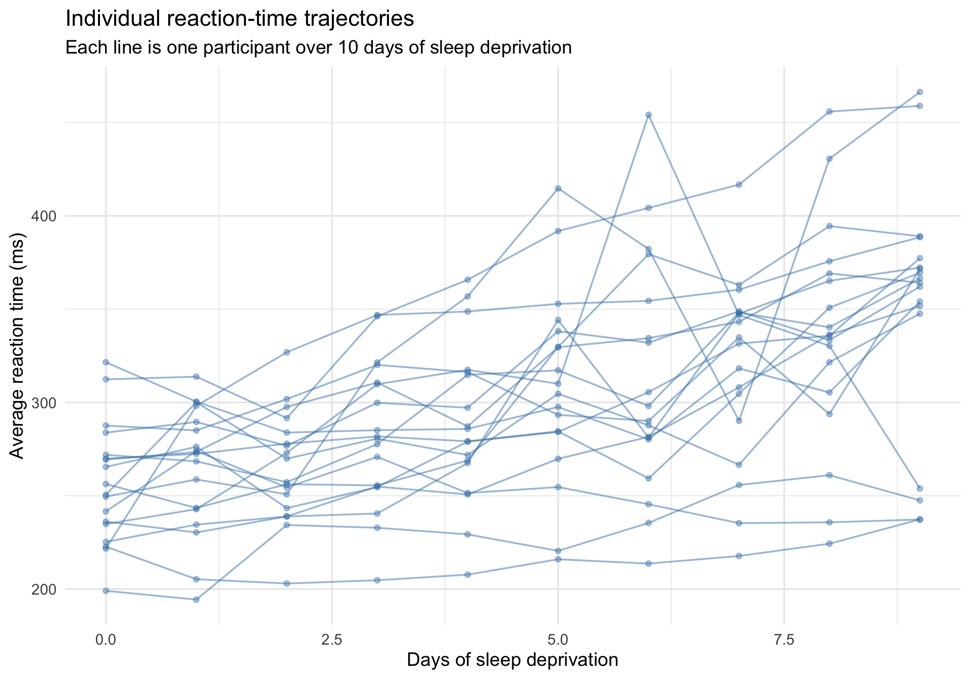
The first thing to do with clustered data is plot the individual trajectories. A “spaghetti plot” draws a line for each participant, revealing how much individuals differ in both their baseline reaction time and their sensitivity to sleep deprivation.
Code
ggplot(sleepstudy, aes(x = Days, y = Reaction, group = Subject)) +geom_line(alpha =0.5, color ="steelblue") +geom_point(alpha =0.4, size =1.5, color ="steelblue") +labs(title ="Individual reaction-time trajectories",subtitle ="Each line is one participant over 10 days of sleep deprivation",x ="Days of sleep deprivation",y ="Average reaction time (ms)" ) +theme_minimal(base_size =14)
Notice two things:
People have different baseline levels — some are fundamentally faster or slower when Days = 0. These are differences in intercepts.
People change at different rates — some deteriorate quickly, others are barely affected. These are differences in slopes.
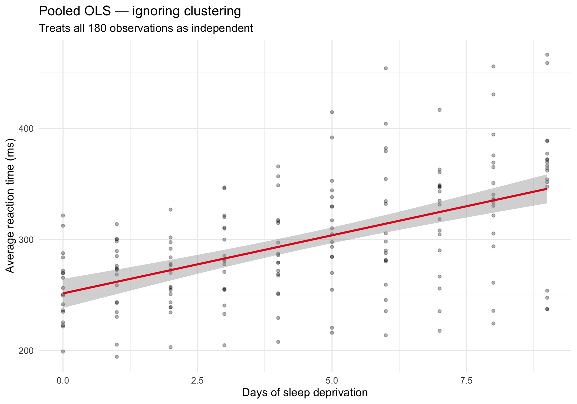
What happens if we ignore the clustering?
If we fit a single lm() across all observations, we treat every row as independent. The pooled regression line misses the individual differences:
Code
ggplot(sleepstudy, aes(x = Days, y = Reaction)) +geom_point(alpha =0.3, size =1.5) +geom_smooth(method ="lm", se =TRUE, color ="#e41a1c", linewidth =1.2) +labs(title ="Pooled OLS — ignoring clustering",subtitle ="Treats all 180 observations as independent",x ="Days of sleep deprivation",y ="Average reaction time (ms)" ) +theme_minimal(base_size =14)
The line captures the average trend, but it tells us nothing about variability across people. And the standard errors are wrong because they assume independence.
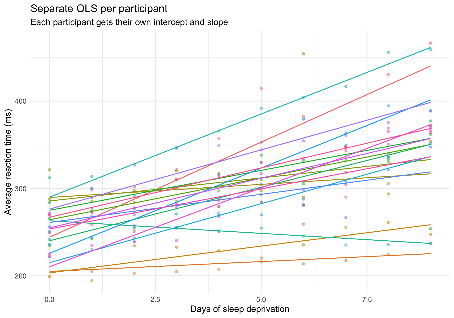
The contrast: individual OLS lines
For comparison, here is what happens if we fit a separate regression for each participant:
Code
ggplot(sleepstudy, aes(x = Days, y = Reaction, color = Subject)) +geom_point(alpha =0.5, size =1.5) +geom_smooth(method ="lm", se =FALSE, linewidth =0.7) +labs(title ="Separate OLS per participant",subtitle ="Each participant gets their own intercept and slope",x ="Days of sleep deprivation",y ="Average reaction time (ms)" ) +theme_minimal(base_size =14) +theme(legend.position ="none")
This is the other extreme: every participant is treated completely independently, with no borrowing of information across people.
Multilevel models live between these extremes: they estimate a distribution of intercepts and slopes across people, shrinking extreme estimates toward the group average.
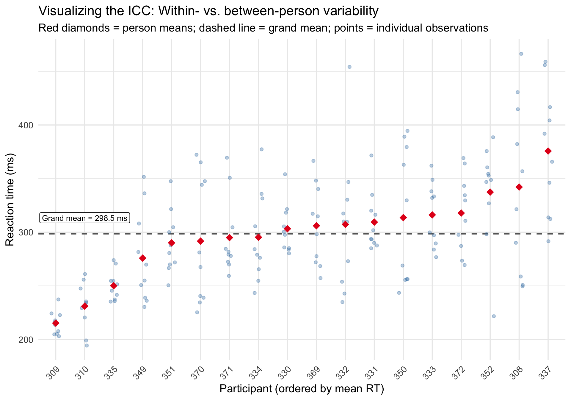
Step 2: The intraclass correlation coefficient (ICC)
The ICC answers a fundamental question: what proportion of the total variance in the outcome is attributable to differences between clusters (people)?
To compute the ICC, we fit an intercept-only model — a model with no predictors, just the overall mean and a random intercept for each person.
Code
m_null <-lmer(Reaction ~1+ (1| Subject), data = sleepstudy)summary(m_null)
Linear mixed model fit by REML ['lmerMod']
Formula: Reaction ~ 1 + (1 | Subject)
   Data: sleepstudy

REML criterion at convergence: 1904.3

Scaled residuals:
    Min      1Q  Median      3Q     Max
-2.4983 -0.5501 -0.1476  0.5123  3.3446

Random effects:
 Groups   Name        Variance Std.Dev.
 Subject  (Intercept) 1278     35.75
 Residual             1959     44.26
Number of obs: 180, groups:  Subject, 18

Fixed effects:
            Estimate Std. Error t value
(Intercept)   298.51       9.05   32.98
The ICC can be hard to grasp as a number. Visually, it reflects how tightly observations cluster around their person-specific mean versus the grand mean.
Code
# Compute person means and grand meanperson_means <- sleepstudy %>%group_by(Subject) %>%summarize(person_mean =mean(Reaction), .groups ="drop") %>%arrange(person_mean) %>%mutate(rank =row_number())grand_mean <-mean(sleepstudy$Reaction)# Join back to plotsleepstudy_ranked <- sleepstudy %>%left_join(person_means, by ="Subject")ggplot(sleepstudy_ranked, aes(x =reorder(Subject, person_mean), y = Reaction)) +geom_hline(yintercept = grand_mean, linetype ="dashed", color ="gray40", linewidth =0.8) +geom_jitter(width =0.15, alpha =0.35, size =1.5, color ="steelblue") +geom_point(aes(y = person_mean), shape =18, size =4, color ="#e41a1c",data = person_means %>%mutate(Subject =reorder(Subject, person_mean)) ) +annotate("label", x =2, y = grand_mean +15,label =paste0("Grand mean = ", round(grand_mean, 1), " ms"),size =3.5, fill ="white", label.size =0.3 ) +labs(title ="Visualizing the ICC: Within- vs. between-person variability",subtitle ="Red diamonds = person means; dashed line = grand mean; points = individual observations",x ="Participant (ordered by mean RT)",y ="Reaction time (ms)" ) +theme_minimal(base_size =14) +theme(axis.text.x =element_text(angle =45, hjust =1))
When the ICC is high, points within a person cluster tightly around the person mean (red diamond), and person means spread widely around the grand mean (dashed line). When the ICC is low, the opposite is true.
Step 3: Random intercept model
The random intercept model allows each person to have their own baseline reaction time, but forces the effect of Days to be the same for everyone.
Code
m_ri <-lmer(Reaction ~ Days + (1| Subject), data = sleepstudy)summary(m_ri)
Linear mixed model fit by REML ['lmerMod']
Formula: Reaction ~ Days + (1 | Subject)
   Data: sleepstudy

REML criterion at convergence: 1786.5

Scaled residuals:
    Min      1Q  Median      3Q     Max
-3.2257 -0.5529  0.0109  0.5188  4.2506

Random effects:
 Groups   Name        Variance Std.Dev.
 Subject  (Intercept) 1378.2   37.12
 Residual              960.5   30.99
Number of obs: 180, groups:  Subject, 18

Fixed effects:
            Estimate Std. Error t value
(Intercept) 251.4051     9.7467   25.79
Days         10.4673     0.8042   13.02

Correlation of Fixed Effects:
     (Intr)
Days -0.371
Unpacking the syntax: The lmer formula syntax can be confusing at first. Let’s break down (1 | Subject):
1: Represents the intercept (the predicted reaction time when all predictors are exactly zero—in this case, Day 0).
|: Can be read as “grouped by” or “conditional on”.
Subject: The clustering variable.
So (1 | Subject) simply tells R: “estimate a separate, random intercept for each Subject.”
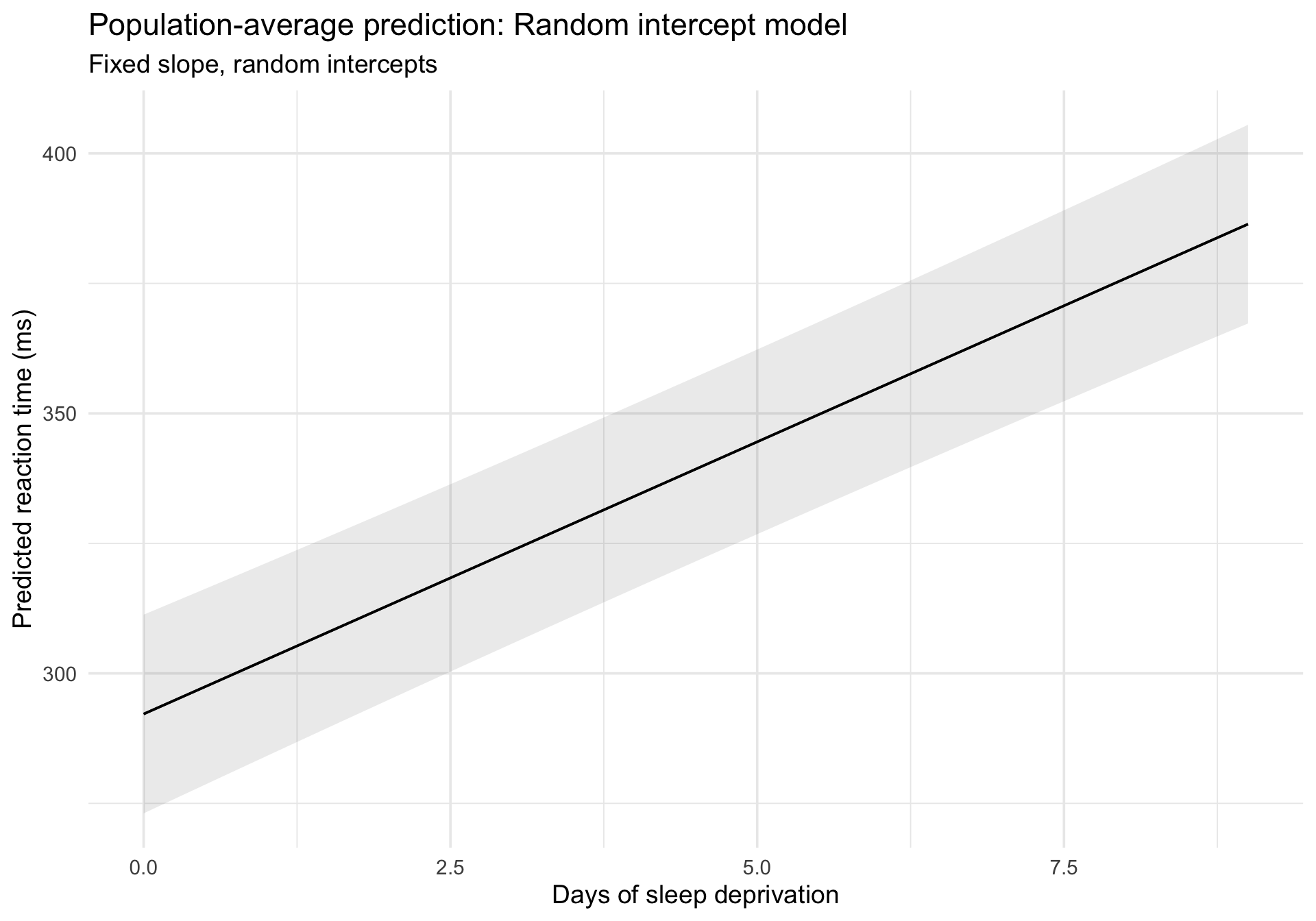
Visualizing population-average prediction
plot_predictions() gives us the population-average (fixed-effects) prediction:
Code
plot_predictions(m_ri, condition ="Days") +labs(title ="Population-average prediction: Random intercept model",subtitle ="Fixed slope, random intercepts",x ="Days of sleep deprivation",y ="Predicted reaction time (ms)" ) +theme_minimal(base_size =14)
Overlaying subject-specific fitted values
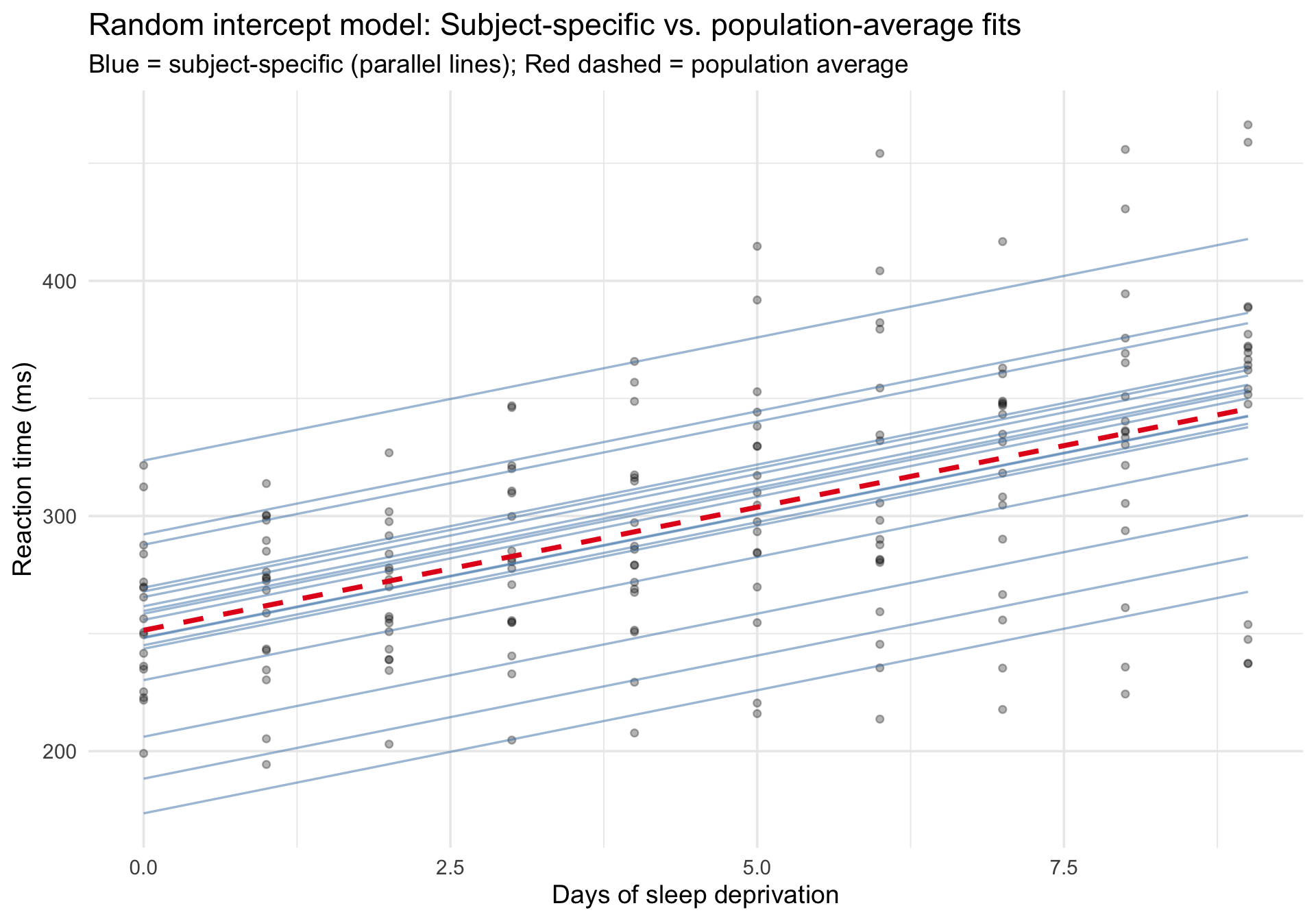
To see both the population-average and subject-specific predictions, we extract fitted values at the subject level:
Code
sleepstudy$fitted_ri <-predict(m_ri)# Use fixed-effects-only predictions for the dashed line so it truly# represents the mixed model's population-average trend rather than a new OLS fit.sleepstudy_pop_ri <-data.frame(Days =sort(unique(sleepstudy$Days)))sleepstudy_pop_ri$fixed_ri <-predict(m_ri, newdata = sleepstudy_pop_ri, re.form =NA)ggplot(sleepstudy, aes(x = Days, y = Reaction)) +# Raw datageom_point(alpha =0.3, size =1.5) +# Subject-specific fits (random intercepts, parallel lines)geom_line(aes(y = fitted_ri, group = Subject),color ="steelblue", alpha =0.5, linewidth =0.6 ) +# Fixed-effects-only prediction from the mixed model (population average)geom_line(data = sleepstudy_pop_ri,aes(x = Days, y = fixed_ri),inherit.aes =FALSE,color ="#e41a1c", linewidth =1.3, linetype ="dashed" ) +labs(title ="Random intercept model: Subject-specific vs. population-average fits",subtitle ="Blue = subject-specific (parallel lines); Red dashed = population average",x ="Days of sleep deprivation",y ="Reaction time (ms)" ) +theme_minimal(base_size =14)
Notice that all the blue lines are parallel — they share the same slope but differ in their intercepts. This constraint may or may not be realistic.
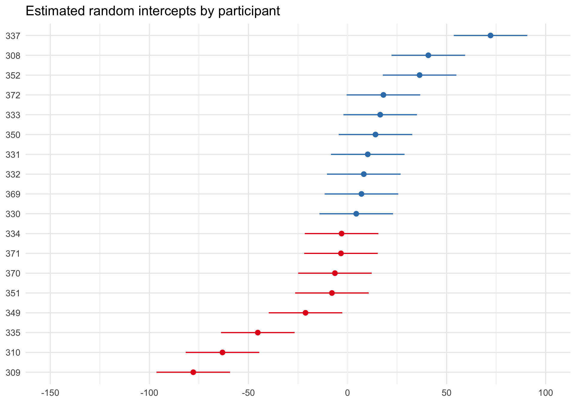
Caterpillar plot of estimated random intercepts
sjPlot::plot_model() with type = "re" shows the estimated subject-specific random effects as a caterpillar plot:
Code
plot_model(m_ri, type ="re", sort.est ="(Intercept)") +labs(title ="Estimated random intercepts by participant") +theme_minimal(base_size =14)
Each dot represents one participant’s estimated deviation from the fixed intercept, and the plot orders participants from lower to higher estimated intercepts. Participants with dots to the right have higher baseline reaction times than the population average; dots to the left have lower baseline reaction times.
This figure is useful for seeing how participants differ from one another and for spotting especially large or uncertain deviations. But it is not a direct plot of the population distribution of random effects itself. For that question, QQ plots are more appropriate.
Step 4: Random intercept and slope model
Now we allow each person to have their own intercept and their own slope for Days:
Code
m_ris <-lmer(Reaction ~ Days + (1+ Days | Subject), data = sleepstudy)summary(m_ris)
Linear mixed model fit by REML ['lmerMod']
Formula: Reaction ~ Days + (1 + Days | Subject)
   Data: sleepstudy

REML criterion at convergence: 1743.6

Scaled residuals:
    Min      1Q  Median      3Q     Max
-3.9536 -0.4634  0.0231  0.4634  5.1793

Random effects:
 Groups   Name        Variance Std.Dev. Corr
 Subject  (Intercept) 612.10   24.741
          Days         35.07    5.922   0.07
 Residual             654.94   25.592
Number of obs: 180, groups:  Subject, 18

Fixed effects:
            Estimate Std. Error t value
(Intercept)  251.405      6.825  36.838
Days          10.467      1.546   6.771

Correlation of Fixed Effects:
     (Intr)
Days -0.138
Unpacking the syntax: Here, (1 + Days | Subject) means “estimate a separate intercept (1) AND a separate slope for Days for each Subject, and allow the intercepts and slopes to be correlated.”
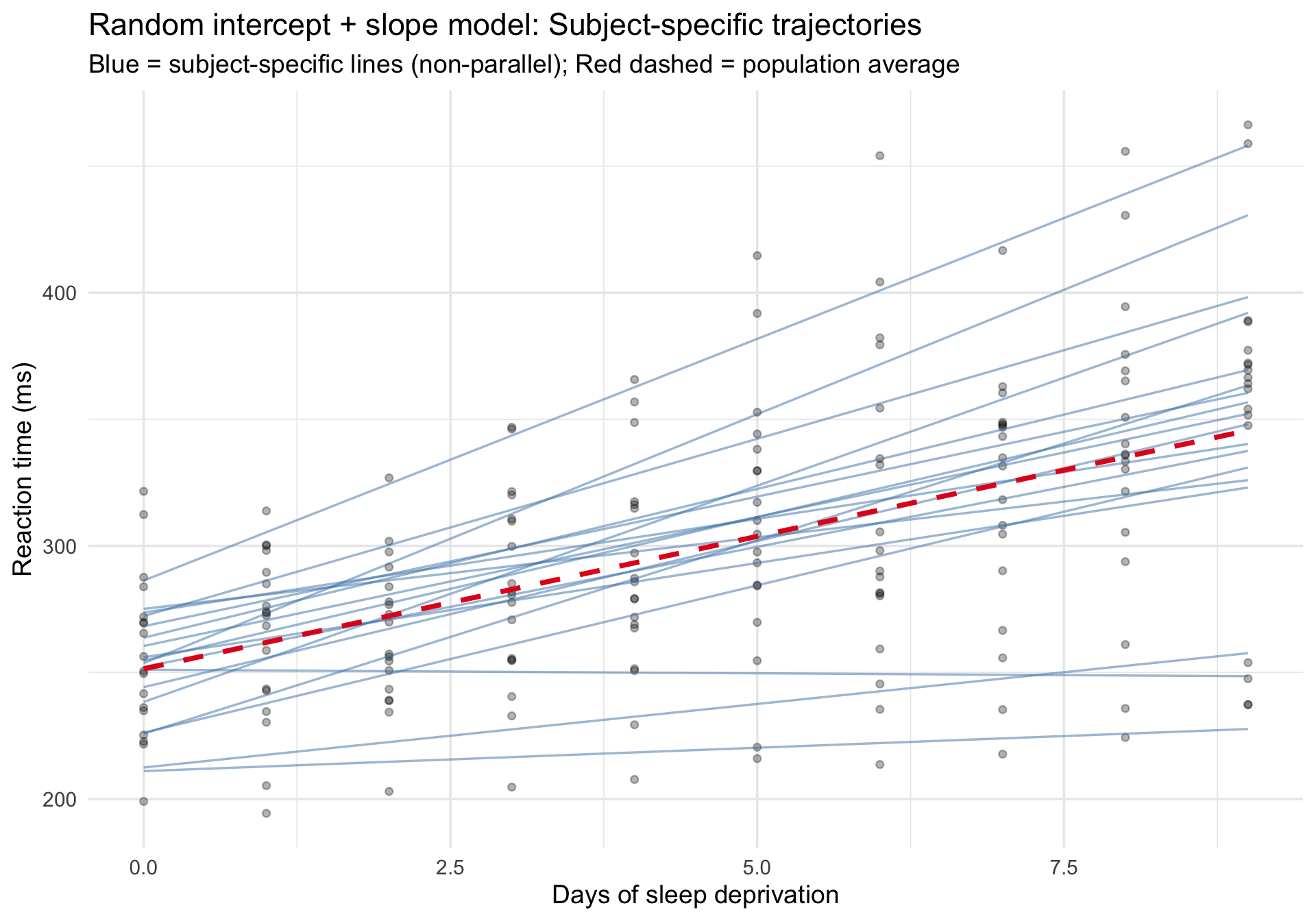
Subject-specific fitted trajectories
Code
sleepstudy$fitted_ris <-predict(m_ris)# Again, use fixed-effects-only predictions so the dashed line is the# mixed model's marginal trend rather than an OLS smoother through the raw data.sleepstudy_pop_ris <-data.frame(Days =sort(unique(sleepstudy$Days)))sleepstudy_pop_ris$fixed_ris <-predict(m_ris, newdata = sleepstudy_pop_ris, re.form =NA)ggplot(sleepstudy, aes(x = Days, y = Reaction)) +# Raw datageom_point(alpha =0.3, size =1.5) +# Subject-specific fits (varying intercepts and slopes)geom_line(aes(y = fitted_ris, group = Subject),color ="steelblue", alpha =0.5, linewidth =0.6 ) +# Fixed-effects-only prediction from the mixed model (population average)geom_line(data = sleepstudy_pop_ris,aes(x = Days, y = fixed_ris),inherit.aes =FALSE,color ="#e41a1c", linewidth =1.3, linetype ="dashed" ) +labs(title ="Random intercept + slope model: Subject-specific trajectories",subtitle ="Blue = subject-specific lines (non-parallel); Red dashed = population average",x ="Days of sleep deprivation",y ="Reaction time (ms)" ) +theme_minimal(base_size =14)
Now the blue lines are no longer parallel — each person has their own rate of deterioration. Compare this to the random-intercept-only model above to see the difference.
Comparing models: Marginal vs. conditional R²
Marginal R²: Variance explained by the fixed effects alone (Days).
Conditional R²: Variance explained by both fixed and random effects (Days + person-specific intercepts and slopes).
The gap between the two tells you how much individual differences contribute beyond the population trend.
Notice the output: the fixed effect (Days) explains about 28% of the variance (Marginal R²). However, when we include the individual differences in intercepts and slopes, the model explains about 80% of the variance (Conditional R²). The massive ~52% gap highlights just how much of the variation in reaction time is driven purely by individual differences between people rather than the main effect of sleep deprivation.
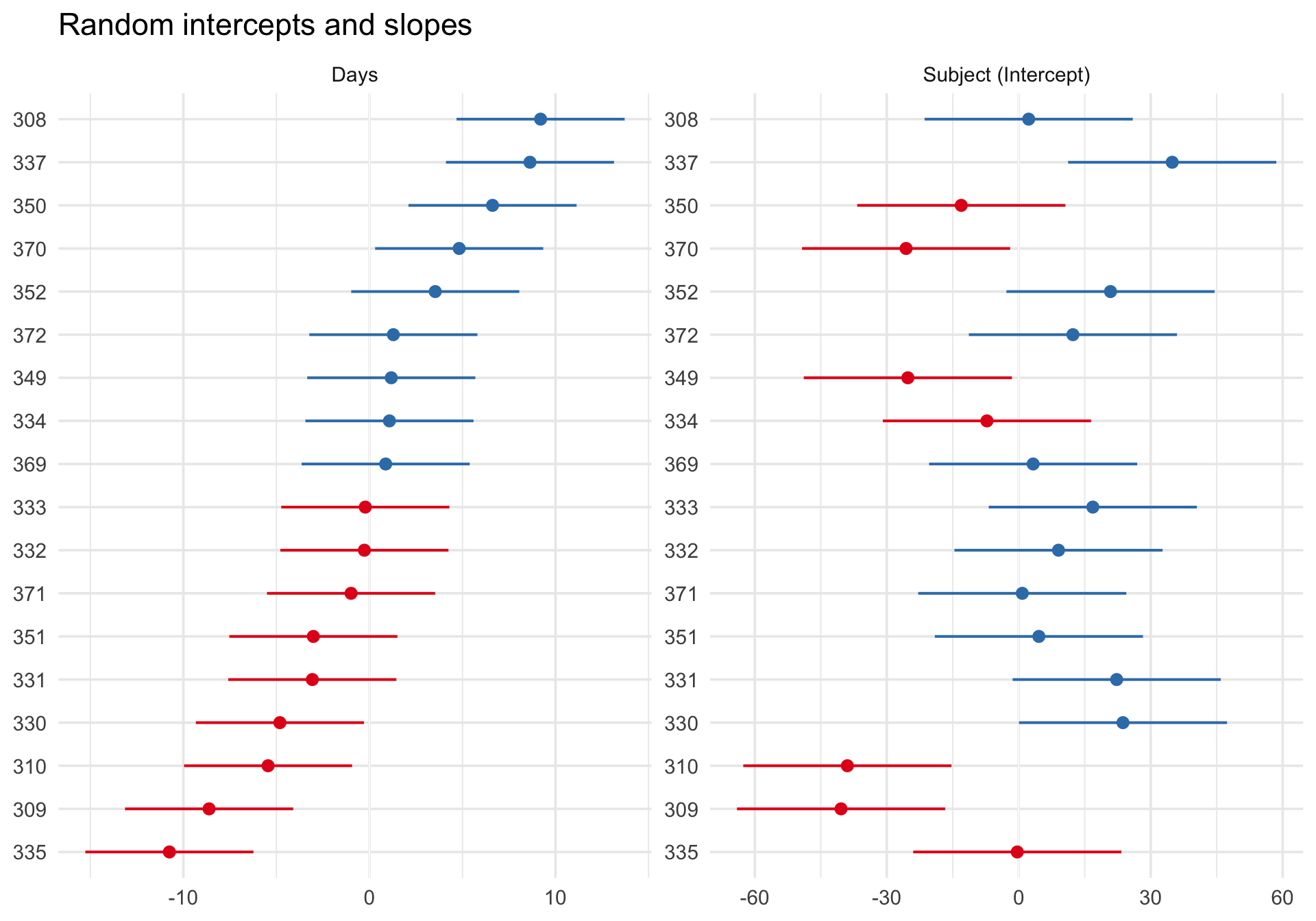
Random effects for the slope model
Code
plot_model(m_ris, type ="re", sort.est ="Days") +scale_y_continuous(limits =c(NA,NA)) +# manually undo sjPlot's preference for identical scalesfacet_wrap(~facet, scales ="free") +labs(title ="Random intercepts and slopes") +theme_minimal(base_size =14)
Publication-quality model table
sjPlot::tab_model() can compare multiple models side by side:
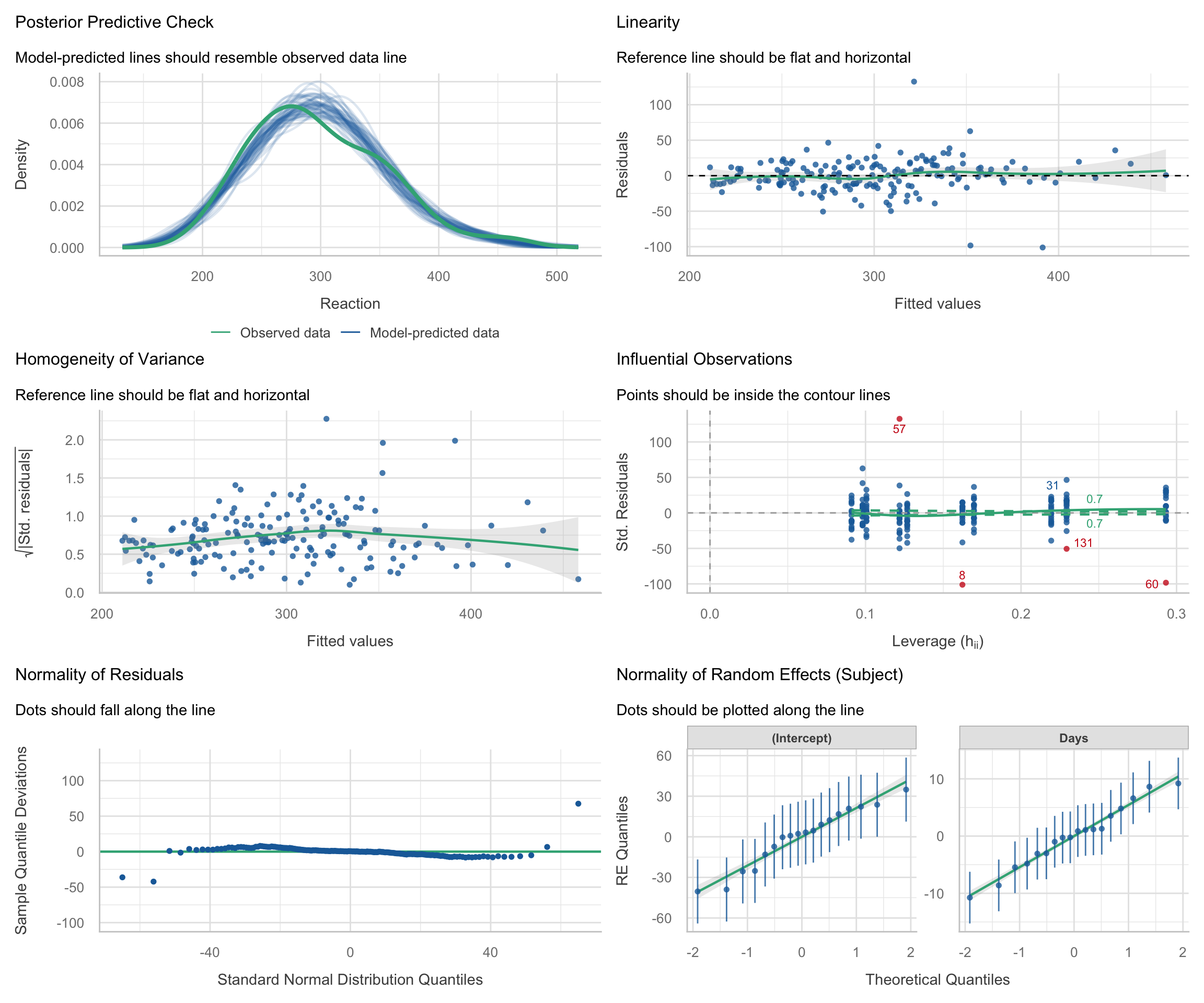
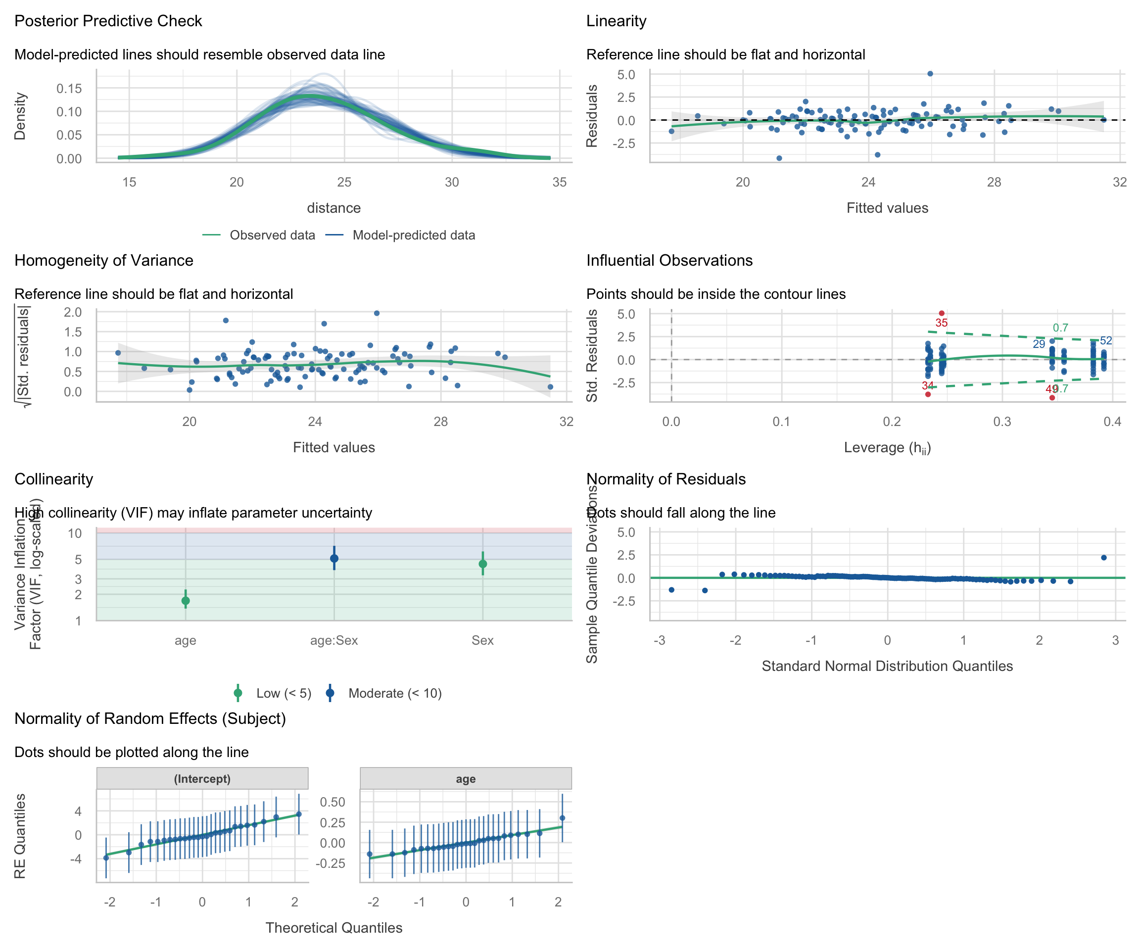
performance::check_model() works with merMod objects from lme4. The diagnostic panels are adapted for the multilevel context:
Code
check_model(m_ris)
Interpreting the diagnostic panels: The check_model() output is packed with information. Here is how to read the standard panels for a multilevel model:
Posterior Predictive Check: Compares the distribution of the raw outcome data against simulated data based on the model’s predictions. If the model fits well, the lines should overlap closely.
Linearity: Plots residuals against fitted values. A flat, horizontal reference line indicates the relationship is truly linear. A strong U-shape or curve suggests you might be missing a non-linear term (like a quadratic effect).
Homogeneity of Variance: Checks if the error variance is uniform. The reference line should be flat. If it looks like a funnel (e.g., variance widens at higher fitted values), the model suffers from heteroscedasticity.
Influential Observations: In this plot, the x-axis shows leverage (how unusual an observation’s predictor values are) and the y-axis shows standardized residuals (how far the observed outcome is from the model’s prediction, in standard deviation units). Observations with both high leverage (far right) and large standardized residuals (far from zero) are potentially influential, as they can disproportionately affect the fitted model, while points with only one of these features are less concerning but still worth checking. The dashed lines indicate Cook’s distance thresholds; observations beyond these lines may be unduly influential on the model estimates.
Normality of Residuals: This plot checks the normality of the “level 1” residuals. The points should tightly hug the horizontal line. The x-axis shows the theoretical quantiles of a standard normal distribution, and the y-axis shows the deviations of the sample residual quantiles from those theoretical values. Departures at the tails are common, but systematic deviations from the line (e.g., curvature) may indicate that the model does not conform to the normal residuals assumption.
Normality of Random Effects: Unique to mixed models, this checks the “level 2” deviations. Because lmer() mathematically assumes that the subject-specific random intercepts and slopes are drawn from normal distributions, these group-level dots should also hug the diagonal tracking lines.
Random-effects normality
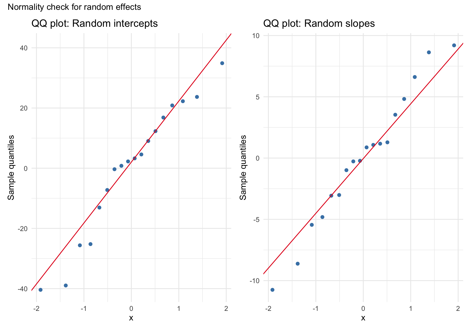
N.B. This section largely recapitulates the “Normality of Random Effects (Subject)” panel in check_model() and is included to show you how to create such a plot yourself.
A common assumption in linear mixed models is that the random effects are approximately normally distributed. A QQ plot of the estimated random intercepts and slopes can help us look for gross departures from that assumption, such as strong skew, heavy tails, or clear multimodality. But these are estimates of the latent random effects, not the random effects themselves, so this is best treated as a rough diagnostic rather than a definitive test.
Code
re <-ranef(m_ris)$Subjectp1 <-ggplot(re, aes(sample =`(Intercept)`)) +stat_qq(color ="steelblue", size =2) +stat_qq_line(color ="#e41a1c") +labs(title ="QQ plot: Random intercepts", y ="Sample quantiles") +theme_minimal(base_size =13)p2 <-ggplot(re, aes(sample = Days)) +stat_qq(color ="steelblue", size =2) +stat_qq_line(color ="#e41a1c") +labs(title ="QQ plot: Random slopes", y ="Sample quantiles") +theme_minimal(base_size =13)p1 + p2 +plot_annotation(title ="Normality check for random effects")
With only 18 subjects, subtle departures from normality are hard to judge, so the main question is whether the plot shows obvious, practically important problems.
Part 2: Growth curves with the Orthodont dataset
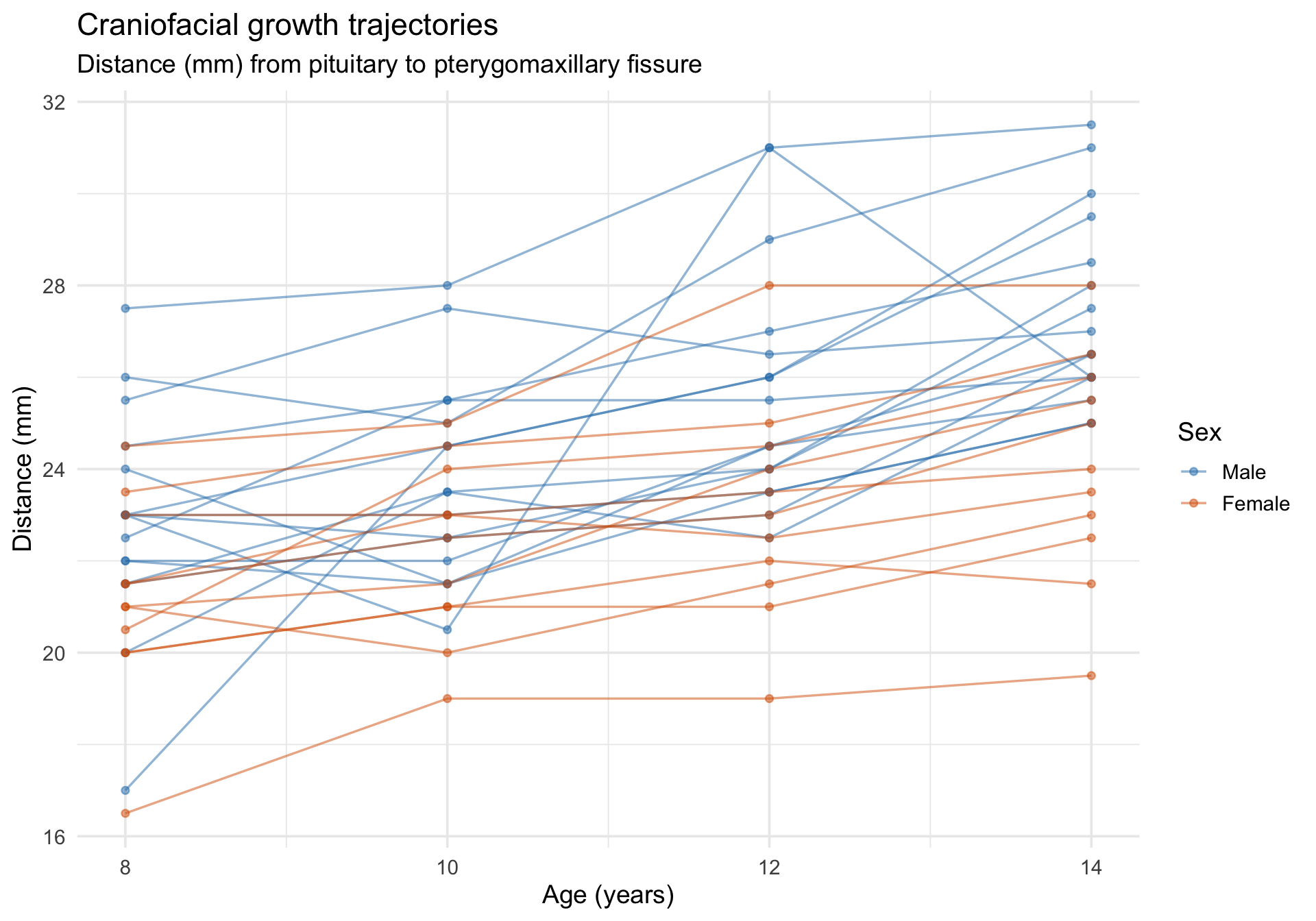
The Orthodont dataset from nlme records the distance (mm) from the pituitary gland to the pterygomaxillary fissure in 27 children (16 boys, 11 girls) measured at ages 8, 10, 12, and 14. This is a growth-curve dataset with a substantive question: do boys and girls differ in craniofacial growth trajectories?
Code
data(Orthodont, package ="nlme")Orthodont <-as.data.frame(Orthodont) # convert from groupedDataglimpse(Orthodont)
ggplot(Orthodont, aes(x = age, y = distance, group = Subject, color = Sex)) +geom_line(alpha =0.5, linewidth =0.6) +geom_point(alpha =0.5, size =1.5) +scale_color_manual(values =c("Male"="#2c7fb8", "Female"="#d95f02")) +labs(title ="Craniofacial growth trajectories",subtitle ="Distance (mm) from pituitary to pterygomaxillary fissure",x ="Age (years)",y ="Distance (mm)",color ="Sex" ) +theme_minimal(base_size =14)
Fitting a growth model
We allow each child to have their own intercept and age-slope, and test whether Sex moderates the growth trajectory.
Code
m_growth <-lmer(distance ~ age * Sex + (1+ age | Subject), data = Orthodont)summary(m_growth)
Linear mixed model fit by REML ['lmerMod']
Formula: distance ~ age * Sex + (1 + age | Subject)
   Data: Orthodont

REML criterion at convergence: 432.6

Scaled residuals:
    Min      1Q  Median      3Q     Max
-3.1694 -0.3862  0.0070  0.4454  3.8490

Random effects:
 Groups   Name        Variance Std.Dev. Corr
 Subject  (Intercept) 5.77449  2.4030
          age         0.03245  0.1801   -0.67
 Residual             1.71663  1.3102
Number of obs: 108, groups:  Subject, 27

Fixed effects:
              Estimate Std. Error t value
(Intercept)   16.34062    1.01825  16.048
age            0.78438    0.08598   9.123
SexFemale      1.03210    1.59529   0.647
age:SexFemale -0.30483    0.13471  -2.263

Correlation of Fixed Effects:
            (Intr) age    SexFml
age         -0.880
SexFemale   -0.638  0.562
age:SexFeml  0.562 -0.638 -0.880
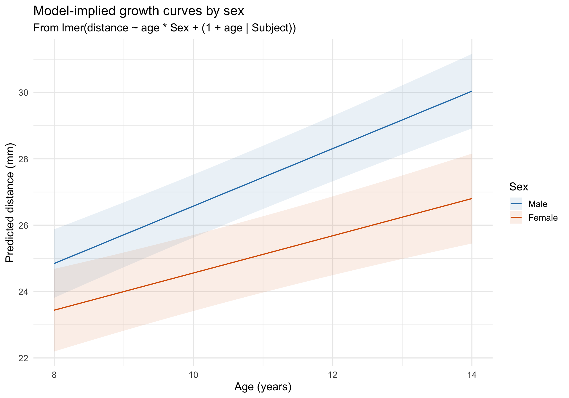
Model-implied growth curves
Code
plot_predictions(m_growth, condition =c("age", "Sex")) +scale_color_manual(values =c("Male"="#2c7fb8", "Female"="#d95f02")) +scale_fill_manual(values =c("Male"="#2c7fb8", "Female"="#d95f02")) +labs(title ="Model-implied growth curves by sex",subtitle ="From lmer(distance ~ age * Sex + (1 + age | Subject))",x ="Age (years)",y ="Predicted distance (mm)",color ="Sex",fill ="Sex" ) +theme_minimal(base_size =14)
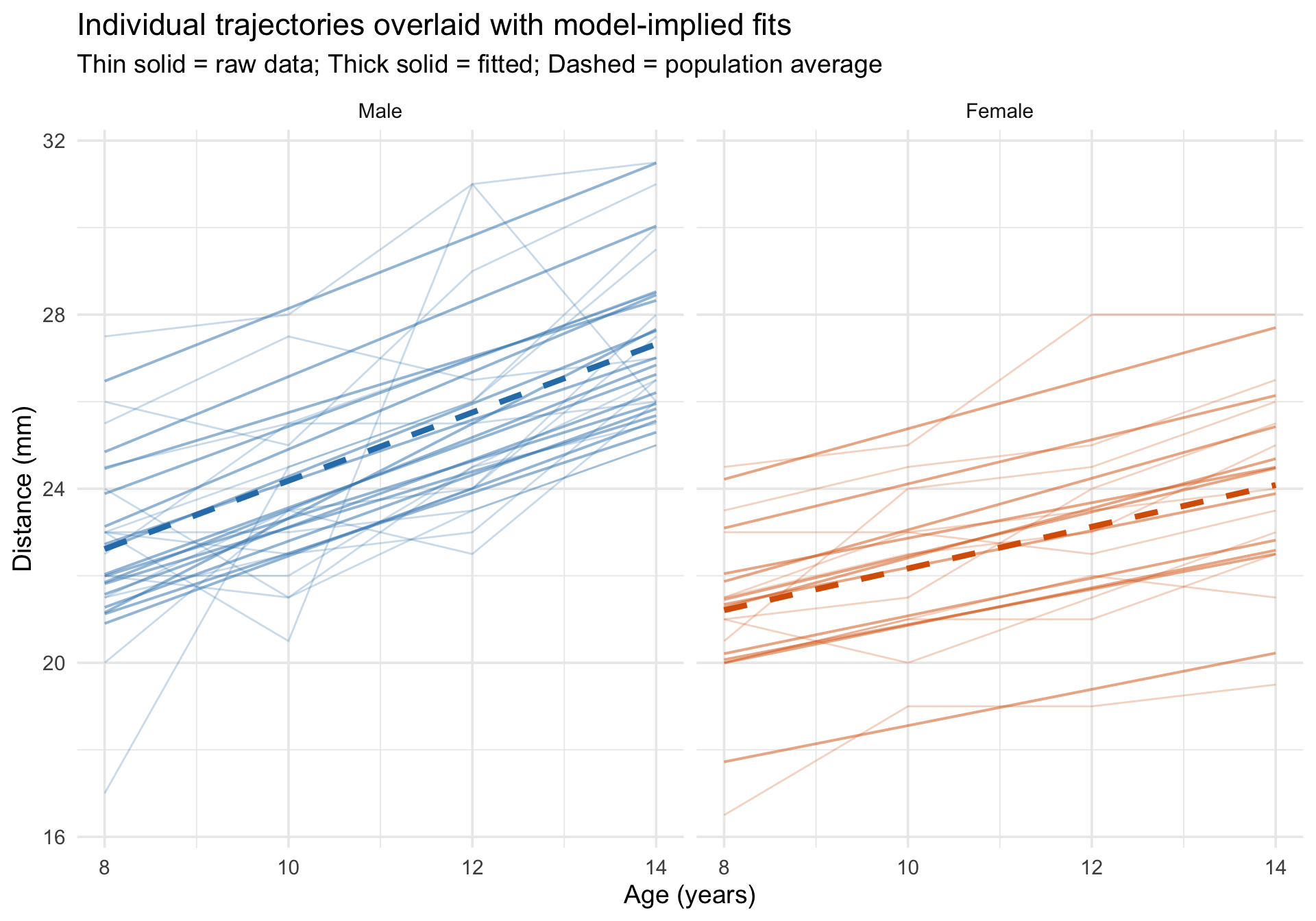
Overlaying individual trajectories on model predictions
Code
Orthodont$fitted_growth <-predict(m_growth)# For the dashed lines, predict with re.form = NA so we plot the fixed-effects# growth curves from the mixed model rather than separate OLS lines by sex.growth_pop <-expand.grid(age =sort(unique(Orthodont$age)),Sex =levels(Orthodont$Sex))growth_pop$Sex <-factor(growth_pop$Sex, levels =levels(Orthodont$Sex))growth_pop$fixed_growth <-predict(m_growth, newdata = growth_pop, re.form =NA)ggplot(Orthodont, aes(x = age, y = distance)) +# Raw data as thin linesgeom_line(aes(group = Subject, color = Sex),alpha =0.25, linewidth =0.5 ) +# Subject-specific fitted linesgeom_line(aes(y = fitted_growth, group = Subject, color = Sex),linewidth =0.7, alpha =0.5 ) +# Fixed-effects-only predictions by sex from the mixed modelgeom_line(data = growth_pop,aes(x = age, y = fixed_growth, color = Sex, group = Sex),inherit.aes =FALSE,linewidth =1.5, linetype ="dashed" ) +scale_color_manual(values =c("Male"="#2c7fb8", "Female"="#d95f02")) +facet_wrap(~Sex) +labs(title ="Individual trajectories overlaid with model-implied fits",subtitle ="Thin solid = raw data; Thick solid = fitted; Dashed = population average",x ="Age (years)",y ="Distance (mm)" ) +theme_minimal(base_size =14) +theme(legend.position ="none")
Model comparison table
Code
m_growth_simple <-lmer(distance ~ age + Sex + (1| Subject), data = Orthodont)tab_model(m_growth_simple, m_growth,dv.labels =c("Additive (RI only)", "Interaction (RI + RS)"),show.ci =0.95, show.icc =TRUE, show.re.var =TRUE)
Adjusted vs. Unadjusted ICC: Notice the large gap between the two ICC estimates!
Adjusted ICC (~67%): This looks only at the “leftover” variance in the model. It asks: Of the variance that is NOT already accounted for by our fixed predictors (Age and Sex), how much is driven by individual differences between children?
Unadjusted ICC (~40%): This looks at the total variance. It asks: Out of ALL the variation in the entire dataset, how much is driven by individual differences?
Because Age and Sex explain a large chunk of the total variance, the individual differences make up a smaller slice of the total pie (40%) but a proportionately massive slice of the leftover pie (67%).
Diagnostics
Code
check_model(m_growth)
Follow-up: Why is the Age x Sex VIF relatively high?
One thing worth noticing in the check_model() output is that the fixed-effect interaction age:Sex has a moderately elevated VIF. At first glance, this can look like a warning sign about the model. But in interaction models, a higher VIF is often caused by nonessential collinearity: overlap that is created by how the predictors are coded, rather than by a substantive problem in the data.
Let’s inspect the fixed-effect collinearity directly:
Code
check_collinearity(m_growth)
Term
VIF
VIF_CI_low
VIF_CI_high
SE_factor
Tolerance
Tolerance_CI_low
Tolerance_CI_high
age
1.687500
1.372462
2.269007
1.299038
0.5925926
0.4407214
0.7286179
Sex
4.436138
3.288415
6.159485
2.106214
0.2254213
0.1623512
0.3040978
age:Sex
5.123638
3.770024
7.138717
2.263546
0.1951738
0.1400812
0.2652503
The interaction term age:Sex has the highest VIF. Why? Because age is coded in its raw units (8, 10, 12, 14), so the main effect of Sex is defined at age = 0 which is far outside the observed data. That coding choice makes the Sex column and the age:Sex column overlap more than necessary.
This is a common issue in interaction models with a continuous predictor. The remedy is to center the continuous predictor at a meaningful value, often its sample mean. Here, the average age is 11 years, so we will create a centered age variable where 0 means “the average child in this sample.”
Code
Orthodont_c <- Orthodont %>%mutate(age_c = age -mean(age))mean(Orthodont_c$age)
[1] 11
Now refit the same model using centered age:
Code
m_growth_c <-lmer(distance ~ age_c * Sex + (1+ age_c | Subject), data = Orthodont_c)check_collinearity(m_growth_c)
Term
VIF
VIF_CI_low
VIF_CI_high
SE_factor
Tolerance
Tolerance_CI_low
Tolerance_CI_high
age_c
1.687500
1.372462
2.269007e+00
1.299038
0.5925926
0.4407214
0.7286179
Sex
1.010492
1.000000
3.304846e+05
1.005232
0.9896169
0.0000030
1.0000000
age_c:Sex
1.697992
1.379616
2.283385e+00
1.303070
0.5889309
0.4379463
0.7248397
Centering substantially reduces the VIF for the interaction and for the Sex main effect. Importantly, this does not change the fitted values or the substantive interaction. It changes the parameterization so that the main effects are easier to interpret and the model matrix is less redundant.
The slope for age and the Age x Sex interaction are unchanged apart from relabeling (age becomes age_c).
The coefficient for Sex changes because it now refers to the sex difference at age 11, the sample mean, instead of the sex difference at age 0, which is outside the observed data.
The intercept also changes for the same reason: it is now the predicted outcome for a child at the mean age, which is much easier to interpret.
Centering can also improve the random-effects parameterization. When age is uncentered, the random intercept is the child’s expected outcome at age = 0, which is not observed in this dataset. That makes the random intercept and random slope more entangled than they need to be. After centering, the random intercept refers to the expected outcome at the sample mean age, so the intercept and slope are usually easier to interpret as separate sources of individual differences.
Code
VarCorr(m_growth)
 Groups   Name        Std.Dev. Corr
 Subject  (Intercept) 2.40302
          age         0.18014  -0.667
 Residual             1.31020
Code
VarCorr(m_growth_c)
 Groups   Name        Std.Dev. Corr
 Subject  (Intercept) 1.83033
          age_c       0.18034  0.206
 Residual             1.31004
In this example, the correlation between the random intercept and random slope is much larger in the uncentered model than in the centered model. That does not mean the uncentered model is “wrong,” but it does mean the random effects are parameterized in a way that is harder to interpret. A very high random-effects correlation can sometimes reflect a real substantive pattern, but it can also be partly induced by where the predictor is centered.
The broader lesson is:
When a multilevel model includes a continuous predictor and its interaction with another variable, center the continuous predictor at a meaningful value.
Centering often reduces nonessential collinearity among the fixed effects.
Centering can also make the random intercept more meaningful and reduce artificially high random intercept-slope correlations.
If you see a high random-effects correlation, do not jump immediately to a substantive conclusion. First ask whether the parameterization makes the intercept interpretable and whether centering would clarify the model.
So the takeaway is: a moderately high VIF for an interaction term does not automatically mean the model is defective. In multilevel models with interactions, first ask whether the collinearity is structural and can be reduced by centering the continuous predictor. The same logic applies to the random-effects side of the model: centering often leads to cleaner, more interpretable variance-covariance estimates.
Take-home summary
The multilevel visualization workflow
Before fitting: Always start with spaghetti plots of individual trajectories. Look for differences in intercepts (the predicted value when time/predictors equal zero) and trends (slopes). These plots can suggest whether random intercepts alone may be too simple and whether a random-slope model is worth considering, but the final random-effects structure should also reflect the design, theory, and model estimability.
After fitting: Overlay subject-specific fitted lines on the raw data. Compare the random-intercept model (parallel lines) with the random-intercept-and-slope model (non-parallel lines). Use plot_predictions() for the population-average trend.
Diagnosing misfit: Use check_model() for the standard panels, then add QQ plots of the random effects. Check the ICC and R² (marginal vs. conditional) to understand variance partitioning.