Cluster Analysis as an Exploratory Data Analysis Tool
Author
Michael Hallquist, PSYC 859
Published
April 16, 2026
Overview
Cluster analysis is one of the classic tools for exploratory data analysis (EDA) when you have many variables and want to know whether observations seem to organize into meaningful groups. The core question is simple: which observations are close to each other in a multivariate space? But the answer depends on several choices that are easy to overlook:
Which variables should define “closeness”?
How should those variables be scaled?
What distance metric should we use?
How should the algorithm convert pairwise distances into groups?
This walkthrough treats clustering as a structure-finding tool, not a confirmatory model (Peng). A clustering solution can help you see patterns, organize a large matrix, and generate hypotheses. But it is also sensitive to scaling, distance metrics, algorithm choice, and the number of clusters you request.
We will use the bfi dataset from the psych package and ask a psychologically meaningful question:
If we summarize each participant on the Big Five traits, do people appear to fall into a few provisional personality-profile groups?
That is an exploratory question. We are not trying to prove that personality comes in a fixed number of natural “types.” Instead, we are asking whether clustering helps us organize multivariate individual-difference data in a useful way.
This walkthrough covers:
Preparing clustering features by scoring the Big Five scales.
Inspecting distributions and scaling before computing distances.
Hierarchical clustering for visual exploration with dendrograms and distance heatmaps.
K-means clustering for a fixed-k partition of participants.
Interpreting clusters cautiously as EDA summaries rather than ground truth.
Learning goals
After working through this document, you should be able to:
Explain why clustering is primarily an exploratory tool.
Compute psychologically meaningful features to cluster on.
Standardize variables before distance-based clustering and explain why that matters.
Use dist() and hclust() to build and visualize a hierarchical clustering solution.
Use kmeans() to compare candidate values of k and inspect cluster profiles.
Interpret cluster solutions cautiously, including their dependence on tuning choices.
Packages
Code
# Install any missing packages (uncomment if needed):# install.packages(c(# "ggplot2", "dplyr", "tidyr", "tibble",# "psych", "cluster", "patchwork"# ))library(ggplot2)library(dplyr)library(tidyr)library(tibble)library(psych)library(cluster)library(patchwork)
Data: Big Five trait scores
The bfi dataset contains item-level responses from 2,800 people on 25 personality items. Clustering raw item responses would be possible, but it would mix together two different goals:
discovering how items group together, and
discovering how people group together.
Here we focus on people, so we first score the five Big Five traits and cluster participants on those scale scores.
Notice that all 2,800 participants have complete Big Five trait scores after scale scoring, but that does not mean the item-level data were complete. Some questionnaire items are missing in the raw bfi data; scoreItems() can still return scale scores by prorating from the observed items within each trait when enough information is available. That is convenient here, but in a real project, missing-data handling should be part of the clustering plan from the start because distance-based methods are sensitive to missingness and because feature construction can hide item-level incompleteness.
Step 1: Inspect the features before clustering
Before running any clustering algorithm, we should look at the variables that will define distance. This is a central EDA principle: do not ask an algorithm to summarize a feature space that you have not examined yourself.
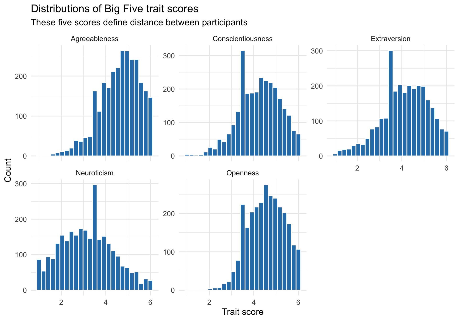
Trait-score distributions
Code
trait_long <- cluster_data %>%select(all_of(trait_names)) %>%pivot_longer(everything(), names_to ="trait", values_to ="score")ggplot(trait_long, aes(x = score)) +geom_histogram(bins =25, fill ="#2c7fb8", color ="white") +facet_wrap(~ trait, scales ="free_y") +labs(title ="Distributions of Big Five trait scores",subtitle ="These five scores define distance between participants",x ="Trait score",y ="Count" ) +theme_minimal(base_size =14)
These variables are all on the same nominal scale (roughly 1 to 6), which is better than trying to cluster a mix of reaction times, questionnaire scores, and counts without preprocessing. Even so, equal units do not guarantee equal influence on distance.
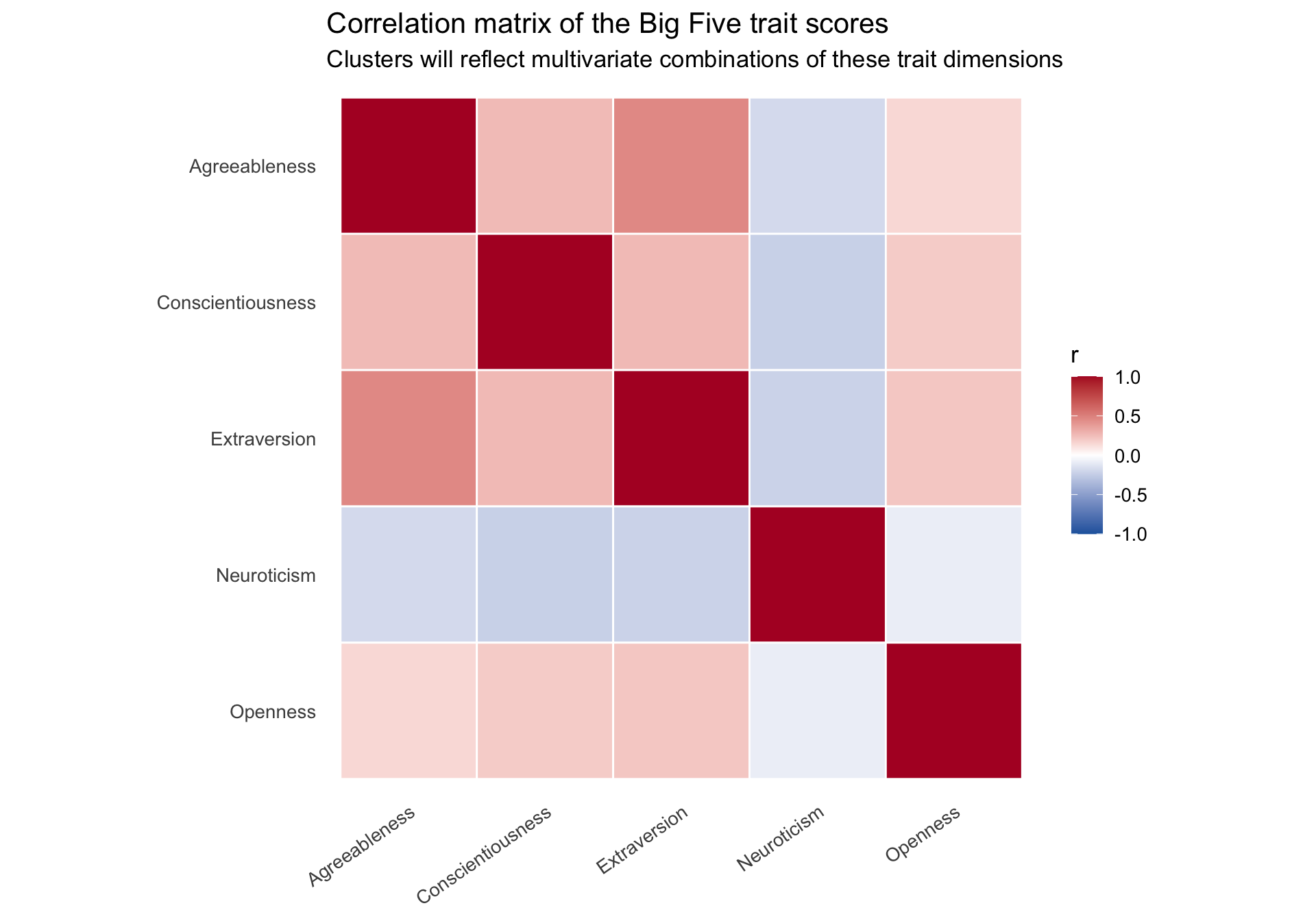
Correlation structure among the traits
Code
trait_cor <-cor(cluster_data %>%select(all_of(trait_names)))trait_cor_long <- trait_cor %>%as.data.frame() %>%rownames_to_column("trait1") %>%pivot_longer(-trait1, names_to ="trait2", values_to ="r") %>%mutate(trait1 =factor(trait1, levels = trait_names),trait2 =factor(trait2, levels =rev(trait_names)) )ggplot(trait_cor_long, aes(x = trait1, y = trait2, fill = r)) +geom_tile(color ="white", linewidth =0.5) +scale_fill_gradient2(low ="#2166ac", mid ="white", high ="#b2182b",midpoint =0, limits =c(-1, 1), name ="r" ) +labs(title ="Correlation matrix of the Big Five trait scores",subtitle ="Clusters will reflect multivariate combinations of these trait dimensions",x =NULL,y =NULL ) +theme_minimal(base_size =13) +theme(axis.text.x =element_text(angle =35, hjust =1),panel.grid =element_blank() ) +coord_fixed()
Clusters will not be defined by any single trait. Instead, they emerge from combinations of traits. That is why inspecting the multivariate structure matters.
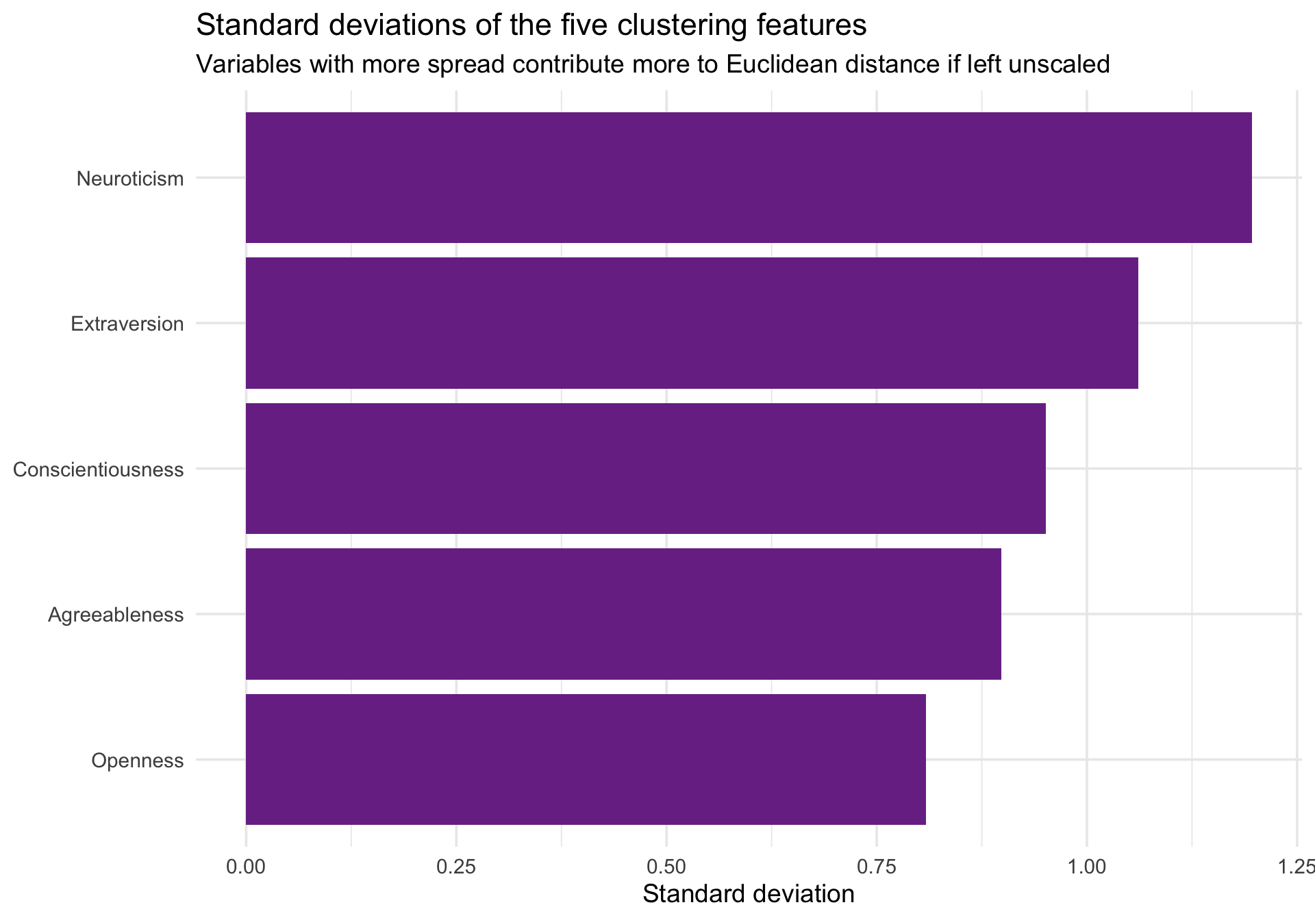
Why standardization still matters
Euclidean distance gives more weight to dimensions with larger spread. Even if variables share the same response metric, a variable with more variance can dominate the distance calculation.
Code
trait_spread <- cluster_data %>%summarize(across(all_of(trait_names), sd)) %>%pivot_longer(everything(), names_to ="trait", values_to ="sd")ggplot(trait_spread, aes(x =reorder(trait, sd), y = sd)) +geom_col(fill ="#7b3294") +coord_flip() +labs(title ="Standard deviations of the five clustering features",subtitle ="Variables with more spread contribute more to Euclidean distance if left unscaled",x =NULL,y ="Standard deviation" ) +theme_minimal(base_size =14)
To give each trait equal opportunity to shape the clustering solution, we standardize the features to z-scores before computing distances.
Now each feature has mean 0 and standard deviation 1, so Euclidean distance reflects standardized psychological profiles rather than raw scale magnitudes.
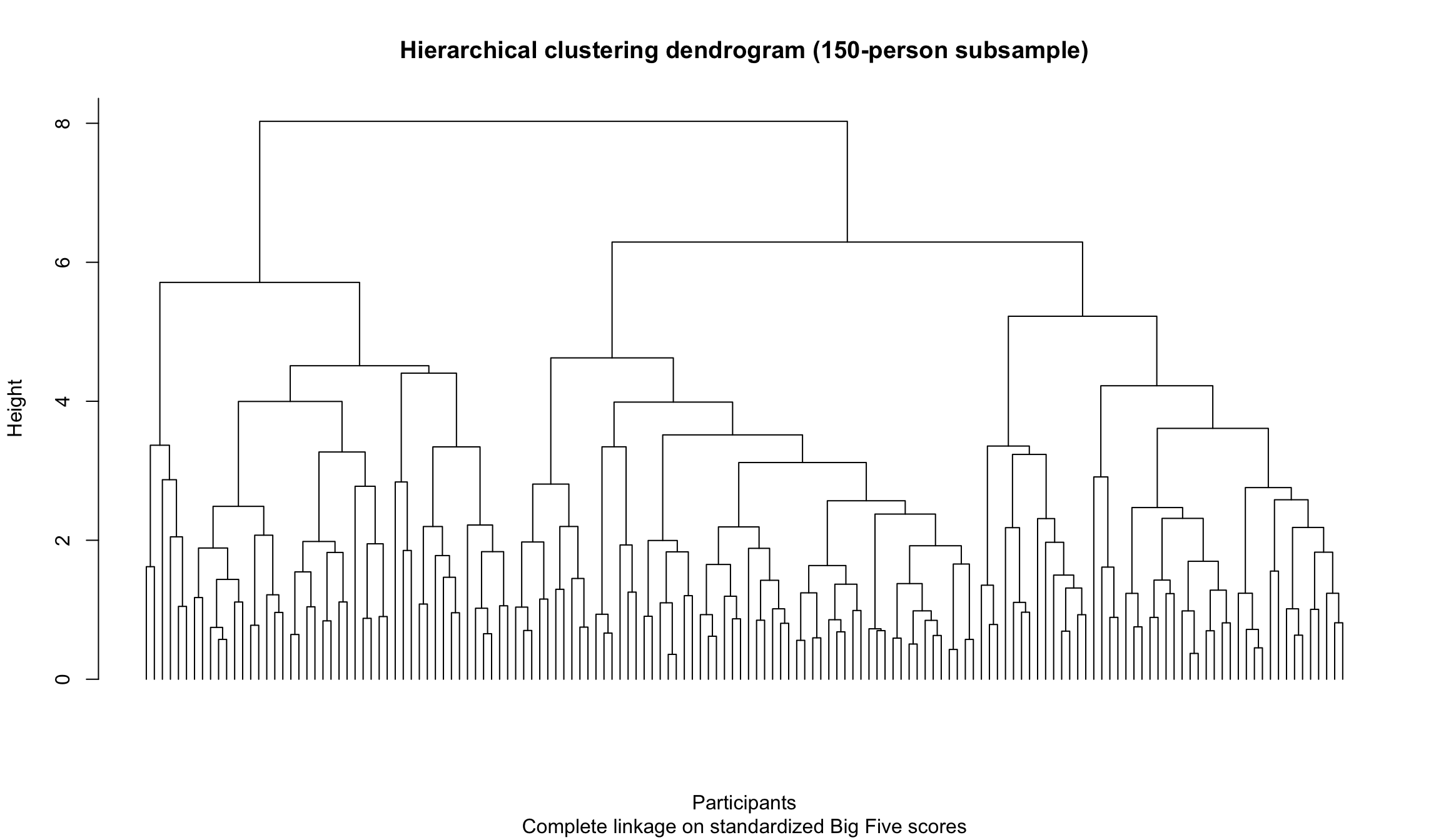
Step 2: Hierarchical clustering for visual exploration
Hierarchical agglomerative clustering is a powerful way to visualize the structure of a multivariate dataset. The idea is bottom-up:
Treat each observation as its own cluster.
Merge the two closest observations or clusters.
Repeat until everything has been merged into a single tree.
That tree is the dendrogram.
A dendrogram on a manageable subsample
With 2,800 participants, a full dendrogram is too crowded to read. For visualization, we take a random subsample of 150 participants so that the tree structure is visible.
plot( hc_sample,labels =FALSE,hang =-1,main ="Hierarchical clustering dendrogram (150-person subsample)",xlab ="Participants",sub ="Complete linkage on standardized Big Five scores")
The height of each merge reflects dissimilarity. Low merges indicate participants or clusters that are very similar; high merges indicate combinations that are much less similar.
This is one reason hierarchical clustering is valuable for EDA: it does not force you to commit immediately to a single number of clusters. You can first inspect the structure and only then ask where a cut might be reasonable.
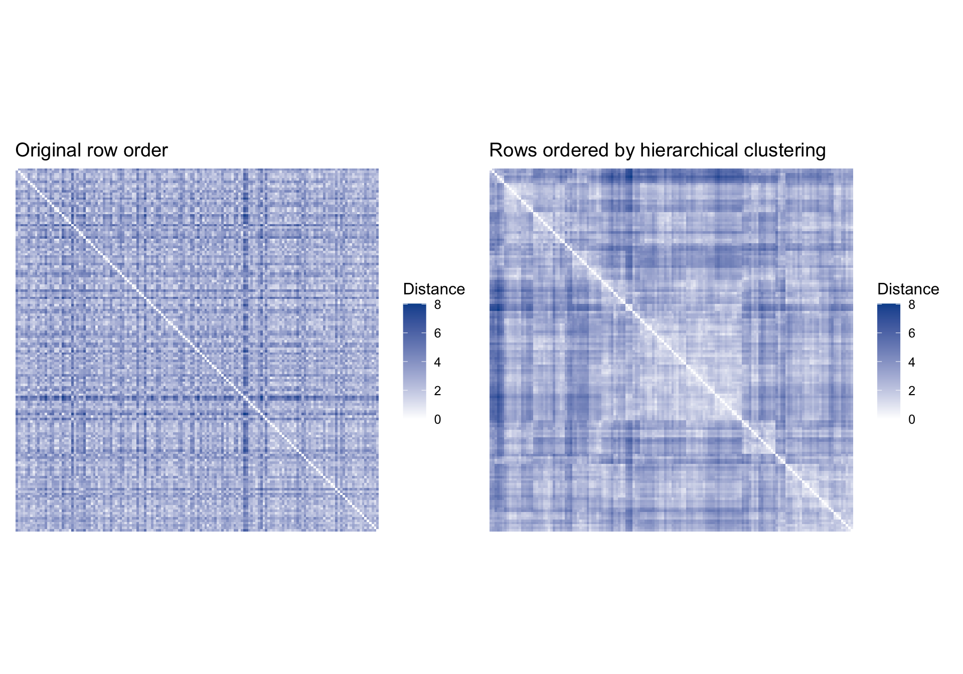
Using clustering to reorganize a distance heatmap
Clustering is often most useful because it helps us reorder data displays so structure becomes visually distinct (Peng). We can see that directly by plotting the same distance matrix twice: first in its arbitrary row order, then ordered by the dendrogram.
The clustered version usually shows darker blocks along the diagonal. That is the visual signature of observations that are closer to one another than to the rest of the sample.
A caution about “cutting the tree”
The dendrogram is often more informative than any single cut. If we move too quickly from “tree” to “partition,” we risk making the structure look cleaner than it really is. That is why the dendrogram above is shown without forcing an arbitrary cut.
On the full dataset, cutting a complete-linkage tree into four groups gives a somewhat awkward solution:
Code
hc_full <-hclust(dist(cluster_scaled), method ="complete")table(cutree(hc_full, k =4))
   1    2    3    4
 351  353 1808  288
One cluster absorbs most participants, while the remaining groups are much smaller. That does not mean the method failed. It means the hierarchical structure does not separate neatly into four equally convincing groups. This is a good reminder that clustering is exploratory: the tree may reveal graded structure rather than a clean partition, and a four-cluster cut may be more of a pedagogical convenience than a compelling summary of the data.
Step 3: K-means clustering for a fixed partition
K-means clustering answers a slightly different question than hierarchical clustering. Instead of building a tree, it asks:
If I insist on exactly k clusters, how should I place k centroids so that observations are as close as possible to their assigned centroid?
The \(K\)-means algorithm is fundamentally iterative:
Start with k initial centroids.
Assign each observation to the nearest centroid.
Recompute the centroids.
Repeat until the solution stabilizes.
Because starting values matter, we use nstart > 1 so R tries many random initializations and keeps the best solution.
A crucial geometric caveat is that \(K\)-means works best when clusters are reasonably compact and roughly spherical in the chosen Euclidean feature space. If the real structure is elongated, chained, or differs strongly in density, \(K\)-means can still return a partition, but that partition may reflect the method’s preferences more than the data’s natural shape.
Comparing candidate values of k
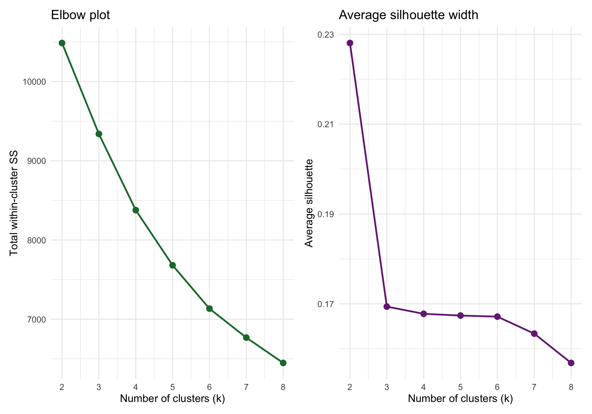
No algorithm can tell us the one “true” number of clusters in a noisy psychological dataset. But we can compare solutions with a few heuristics:
Total within-cluster sum of squares should decline as k increases. We look for an elbow where gains start to level off.
Average silhouette width measures how well-separated clusters are. Larger values indicate clearer separation.
As a rough rule of thumb, silhouette values around 0.50 or higher suggest fairly clear clustering, values around 0.25 to 0.50 suggest weak-to-moderate structure, and values below about 0.25 indicate that separation is not very convincing. In these data, the silhouette statistic is strongest for k = 2, but it is still only about 0.23, which is weak evidence even for a broad two-group structure. By k = 4, the average silhouette is lower still, around 0.17, so the four-cluster solution should be treated as a convenient descriptive partition rather than strong evidence for four well-separated groups.
The elbow plot still suggests diminishing returns after a small number of clusters. For teaching purposes, we will inspect a k = 4 solution because it gives more nuanced profiles while still remaining interpretable.
The important point is not that four is “correct.” The important point is that exploratory clustering often involves comparing multiple plausible solutions.
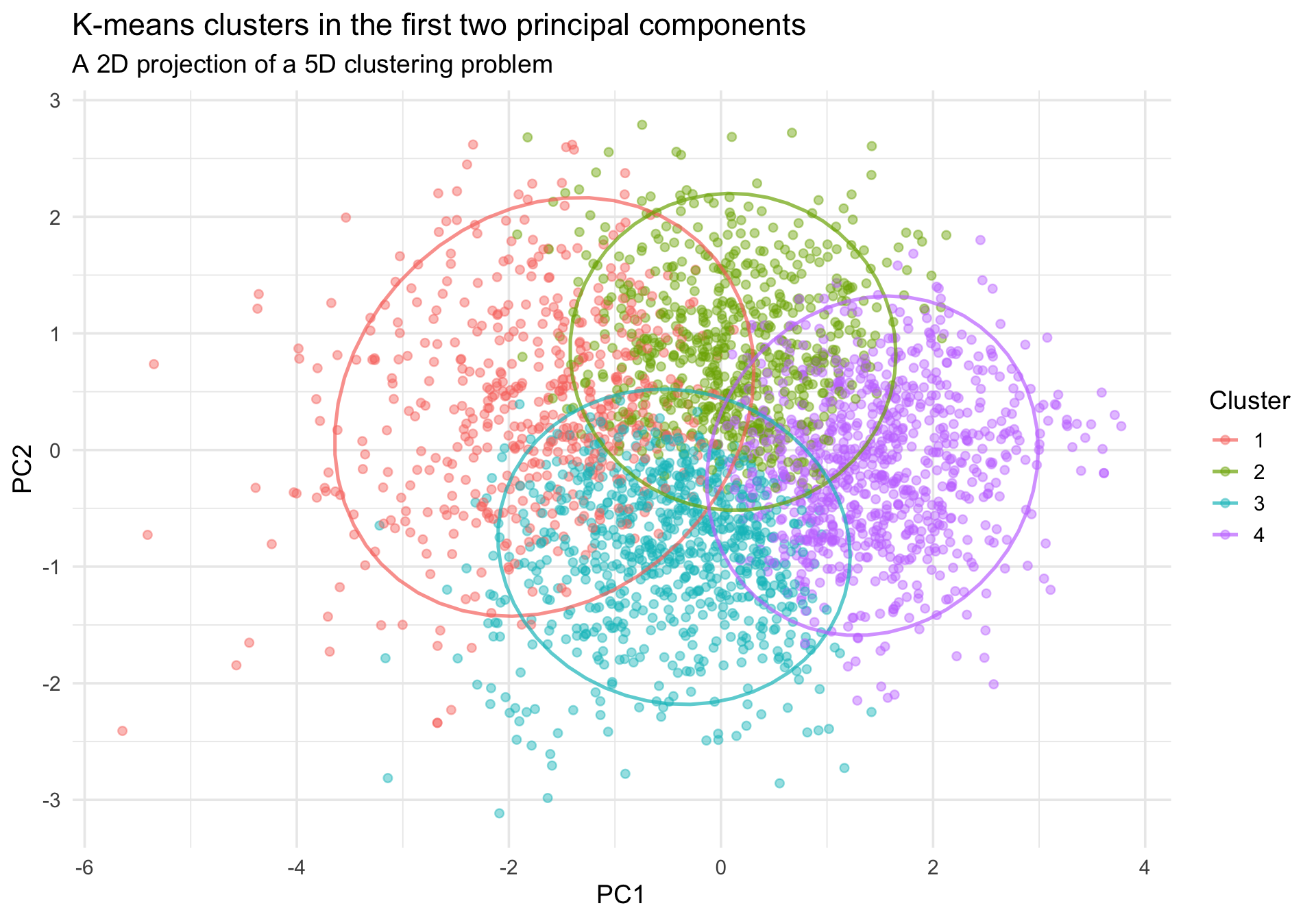
The original clustering happened in a 5-dimensional trait space, which we cannot see directly. A common EDA move is to project people into the first two principal components and color them by cluster membership.
Code
pca_fit <-prcomp(cluster_scaled, center =FALSE, scale. =FALSE)pca_scores <-as_tibble(pca_fit$x[, 1:2]) %>%setNames(c("PC1", "PC2")) %>%mutate(km4 = cluster_data$km4)ggplot(pca_scores, aes(x = PC1, y = PC2, color = km4)) +geom_point(alpha =0.45, size =1.8) +stat_ellipse(linewidth =0.9, alpha =0.7) +labs(title ="K-means clusters in the first two principal components",subtitle ="A 2D projection of a 5D clustering problem",x ="PC1",y ="PC2",color ="Cluster" ) +theme_minimal(base_size =14)
This plot is helpful, but it is still only a projection. Good separation in two principal components is reassuring, but overlap does not necessarily mean the original 5D solution is poor.
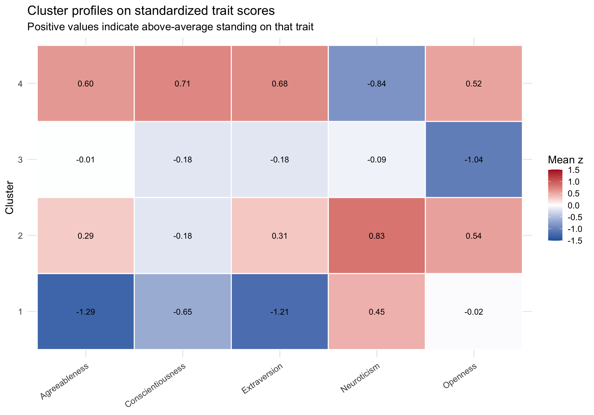
Interpreting cluster profiles
The most important follow-up plot is not the PCA scatterplot. It is a plot of the cluster centers themselves. Those centers tell us what each cluster means psychologically.
A cautious interpretation of these profiles might be:
Cluster 1 is relatively low on agreeableness and extraversion, somewhat low on conscientiousness, and somewhat elevated on neuroticism.
Cluster 2 is moderate on agreeableness and extraversion, somewhat open to experience, and also elevated on neuroticism.
Cluster 3 looks close to average on most traits but distinctly lower on openness.
Cluster 4 is relatively high on agreeableness, conscientiousness, extraversion, and openness, and relatively low on neuroticism.
These are profile summaries, not diagnostic categories and not evidence for discrete personality “types.” The weak silhouette values should already make you cautious about drawing overly categorical conclusions.
Step 4: What clustering is good for in EDA
The cluster solution above is most useful if it helps us see and ask better questions. For example:
Does a cluster profile suggest interactions we may want to model later?
Do certain participants look like outliers or atypical combinations of traits?
Would a continuous method like PCA capture the same structure more parsimoniously?
Are the cluster assignments stable if we change the distance metric, the algorithm, or the number of clusters?
Those are EDA uses. By contrast, clustering is often a poor choice when we need:
a strongly theory-driven confirmatory model,
a guaranteed unique solution,
cluster assignments that are insensitive to preprocessing choices, or
evidence that latent groups are “real” in a substantive sense.
Key cautions
A core principle of applying clustered EDA is that these methods are highly sensitive to analysis decisions (Peng). In practice, always ask:
Scale: Did one variable dominate distance because of its variance or units?
Distance metric: Would Manhattan or correlation-based distance tell a different story?
Algorithm: Do hierarchical clustering and k-means converge on similar patterns?
Number of clusters: Is your chosen k driven by theory, interpretability, or convenience?
Stability: Would the solution replicate in another sample?
Take-home points
Cluster analysis is valuable because it can quickly expose structure in multivariate psychological data. But its output is only as good as the features, scaling decisions, distance metric, and algorithm you choose.
For that reason, clustering should usually be treated as a map, not a verdict. Use it to organize your data, generate hypotheses, and decide what to inspect next. Then challenge the pattern with alternative visualizations and more formal models.