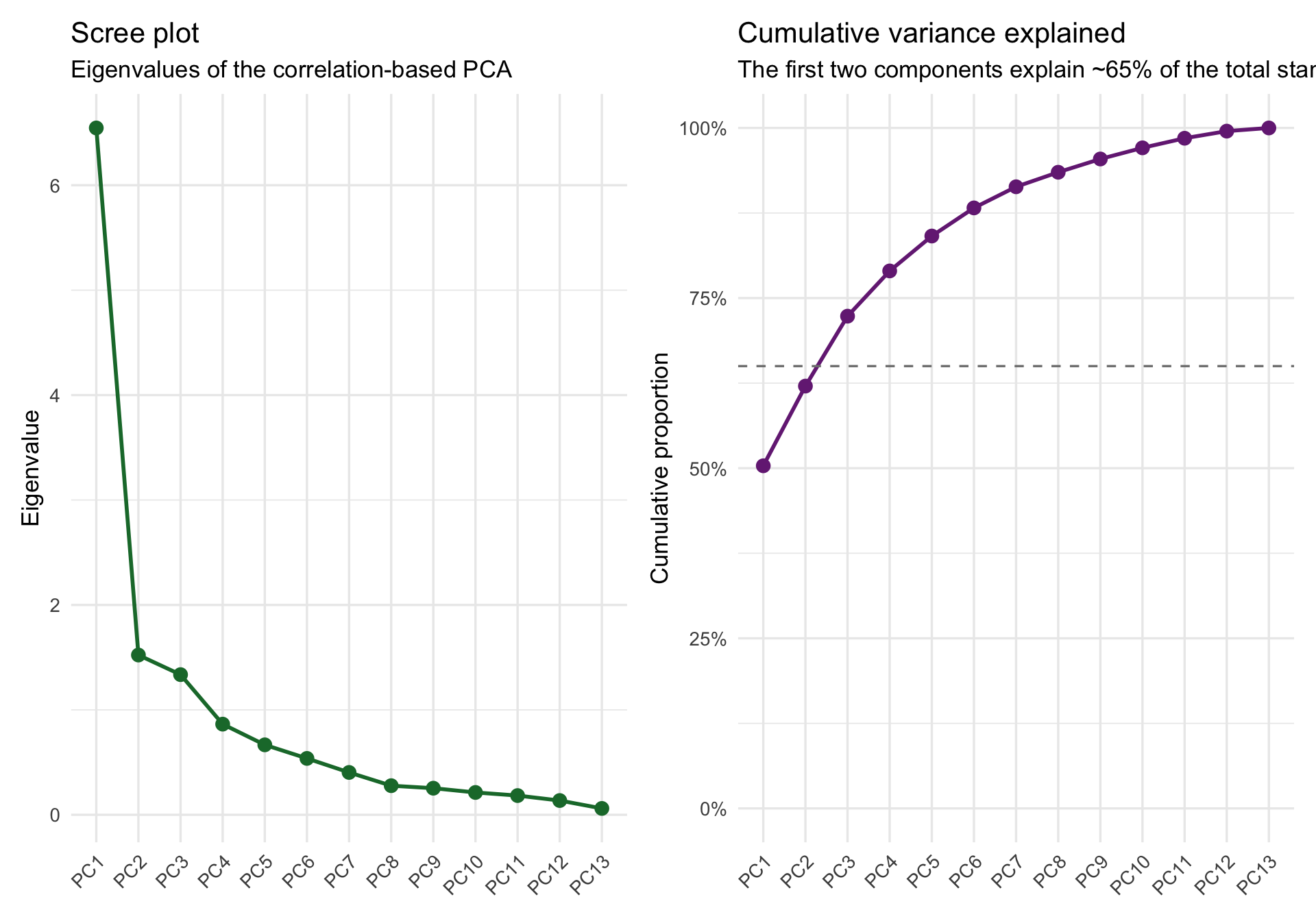
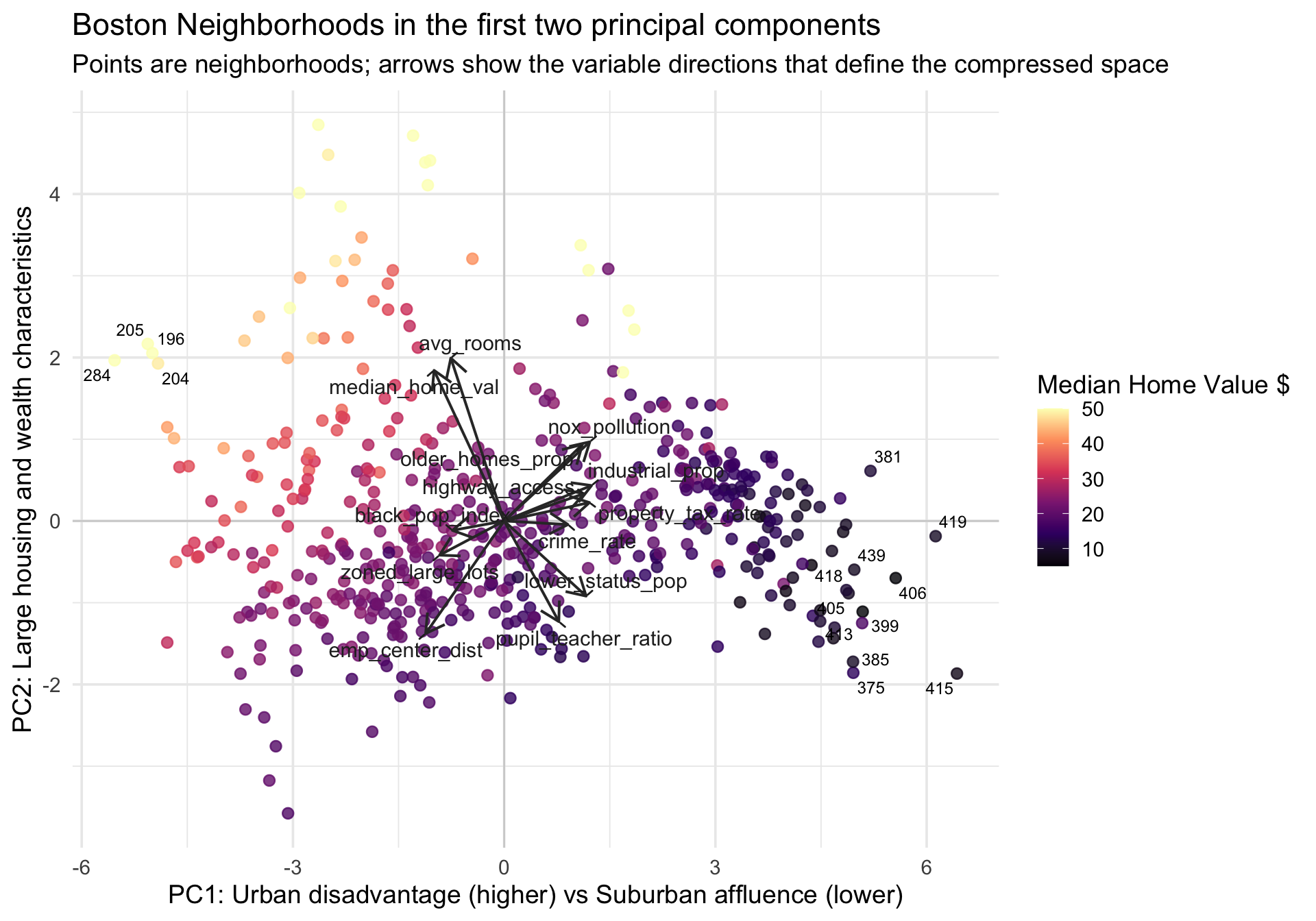
Dimension Reduction as an Exploratory Data Analysis Tool

Author

Michael Hallquist, PSYC 859

Published

April 16, 2026

Overview

When you have only a few variables, it is usually possible to inspect their relationships directly with scatterplots, densities, and small multiples. But once the number of variables grows, the visual task gets harder fast. While many common graphics work well for roughly 2 to 20 variables, beyond that point our ability to resolve structure by eye starts to break down.

That is where dimension reduction enters the EDA workflow. These methods help us summarize a multivariate dataset with a smaller number of derived dimensions that retain as much meaningful structure as possible (see Peng). In practice, that gives us two related benefits:

  1. a compressed view of the data that is easier to visualize,
  2. a low-rank approximation of the original matrix that can reveal dominant patterns.

This walkthrough focuses on principal components analysis (PCA), which is arguably the workhorse of dimension reduction. PCA can be used as a purely exploratory tool or as part of a more substantive inquiry, but here we treat it as EDA first: a way to see broad structure, generate hypotheses, and decide what deserves closer follow-up.

We will use the Boston_df dataset from the crimedatasets package and ask a simple exploratory question:

Can a small number of latent directions summarize how Boston neighborhoods differ across structural, environmental, and socio-economic indicators?

This tutorial covers:

  1. Inspecting the original feature space before reducing anything.
  2. Motivating standardization and the choice between covariance- and correlation-based PCA.
  3. Running PCA and interpreting variance explained, scores, and loadings.
  4. Exploring neighborhoods in a compressed 2D space with a custom biplot.
  5. Connecting PCA back to the matrix-compression view of dimension reduction.
  6. Relating PCA to metric multidimensional scaling (MDS) as a distance-based companion method.

Learning goals

After working through this document, you should be able to:

  1. Explain why dimension reduction is useful for exploratory analysis of multivariate data.
  2. Decide when PCA should be run on a correlation matrix rather than a covariance matrix.
  3. Interpret principal-component variance explained, loadings, and observation scores.
  4. Use the first two principal components to build an informative exploratory display.
  5. Explain how PCA can be understood as a low-rank approximation of a data matrix.
  6. Describe how metric MDS relates to PCA when both are based on Euclidean distances.

Packages

Code
# Install any missing packages (uncomment if needed):
# install.packages(c(
#   "ggplot2", "dplyr", "tidyr", "tibble",
#   "patchwork", "ggrepel", "scales", "crimedatasets",
#   "pheatmap"
# ))

library(ggplot2)
library(dplyr)
library(tidyr)
library(tibble)
library(patchwork)
library(ggrepel)
library(scales)
library(crimedatasets)
library(pheatmap)

Data: Boston housing and neighborhood indicators

The Boston_df dataset contains tract-level variables describing Boston neighborhoods:

  • crime_rate (originally crim): per capita crime rate by town
  • zoned_large_lots (originally zn): proportion of residential land zoned for lots over 25,000 sq.ft
  • industrial_prop (originally indus): proportion of non-retail business acres per town
  • nox_pollution (originally nox): nitrogen oxides concentration (parts per 10 million)
  • avg_rooms (originally rm): average number of rooms per dwelling
  • older_homes_prop (originally age): proportion of owner-occupied units built prior to 1940
  • emp_center_dist (originally dis): weighted mean of distances to five Boston employment centres
  • highway_access (originally rad): index of accessibility to radial highways
  • property_tax_rate (originally tax): full-value property-tax rate per $10,000
  • pupil_teacher_ratio (originally ptratio): pupil-teacher ratio by town
  • black_pop_index (originally black): 1000(Bk - 0.63)^2 where Bk is the proportion of Black residents by town
  • lower_status_pop (originally lstat): lower status of the population (percent)
  • median_home_val (originally medv): median value of owner-occupied homes in $1000s

Omitting the categorical Charles River dummy (chas), these are all numeric variables, so they can be arranged naturally into an n x p data matrix where rows are observations and columns are variables. This is the exact mathematical setting required for dimension reduction techniques like PCA and SVD (Peng).

Code
boston <- as_tibble(Boston_df) %>%
  rename(
    crime_rate = crim,
    zoned_large_lots = zn,
    industrial_prop = indus,
    nox_pollution = nox,
    avg_rooms = rm,
    older_homes_prop = age,
    emp_center_dist = dis,
    highway_access = rad,
    property_tax_rate = tax,
    pupil_teacher_ratio = ptratio,
    black_pop_index = black,
    lower_status_pop = lstat,
    median_home_val = medv
  ) %>%
  select(crime_rate, zoned_large_lots, industrial_prop, nox_pollution, avg_rooms, 
         older_homes_prop, emp_center_dist, highway_access, property_tax_rate, 
         pupil_teacher_ratio, black_pop_index, lower_status_pop, median_home_val) %>%
  mutate(neighborhood_id = row_number()) %>%
  relocate(neighborhood_id)

boston_vars <- setdiff(names(boston), "neighborhood_id")

glimpse(boston)
Rows: 506
Columns: 14
$ neighborhood_id     <int> 1, 2, 3, 4, 5, 6, 7, 8, 9, 10, 11, 12, 13, 14, 15,…
$ crime_rate          <dbl> 0.00632, 0.02731, 0.02729, 0.03237, 0.06905, 0.029…
$ zoned_large_lots    <dbl> 18.0, 0.0, 0.0, 0.0, 0.0, 0.0, 12.5, 12.5, 12.5, 1…
$ industrial_prop     <dbl> 2.31, 7.07, 7.07, 2.18, 2.18, 2.18, 7.87, 7.87, 7.…
$ nox_pollution       <dbl> 0.538, 0.469, 0.469, 0.458, 0.458, 0.458, 0.524, 0…
$ avg_rooms           <dbl> 6.575, 6.421, 7.185, 6.998, 7.147, 6.430, 6.012, 6…
$ older_homes_prop    <dbl> 65.2, 78.9, 61.1, 45.8, 54.2, 58.7, 66.6, 96.1, 10…
$ emp_center_dist     <dbl> 4.0900, 4.9671, 4.9671, 6.0622, 6.0622, 6.0622, 5.…
$ highway_access      <int> 1, 2, 2, 3, 3, 3, 5, 5, 5, 5, 5, 5, 5, 4, 4, 4, 4,…
$ property_tax_rate   <dbl> 296, 242, 242, 222, 222, 222, 311, 311, 311, 311, …
$ pupil_teacher_ratio <dbl> 15.3, 17.8, 17.8, 18.7, 18.7, 18.7, 15.2, 15.2, 15…
$ black_pop_index     <dbl> 396.90, 396.90, 392.83, 394.63, 396.90, 394.12, 39…
$ lower_status_pop    <dbl> 4.98, 9.14, 4.03, 2.94, 5.33, 5.21, 12.43, 19.15, …
$ median_home_val     <dbl> 24.0, 21.6, 34.7, 33.4, 36.2, 28.7, 22.9, 27.1, 16…
Code
cat("Neighborhoods:", nrow(boston), "\n")
Neighborhoods: 506 
Code
cat("Variables:", length(boston_vars), "\n")
Variables: 13 

Step 1: Inspect the original feature space

Before reducing the data, we should look at the variables we are about to compress. Dimension reduction is not a substitute for basic EDA. It is a tool that comes after we inspect distributions, scales, and relationships.

Correlation structure

Code
cor_mat <- cor(boston %>% select(all_of(boston_vars)))

cor_long <- cor_mat %>%
  as.data.frame() %>%
  rownames_to_column("var1") %>%
  pivot_longer(-var1, names_to = "var2", values_to = "r") %>%
  mutate(
    var1 = factor(var1, levels = boston_vars),
    var2 = factor(var2, levels = rev(boston_vars))
  )

ggplot(cor_long, aes(x = var1, y = var2, fill = r)) +
  geom_tile(color = "white", linewidth = 0.4) +
  geom_text(aes(label = sprintf("%.2f", r)), size = 3) +
  scale_fill_gradient2(
    low = "#2166ac", mid = "white", high = "#b2182b",
    midpoint = 0, limits = c(-1, 1), name = "r"
  ) +
  labs(
    title = "Correlation matrix of the original variables",
    subtitle = "Strong correlations exist between industrialization, pollution, taxes, and lower status populations",
    x = NULL,
    y = NULL
  ) +
  theme_minimal(base_size = 13) +
  theme(panel.grid = element_blank(), axis.text.x = element_text(angle = 45, hjust = 1)) +
  coord_fixed()

Several variables are highly correlated (e.g., industrial_prop, nox_pollution, property_tax_rate, older_homes_prop, and lower_status_pop positively; emp_center_dist negatively with nox_pollution and older_homes_prop). That is the basic empirical reason PCA may help here: if several variables are moving together, then a smaller set of derived components may summarize much of the same information.

Hierarchical clustering of correlations

To better understand this correlation structure, we can organize the matrix so that highly correlated variables sit near each other. We use hierarchical clustering to systematically group variables into approximate “factors.”

As a brief recap of hierarchical clustering principles: The algorithm typically begins bottom-up (agglomerative clustering) by treating each single variable as its own cluster. It then evaluates the similarity between all pairs—in this case, treating strong correlations as small “distances.” The two most similar variables are merged into a new branch. This process repeats, iteratively joining variables and sub-clusters based on a linkage criterion (e.g., complete linkage), until all variables are connected in a single overarching tree, or dendrogram.

This is incredibly helpful for EDA. An alphabetically or arbitrarily ordered matrix scatters patterns indiscriminately. Hierarchical clustering reorders the rows and columns to force variables with shared, overlapping variance into contiguous visual “blocks.” This makes large-scale subgroups immediately obvious before we even construct formal dimension reduction models like PCA. The pheatmap package performs this clustering and reordering elegantly in one step.

Code
# Create a clustered heatmap with a dendrogram
pheatmap(
  cor_mat, 
  display_numbers = round(cor_mat, 2),
  number_color = "black",
  color = colorRampPalette(c("#2166ac", "white", "#b2182b"))(100),
  breaks = seq(-1, 1, length.out = 101),
  treeheight_row = 30,
  treeheight_col = 30,
  main = "Clustered correlations of Boston variables"
)

The dendrogram branches reveal distinct groupings of variables. For example, industrial_prop, nox_pollution, property_tax_rate, lower_status_pop, and crime_rate form a unified block of positive correlations, representing urban disadvantage. These empirical groupings hint at the principal components we will extract shortly.

Scale matters before PCA

A crucial property of PCA is that if variables are on very different scales, the first principal component will be dominated by whichever variables have the largest variance. This underscores a broader mathematical principle for PCA and SVD: scale and units matter (Peng).

Code
spread_df <- boston %>%
  summarize(across(all_of(boston_vars), sd)) %>%
  pivot_longer(everything(), names_to = "variable", values_to = "sd")

ggplot(spread_df, aes(x = reorder(variable, sd), y = sd)) +
  geom_col(fill = "#8c510a") +
  coord_flip() +
  labs(
    title = "Standard deviations of the Boston variables",
    subtitle = "Property tax, black population index, older homes, and zoning vary on a much larger scale",
    x = NULL,
    y = "Standard deviation"
  ) +
  theme_minimal(base_size = 14)

Variables like property_tax_rate and black_pop_index have much larger variances than others like nox_pollution or avg_rooms, so an unscaled PCA would mostly discover the direction of greatest raw spread, not necessarily the most interpretable multivariate pattern.

Covariance PCA versus correlation PCA

To show the effect directly, compare PCA on the raw covariance matrix with PCA on standardized variables. The first unscaled component absorbs almost all of the variance because the large-scale variables dominate the geometry.

Code
pca_cov <- prcomp(boston %>% select(all_of(boston_vars)), scale. = FALSE)
pca_cor <- prcomp(boston %>% select(all_of(boston_vars)), scale. = TRUE)

pve_compare <- bind_rows(
  tibble(
    component = factor(paste0("PC", 1:13), levels = paste0("PC", 1:13)),
    pve = (pca_cov$sdev^2) / sum(pca_cov$sdev^2),
    analysis = "Unscaled PCA"
  ),
  tibble(
    component = factor(paste0("PC", 1:13), levels = paste0("PC", 1:13)),
    pve = (pca_cor$sdev^2) / sum(pca_cor$sdev^2),
    analysis = "PCA on standardized variables"
  )
)

ggplot(pve_compare, aes(x = component, y = pve, fill = analysis)) +
  geom_col(position = position_dodge(width = 0.75), width = 0.7) +
  scale_y_continuous(labels = percent_format(accuracy = 1)) +
  scale_fill_manual(values = c("Unscaled PCA" = "#b2182b", "PCA on standardized variables" = "#2166ac")) +
  labs(
    title = "Variance explained depends strongly on scaling",
    subtitle = "Unscaled PCA is overwhelmed by taxes and other high-variance variables",
    x = NULL,
    y = "Proportion of variance explained",
    fill = NULL
  ) +
  theme_minimal(base_size = 13) +
  theme(axis.text.x = element_text(angle = 45, hjust = 1))

For these data, the correlation-based solution is the right exploratory starting point because it puts all variables, measuring vastly different concepts (percentages, rates, dollars, parts per 10 million), on comparable footing.

Step 2: Run PCA on standardized variables

We now fit PCA on standardized data. Conceptually, we are trying to identify a small set of new directions in the data that explain as much variance as possible. Mathematically, this is equivalent to seeking a lower-rank representation of the original matrix (Peng).

Code
boston_matrix <- boston %>%
  select(all_of(boston_vars)) %>%
  scale() %>%
  as.matrix()

pca_fit <- prcomp(boston_matrix, center = FALSE, scale. = FALSE)

pca_var <- tibble(
  component = factor(paste0("PC", 1:13), levels = paste0("PC", 1:13)),
  eigenvalue = pca_fit$sdev^2,
  pve = eigenvalue / sum(eigenvalue),
  cumulative = cumsum(pve)
)

pca_var %>%
  mutate(across(c(eigenvalue, pve, cumulative), ~ round(.x, 3))) %>%
  head(6) %>%
  knitr::kable()
component eigenvalue pve cumulative
PC1 6.546 0.504 0.504
PC2 1.523 0.117 0.621
PC3 1.336 0.103 0.723
PC4 0.864 0.066 0.790
PC5 0.667 0.051 0.841
PC6 0.537 0.041 0.883
Code
scree_plot <- ggplot(pca_var, aes(x = component, y = eigenvalue, group = 1)) +
  geom_line(color = "#1b7837", linewidth = 1) +
  geom_point(color = "#1b7837", size = 3) +
  labs(
    title = "Scree plot",
    subtitle = "Eigenvalues of the correlation-based PCA",
    x = NULL,
    y = "Eigenvalue"
  ) +
  theme_minimal(base_size = 13) +
  theme(axis.text.x = element_text(angle = 45, hjust = 1))

cum_plot <- ggplot(pca_var, aes(x = component, y = cumulative, group = 1)) +
  geom_line(color = "#762a83", linewidth = 1) +
  geom_point(color = "#762a83", size = 3) +
  geom_hline(yintercept = 0.65, linetype = "dashed", color = "gray50") +
  scale_y_continuous(labels = percent_format(accuracy = 1), limits = c(0, 1)) +
  labs(
    title = "Cumulative variance explained",
    subtitle = "The first two components explain ~65% of the total standardized variance",
    x = NULL,
    y = "Cumulative proportion"
  ) +
  theme_minimal(base_size = 13) +
  theme(axis.text.x = element_text(angle = 45, hjust = 1))

scree_plot + cum_plot

This reveals the core promise of dimension reduction: we can move from a 13-dimensional feature space to a 2- or 3-dimensional exploratory display. The first two components capture a substantial majority (~65%) of the variance.

Loadings: what do the components mean?

The eigenvectors, or loading weights, define how each observed variable contributes to each component. If you are coming from factor analysis, the loadings are the closest analog to factor-loading patterns, even though PCA and factor analysis are not the same model.

For interpretability, we can inspect the loadings on the first two principal components. I’ll make sure the sign of PC1 reflects heavier urban disadvantage (positive direction) to make orientation more straightforward.

Code
loadings_display <- pca_fit$rotation[, 1:2, drop = FALSE]
scores_display <- pca_fit$x[, 1:2, drop = FALSE]

# Flip so positive PC1 captures high crime, lower status, etc.
if(loadings_display["crime_rate", "PC1"] < 0) {
  loadings_display[, "PC1"] <- -loadings_display[, "PC1"]
  scores_display[, "PC1"] <- -scores_display[, "PC1"]
}

loadings_tbl <- loadings_display %>%
  as.data.frame() %>%
  rownames_to_column("variable") %>%
  as_tibble()

loadings_tbl %>%
  mutate(across(c(PC1, PC2), ~ round(.x, 3))) %>%
  arrange(desc(PC1)) %>%
  knitr::kable()
variable PC1 PC2
industrial_prop 0.332 0.116
nox_pollution 0.325 0.259
property_tax_rate 0.324 0.060
lower_status_pop 0.311 -0.246
highway_access 0.303 0.089
older_homes_prop 0.297 0.250
crime_rate 0.242 -0.012
pupil_teacher_ratio 0.208 -0.329
black_pop_index -0.197 -0.031
avg_rooms -0.203 0.533
zoned_large_lots -0.245 -0.112
median_home_val -0.266 0.493
emp_center_dist -0.298 -0.368

Two quick interpretations are useful:

  1. PC1 loads positively on industrial_prop, nox_pollution, property_tax_rate, lower_status_pop, and crime_rate, and negatively on emp_center_dist, median_home_val, and zoned_large_lots. This represents an overarching dimension of urban distress vs. suburban affluence: it opposes dense, polluted, higher-crime core areas with lower home values, against dispersed residential areas with high values.
  2. PC2 loads strongly on avg_rooms, median_home_val and older_homes_prop, and negatively on pupil_teacher_ratio, emp_center_dist, and lower_status_pop. This captures a secondary pattern reflecting housing stock and wealth characteristics, differentiating neighborhoods with large, valuable homes from others.

Custom biplot in the compressed space

The most useful EDA question now becomes: what do the observations look like when projected into the first two principal components? This provides a “compressed space” view of the data.

A biplot is a display that shows two things in the same PCA figure:

  1. the observation scores as points, which tell us where neighborhoods fall in the reduced space, and
  2. the variable loadings as arrows, which tell us which original variables define the directions in that space.

That combination is what makes the plot so useful pedagogically. It lets you see both the arrangement of observations and the meaning of the axes at the same time.

Code
scores_df <- boston %>%
  select(neighborhood_id, median_home_val) %>%
  bind_cols(as_tibble(scores_display))

# Label a few extreme neighborhoods to see where they lie
scores_df <- scores_df %>%
  mutate(label_me = dense_rank(desc(pmax(abs(PC1), abs(PC2)))) <= 15)

arrow_scale <- min(
  diff(range(scores_df$PC1)) / diff(range(loadings_tbl$PC1)),
  diff(range(scores_df$PC2)) / diff(range(loadings_tbl$PC2))
) * 0.4

ggplot(scores_df, aes(x = PC1, y = PC2)) +
  geom_hline(yintercept = 0, color = "gray82", linewidth = 0.5) +
  geom_vline(xintercept = 0, color = "gray82", linewidth = 0.5) +
  geom_point(aes(color = median_home_val), size = 2.4, alpha = 0.8) +
  geom_text_repel(
    data = filter(scores_df, label_me),
    aes(label = neighborhood_id),
    size = 3.2,
    show.legend = FALSE,
    max.overlaps = Inf
  ) +
  geom_segment(
    data = loadings_tbl,
    aes(x = 0, y = 0, xend = PC1 * arrow_scale, yend = PC2 * arrow_scale),
    inherit.aes = FALSE,
    color = "gray20",
    linewidth = 0.7,
    arrow = arrow(length = grid::unit(0.16, "inches"))
  ) +
  geom_text_repel(
    data = loadings_tbl,
    aes(x = PC1 * arrow_scale, y = PC2 * arrow_scale, label = variable),
    inherit.aes = FALSE,
    color = "gray15",
    size = 4,
    min.segment.length = 0
  ) +
  scale_color_viridis_c(option = "magma", name = "Median Home Value $") +
  labs(
    title = "Boston Neighborhoods in the first two principal components",
    subtitle = "Points are neighborhoods; arrows show the variable directions that define the compressed space",
    x = "PC1: Urban disadvantage (higher) vs Suburban affluence (lower)",
    y = "PC2: Large housing and wealth characteristics"
  ) +
  theme_minimal(base_size = 14)

Several exploratory patterns are now easy to see:

  1. We see a cluster of high median value homes (yellow points) sitting up and to the left (low urban disadvantage, higher on housing characteristics).
  2. Neighborhoods with low values (dark purple points) extend dramatically to the right along PC1, matching the arrows for crime_rate, industrial_prop, and nox_pollution.
  3. The arrows visually represent the correlation structure we saw earlier: emp_center_dist strongly opposes nox_pollution and industrial_prop, radiating in the exact opposite direction. zoned_large_lots opposes property_tax_rate and highway_access.

This is the practical value of PCA in EDA: a 13-dimensional problem becomes a 2-dimensional picture that is still closely tied to the original variables.

Note

The signs of principal components are arbitrary. If every loading and every score on a component were multiplied by -1, the geometry of the solution would be unchanged. I flipped PC1 only to make the interpretation more intuitive.

Step 3: PCA as low-rank approximation

PCA/SVD is not just a plotting convenience. It is also a powerful way to formally approximate a higher-dimensional matrix with a lower-rank one (Peng). For a standardized data matrix X, a PCA reconstruction using only the first k components is:

\[\hat{X}_k = Z_k V_k^\top\]

where Z_k contains the first k component scores and V_k contains the first k loading vectors.

That means PCA doubles as a lossy compression tool: fewer components give a simpler summary, but some information is discarded.

Code
reconstruct_pca <- function(fit, k) {
  fit$x[, 1:k, drop = FALSE] %*% t(fit$rotation[, 1:k, drop = FALSE])
}

num_vars <- ncol(boston_matrix)

compression_df <- tibble(
  k = 1:4,
  variance_retained = cumsum(pca_var$pve)[1:4],
  rmse = vapply(
    1:4,
    function(k) sqrt(mean((boston_matrix - reconstruct_pca(pca_fit, k))^2)),
    numeric(1)
  ),
  values_needed = (nrow(boston_matrix) + num_vars) * (1:4),
  original_values = length(boston_matrix)
)

compression_df %>%
  mutate(
    variance_retained = percent(variance_retained, accuracy = 0.1),
    rmse = round(rmse, 3),
    compression = percent(1 - values_needed / original_values, accuracy = 1)
  ) %>%
  knitr::kable()
k variance_retained rmse values_needed original_values compression
1 50.4% 0.704 519 6578 92%
2 62.1% 0.615 1038 6578 84%
3 72.3% 0.525 1557 6578 76%
4 79.0% 0.458 2076 6578 68%

For k = 3, we retain about 76% of the variance while representing the standardized matrix with fewer values (strong compression). In a much larger matrix, that tradeoff becomes far more consequential.

This compression perspective also helps interpret the scree plot: we are looking for a point where a small number of components gives a useful approximation without pretending the remaining dimensions are meaningless.

Step 4: A short MDS extension

A closely allied method is metric multidimensional scaling (MDS). While PCA operates on a matrix of variables, MDS starts from a distance or dissimilarity matrix, then seeks a low-dimensional configuration of points that preserves those distances as accurately as possible.

If we use standard Euclidean distances on the same standardized Boston variables, metric MDS recovers the exact same 2D geometry as PCA up to rotation or reflection.

Code
mds_fit <- cmdscale(dist(boston_matrix), eig = TRUE, k = 2)
mds_scores <- as_tibble(mds_fit$points, .name_repair = ~ c("Dim1", "Dim2"))

round(cor(scores_df %>% select(PC1, PC2), mds_scores), 3)
    Dim1 Dim2
PC1    1    0
PC2    0   -1

The perfect 1 or -1 correlations show that these two solutions represent the identical underlying structure. So when would we use MDS rather than PCA?

Why MDS? The Geographical Distances Example

To understand when MDS is uniquely useful, consider a classic geographical example. PCA requires an \(n \times p\) data matrix of features. But what if you only have relationships between items, and no original feature columns at all?

For example, imagine we only have a table of driving distances between five North Carolina cities:

Code
# A simple distance matrix for 5 NC cities (in miles)
nc_cities <- c("Asheville", "Charlotte", "Raleigh", "Wilmington", "Greenville")
dist_mat <- matrix(c(
    0, 130, 248, 335, 333,
  130,   0, 165, 208, 250,
  248, 165,   0, 132,  85,
  335, 208, 132,   0, 114,
  333, 250,  85, 114,   0
), nrow = 5, byrow = TRUE, dimnames = list(nc_cities, nc_cities))

nc_dist <- as.dist(dist_mat)

We can’t run PCA here because there are no variables like population or elevation—we only know how far apart things are. Metric MDS (cmdscale) takes these pairwise distances and reconstructs the implied dimensions, effectively redrawing the map from scratch:

Code
# Reconstruct 2D coordinates preserving driving distances
city_coords <- cmdscale(nc_dist, k = 2) %>% 
  as.data.frame() %>%
  rownames_to_column("City") %>%
  rename(X = V1, Y = V2)

# Plot the reconstructed map (flipping X to match standard NC Geography: Asheville West, Wilmington East)
ggplot(city_coords, aes(x = -X, y = Y, label = City)) +
  geom_point(color = "#b2182b", size = 3) +
  geom_text_repel(size = 4, nudge_y = 10) +
  theme_minimal(base_size = 14) +
  labs(
    title = "MDS Reconstruction of NC Cities",
    subtitle = "Derived entirely from pairwise driving distances",
    x = "Dimension 1 (Implied West to East)", 
    y = "Dimension 2 (Implied North to South)"
  ) +
  coord_fixed()

This perfectly illustrates the core distinction:

  1. PCA is preferable when you have continuous variables (a raw data matrix) and want to find axes of maximum variance and interpretable variable loadings.
  2. MDS is uniquely powerful when our primary object is a pairwise dissimilarity. It applies flexibly to “distances” ranging from driving miles to subjective human similarity ratings (e.g., “how similar are these two faces?”), genetic distances, or text-overlap metrics where no strict feature columns exist at all.

Step 5: What PCA is good for in EDA

PCA is most useful when it helps you ask better follow-up questions. In this example, the compressed-space view suggests questions such as:

  1. What specific historical or policy decisions trace the strong inverse relationship between employment distance (emp_center_dist) and pollution (nox_pollution)?
  2. Are the distinct outliers on the right tail of PC1 specific types of highly-industrial or densely-urbanized tracts that require completely different modeling regimes than typical suburban tracts?
  3. Might median_home_val be better understood not just as a continuous outcome, but as defining distinct regimes across the PC1 vs PC2 plane?
  4. Is a continuous summary more appropriate than trying to force the data into discrete clusters?

Those are exactly the kinds of questions that exploratory statistics should generate.

Key cautions

A running theme in the study of dimension reduction is that these tools are highly useful, but not magical (Peng). In practice, always ask:

  1. Scale: Would different units or variances change the solution?
  2. Interpretation: Are you treating components as descriptive summaries or over-reading them as latent causes?
  3. Compression loss: What meaningful structure might be hiding in later components?
  4. Pattern mixing: Could one principal component combine multiple real processes into a single axis?
  5. Missing data: Have missing values been handled before PCA? Standard PCA routines will usually fail with NAs.

PCA is exploratory structure-finding, not a substitute for theory or formal modeling.

Take-home points

  1. Dimension reduction helps when the original multivariate space is too complex to inspect directly.
  2. PCA finds orthogonal directions that explain as much variance as possible, and those directions are defined by loading weights on the observed variables.
  3. Standardization is often essential for EDA because otherwise high-variance variables can dominate the first component.
  4. In these data, the first two principal components explain about 65% of the standardized variance, making a 2D exploratory display highly informative for understanding urban versus suburban structure.
  5. PCA is useful not only for plotting but also for formal low-rank approximation and data compression (Peng).
  6. Metric MDS provides a closely related distance-based view of the same problem and can coincide exactly with PCA when Euclidean distances are used on standardized data.