Interpreting Eigenvalues and Eigenvectors in PCA

Author

Michael Hallquist, PSYC 859

Published

April 16, 2026

Overview

People often learn the algebra of PCA and eigendecomposition before they develop a geometric feel for what the method is actually doing. This note is meant to close that gap. It follows the intuition explored in a wonderful [Cross Validated discussion of PCA]https://stats.stackexchange.com/questions/2691/making-sense-of-principal-component-analysis-eigenvectors-eigenvalues and then extends it into a few ideas that are especially useful for people new to this topic, including the difference between scores and loadings, why scaling choices matter, and why dimension reduction is fundamentally a compression problem (Cross Validated contributors 2010).

The central claim of this note is simple:

PCA rotates the coordinate system so that the first new axis captures as much variation as possible, the second captures as much of the leftover variation as possible, and so on.

That one sentence already contains the roles of eigenvectors and eigenvalues:

  • Eigenvectors tell us the directions of the new axes.
  • Eigenvalues tell us how much variance lies along each of those axes.

Several sections below deliberately reuse the geometric story emphasized in the Stack Exchange thread: PCA does not simply keep some old variables and throw away others; it creates new variables that are weighted combinations of the originals (Cross Validated contributors 2010).

Learning goals

After working through this document, you should be able to:

  1. Explain why PCA is useful for dimension reduction.
  2. Interpret eigenvectors as directions and eigenvalues as variances along those directions.
  3. Explain why maximizing projected variance and minimizing reconstruction error are two views of the same optimization problem.
  4. Distinguish scores from loadings/eigenvectors in a PCA output.
  5. Explain how truncating the PCA/SVD representation creates a lossy compression algorithm.

Packages

Code
# Install any missing packages (uncomment if needed):
# install.packages(c(
#   "ggplot2", "dplyr", "tidyr", "tibble",
#   "patchwork", "scales", "htmltools",
#   "jsonlite", "magick", "plotly"
# ))

library(ggplot2)
library(dplyr)
library(tidyr)
library(tibble)
library(patchwork)
library(scales)
library(htmltools)
library(jsonlite)
library(magick)
library(plotly)

Why PCA exists

Imagine that each observation in a dataset is described by many variables. If those variables are correlated, then some of them are partly telling the same story. PCA attacks that redundancy by constructing a new set of orthogonal axes that summarize the main patterns of variation with fewer dimensions (Cross Validated contributors 2010).

This is why PCA is a dimension-reduction tool rather than a variable-selection tool:

  • It does not ask, “Which original variables should I keep?”
  • It asks, “Can I replace this high-dimensional coordinate system with a better low-dimensional one?”

That distinction matters. The output of PCA is not “important variables.” The output is a rotated basis for the data.

A toy data cloud

To build intuition, it helps to start with two dimensions where we can see the geometry directly.

Code
set.seed(859)

n_points <- 160
true_angle <- 34 * pi / 180
rotation_mat <- matrix(
  c(cos(true_angle), -sin(true_angle),
    sin(true_angle),  cos(true_angle)),
  nrow = 2,
  byrow = TRUE
)

raw_cloud <- matrix(rnorm(n_points * 2), ncol = 2) %*%
  diag(c(2.8, 0.9)) %*%
  rotation_mat

toy_df <- as_tibble(scale(raw_cloud, center = TRUE, scale = FALSE))
names(toy_df) <- c("x1", "x2")

toy_pca <- prcomp(toy_df, center = FALSE, scale. = FALSE)

pc_axes <- tibble(
  axis = c("PC1", "PC1", "PC2", "PC2"),
  x = c(-1, 1, -1, 1) * c(rep(sqrt(toy_pca$sdev[1]^2) * 3.4, 2), rep(sqrt(toy_pca$sdev[2]^2) * 3.4, 2)) *
    c(toy_pca$rotation[1, 1], toy_pca$rotation[1, 1], toy_pca$rotation[1, 2], toy_pca$rotation[1, 2]),
  y = c(-1, 1, -1, 1) * c(rep(sqrt(toy_pca$sdev[1]^2) * 3.4, 2), rep(sqrt(toy_pca$sdev[2]^2) * 3.4, 2)) *
    c(toy_pca$rotation[2, 1], toy_pca$rotation[2, 1], toy_pca$rotation[2, 2], toy_pca$rotation[2, 2])
) %>%
  mutate(endpoint = rep(c("start", "end"), 2))

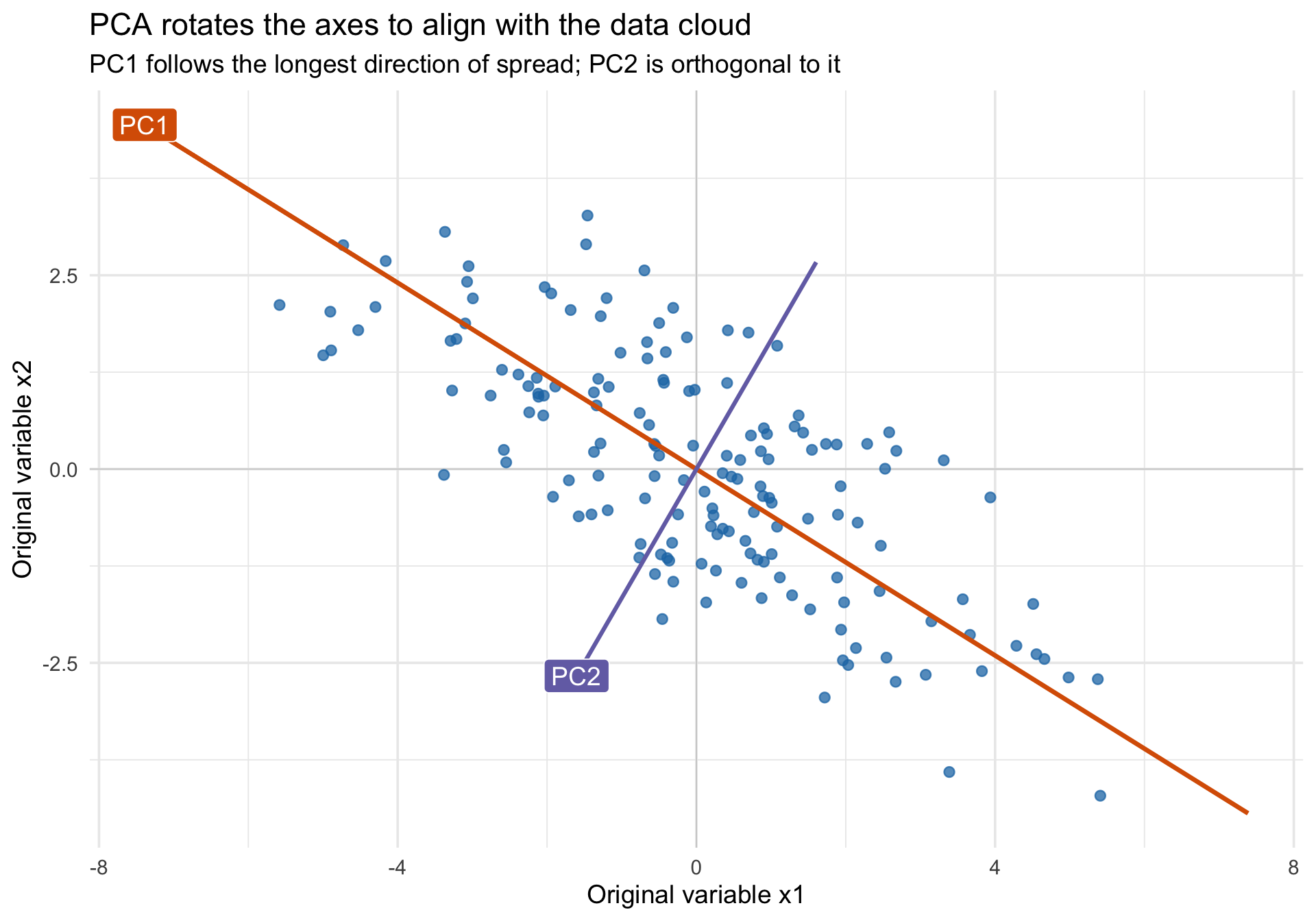
ggplot(toy_df, aes(x = x1, y = x2)) +
  geom_hline(yintercept = 0, linewidth = 0.3, color = "grey80") +
  geom_vline(xintercept = 0, linewidth = 0.3, color = "grey80") +
  geom_point(color = "#1f78b4", alpha = 0.75, size = 2.2) +
  geom_segment(
    data = pc_axes %>% filter(axis == "PC1") %>% tidyr::pivot_wider(names_from = endpoint, values_from = c(x, y)),
    aes(x = x_start, y = y_start, xend = x_end, yend = y_end),
    inherit.aes = FALSE,
    color = "#d95f02",
    linewidth = 1.2
  ) +
  geom_segment(
    data = pc_axes %>% filter(axis == "PC2") %>% tidyr::pivot_wider(names_from = endpoint, values_from = c(x, y)),
    aes(x = x_start, y = y_start, xend = x_end, yend = y_end),
    inherit.aes = FALSE,
    color = "#7570b3",
    linewidth = 1.1
  ) +
  annotate("label", x = pc_axes$x[2], y = pc_axes$y[2], label = "PC1", fill = "#d95f02", color = "white") +
  annotate("label", x = pc_axes$x[4], y = pc_axes$y[4], label = "PC2", fill = "#7570b3", color = "white") +
  labs(
    title = "PCA rotates the axes to align with the data cloud",
    subtitle = "PC1 follows the longest direction of spread; PC2 is orthogonal to it",
    x = "Original variable x1",
    y = "Original variable x2"
  ) +
  theme_minimal(base_size = 14)

The picture already suggests the core interpretation:

  • The first eigenvector points along the direction where the cloud is longest.
  • The second eigenvector is perpendicular to the first and captures the remaining spread.
  • The corresponding eigenvalues are the variances along those directions.

This is exactly the geometric intuition emphasized in the Stack Exchange thread: the principal components are new coordinates obtained by rotating the original axes to better match the shape of the data cloud (Cross Validated contributors 2010).

The two equivalent goals of PCA

The thread’s most useful pedagogical move is to present PCA in two apparently different ways and then show that they lead to the same answer (Cross Validated contributors 2010):

  1. Choose the line where the projected points have the largest variance.
  2. Choose the line that gives the smallest squared reconstruction error when points are projected back into the original space.

For centered data, these are two sides of the same geometry. If the projection line changes angle, then the total squared distance from each point to the origin stays fixed. So when more of that distance is captured along the line, less remains orthogonal to the line. That is the basic reason the two optimization criteria agree (Cross Validated contributors 2010).

Code
angle_grid <- seq(0, 179, by = 1)
toy_matrix <- as.matrix(toy_df)

angle_summary <- bind_rows(lapply(angle_grid, function(theta_deg) {
  theta <- theta_deg * pi / 180
  u <- c(cos(theta), sin(theta))
  scores <- drop(toy_matrix %*% u)
  reconstruction <- tcrossprod(scores, u)
  tibble(
    angle = theta_deg,
    projected_variance = var(scores),
    reconstruction_mse = mean(rowSums((toy_matrix - reconstruction)^2))
  )
}))

pc1_angle <- (atan2(toy_pca$rotation[2, 1], toy_pca$rotation[1, 1]) * 180 / pi) %% 180

variance_plot <- ggplot(angle_summary, aes(x = angle, y = projected_variance)) +
  geom_line(color = "#d95f02", linewidth = 1.1) +
  geom_vline(xintercept = pc1_angle, linetype = 2, color = "#444444") +
  labs(
    title = "Projected variance",
    subtitle = "The best one-dimensional summary maximizes variance",
    x = "Rotation angle (degrees)",
    y = "Variance along the line"
  ) +
  theme_minimal(base_size = 13)

error_plot <- ggplot(angle_summary, aes(x = angle, y = reconstruction_mse)) +
  geom_line(color = "#1b9e77", linewidth = 1.1) +
  geom_vline(xintercept = pc1_angle, linetype = 2, color = "#444444") +
  labs(
    title = "Orthogonal reconstruction error",
    subtitle = "The same angle minimizes squared loss",
    x = "Rotation angle (degrees)",
    y = "Mean squared reconstruction error"
  ) +
  theme_minimal(base_size = 13)

variance_plot + error_plot

The dashed line marks the first principal-component direction. Notice that the peak of projected variance and the trough of reconstruction loss occur at the same angle. That equivalence is one of the most important conceptual takeaways from the source thread (Cross Validated contributors 2010).

A modernized interactive PCA rotation demo

The animation below is a browser-based remake of the rotating graphic discussed in the Stack Exchange post, but with a slider, live metrics, and a play/pause control. Move the slider and watch three things at once:

  • the orientation of the candidate axis,
  • the spread of the projected red points,
  • the lengths of the orthogonal reconstruction segments.

When the red points are most spread out, the reconstruction segments are shortest overall. That is the first principal component.

Angle
Projected variance
Reconstruction MSE
Distance from PC1
Source inspiration: the rotating PCA graphic discussed in the Cross Validated thread Making sense of principal component analysis, eigenvectors & eigenvalues.

From 2D to 3D: Extracting variance iteratively

The animation above shows how the first principal component (PC1) finds the direction of maximum variance. But how do we find PC2, PC3, and beyond? The answer is that PCA is an iterative variance-extraction process.

Once PC1 has captured the longest spread of the data, PCA mathematically subtracts that spread out of the dataset entirely. What is left over is called the residual. PC2 is simply the PC1 of those residuals!

We can see this beautifully in three dimensions using the plotly package. Let’s create a simulated dataset of three correlated variables (\(x_1, x_2, x_3\)) that form a “cigar-shaped” 3D cloud.

Code
set.seed(859)
n_3d <- 400

# We build a dataset driven by one strong latent factor and one weaker one
L1 <- rnorm(n_3d, 0, 5)   # Dominant factor
L2 <- rnorm(n_3d, 0, 1.5) # Secondary factor
L3 <- rnorm(n_3d, 0, 0.4) # Minor noise

df3d <- tibble(
  x1 = L1 * 0.8 + L2 * 0.5 + L3 * 0.2,
  x2 = L1 * -0.5 + L2 * 0.8 + L3 * 0.1,
  x3 = L1 * 0.4 + L2 * -0.4 + L3 * 0.9
)

# Run PCA
pca3 <- prcomp(df3d, scale. = FALSE)
pc1_vec <- pca3$rotation[, 1]
pc2_vec <- pca3$rotation[, 2]

If we plot this original 3D cloud, we can draw PC1 directly through the longest axis of the cigar:

Code
# Helper for drawing vectors
axis_pts <- function(vec, scale_factor = 20) {
  as.data.frame(rbind(-scale_factor * vec, scale_factor * vec))
}

pc1_line <- axis_pts(pc1_vec)

p_orig <- plot_ly(df3d, x = ~x1, y = ~x2, z = ~x3, type = "scatter3d", mode = "markers",
        marker = list(size = 3, color = "#1f78b4", opacity = 0.6), name = "Data") %>%
  add_trace(x = pc1_line$x1, y = pc1_line$x2, z = pc1_line$x3, 
            type = "scatter3d", mode = "lines", 
            line = list(width = 8, color = "#d95f02"), name = "PC1") %>%
  layout(title = "Original 3D Data with PC1 vector")

p_orig

(Note: These 3D plots are interactive. You can click and drag to rotate them!)

Now, let’s observe the magic of dimension reduction. We extract the PC1 scores for each point (where they fall along the red line) and project those scores back onto the line to reconstruct them.

When we subtract these reconstructed points from the original data matrix, we are stripping away all the \(x_1, x_2, x_3\) variance that PC1 successfully explained.

Code
# 1. Get the scores on PC1 (the 1D coordinates along the line)
scores_pc1 <- as.matrix(df3d) %*% pc1_vec

# 2. Reconstruct the 3D points using ONLY PC1
recon_pc1 <- tcrossprod(scores_pc1, pc1_vec)

# 3. Calculate the residuals
res_df <- as_tibble(as.matrix(df3d) - recon_pc1)
names(res_df) <- c("x1", "x2", "x3")

Because we completely removed the longest dimension of variance, the data cloud literally collapses into a flat, 2D pancake. The second principal component (PC2) is simply the longest spread remaining in that flattened pancake!

Code
pc2_line <- axis_pts(pc2_vec, scale_factor = 5)

p_res <- plot_ly(res_df, x = ~x1, y = ~x2, z = ~x3, type = "scatter3d", mode = "markers",
        marker = list(size = 3, color = "#7570b3", opacity = 0.6), name = "Residuals") %>%
  add_trace(x = pc2_line$x1, y = pc2_line$x2, z = pc2_line$x3, 
            type = "scatter3d", mode = "lines", 
            line = list(width = 8, color = "#1b9e77"), name = "PC2") %>%
  layout(title = "Residuals after extracting PC1 (Notice the flattened 2D disk!)")

p_res

Rotate the plot above until you look at it perfectly edge-on. You will see that the cloud has precisely zero width in the direction that PC1 used to occupy.

This visually proves how PCA compresses 3 variables down into fewer dimensions:

  1. Maximize variance along the first dimension (PC1).
  2. Subtract it out.
  3. Maximize residual variance along a new, orthogonal direction (PC2).

Eigenvectors, eigenvalues, scores, and loadings

The PCA output is easier to interpret if you keep four objects conceptually separate:

  • Eigenvectors / rotation vectors: directions of the new axes in the original variable space.
  • Eigenvalues: variances of the data along those axes.
  • Scores: coordinates of observations after the rotation.
  • Loadings: weights relating original variables to components. In practice, many software packages blur the line between loadings and eigenvectors, so always check the exact definition being used.

For the toy example:

Code
toy_cov <- cov(toy_df)
toy_eig <- eigen(toy_cov)

eig_summary <- tibble(
  component = paste0("PC", 1:2),
  eigenvalue = round(toy_eig$values, 3),
  proportion_variance = percent(toy_eig$values / sum(toy_eig$values), accuracy = 0.1),
  eigenvector = c(
    sprintf("[%.3f, %.3f]", toy_eig$vectors[1, 1], toy_eig$vectors[2, 1]),
    sprintf("[%.3f, %.3f]", toy_eig$vectors[1, 2], toy_eig$vectors[2, 2])
  )
)

eig_summary
component eigenvalue proportion_variance eigenvector
PC1 6.427 88.5% [-0.857, 0.515]
PC2 0.839 11.5% [-0.515, -0.857]

Interpret this table as follows:

  • The first eigenvector gives the direction of PC1.
  • The first eigenvalue gives the variance of the data along PC1.
  • The second eigenvector is orthogonal to the first because the covariance matrix is symmetric.
  • The second eigenvalue gives the remaining variance along that second direction.

The Stack Exchange thread is especially helpful here because it connects the algebra back to the picture: diagonalizing the covariance matrix means finding the rotated coordinate system in which the covariance disappears and the variances sit cleanly on the diagonal (Cross Validated contributors 2010).

Two cautionary notes

  1. The sign of an eigenvector is arbitrary. If software flips a component from [0.7, 0.7] to [-0.7, -0.7], nothing substantive has changed.
  2. Large variance explained does not automatically mean scientific importance. PCA is unsupervised; it preserves structure in X, not whatever outcome or theory you care about.

Why dimension reduction is really compression

One of the best ways to appreciate PCA is to treat it as a lossy compression method. The Stack Exchange discussion repeatedly points toward this view: if you keep only the first few components, you get the best low-rank approximation to the original data matrix under squared-error loss (Cross Validated contributors 2010).

This is the idea behind using PCA or SVD to compress an image:

  1. represent the image as a matrix,
  2. decompose that matrix into orthogonal basis patterns,
  3. reconstruct the image with only the first k components,
  4. accept some blur in exchange for a much smaller representation.

For images, svd() is the cleanest computational route, but it is the same low-rank story that underlies PCA.

Image reconstruction with a small number of components

Code
portrait_gray <- image_read("../files/pca_compression_source.jpg") %>%
  image_resize("240x360!") %>%
  image_convert(colorspace = "gray")

gray_array <- image_data(portrait_gray, channels = "gray")
img_mat <- matrix(as.integer(gray_array[1, , ]), nrow = dim(gray_array)[2], ncol = dim(gray_array)[3]) / 255
img_mat <- t(img_mat)[nrow(t(img_mat)):1, ]

img_svd <- svd(img_mat)
ranks <- c(1, 2, 3, 5, 10, 20, 40, 80)

reconstruct_rank_k <- function(k) {
  img_svd$u[, 1:k, drop = FALSE] %*%
    diag(img_svd$d[1:k], nrow = k) %*%
    t(img_svd$v[, 1:k, drop = FALSE])
}

matrix_to_df <- function(mat, label) {
  expand.grid(row = seq_len(nrow(mat)), col = seq_len(ncol(mat))) %>%
    as_tibble() %>%
    mutate(
      value = as.vector(mat[nrow(mat):1, ]),
      version = label
    )
}

image_versions <- bind_rows(
  matrix_to_df(img_mat, "Original"),
  bind_rows(lapply(ranks, function(k) {
    matrix_to_df(pmin(pmax(reconstruct_rank_k(k), 0), 1), paste0("k = ", k))
  }))
) %>%
  mutate(version = factor(version, levels = c("Original", paste0("k = ", ranks))))

ggplot(image_versions, aes(x = col, y = row, fill = value)) +
  geom_raster() +
  facet_wrap(~ version, ncol = 3) +
  scale_fill_gradient(low = "black", high = "white", guide = "none") +
  scale_y_reverse() +
  coord_equal() +
  labs(
    title = "Low-rank image reconstruction gets sharper as more components are retained",
    subtitle = "Using a portrait makes the recovery of coarse shape, then facial detail, easier to see"
  ) +
  theme_void(base_size = 12) +
  theme(
    strip.text = element_text(face = "bold"),
    plot.title = element_text(hjust = 0.5),
    plot.subtitle = element_text(hjust = 0.5)
  )

Even with only a few components, the broad structure of the graphic is already recognizable. As k increases, fine detail, edges, and text come back. That is what lossy compression means in this context: keep the dominant patterns, discard the smaller details, and accept some reconstruction error.

Code
energy_kept <- cumsum(img_svd$d^2) / sum(img_svd$d^2)
image_storage_tbl <- tibble(
  components = ranks,
  matrix_entries_needed = ranks * (nrow(img_mat) + ncol(img_mat) + 1),
  original_entries = nrow(img_mat) * ncol(img_mat),
  storage_fraction = matrix_entries_needed / original_entries,
  energy_retained = energy_kept[ranks]
) %>%
  mutate(
    storage_fraction = percent(storage_fraction, accuracy = 0.1),
    energy_retained = percent(energy_retained, accuracy = 0.1)
  )

image_storage_tbl
components matrix_entries_needed original_entries storage_fraction energy_retained
1 601 86400 0.7% 89.3%
2 1202 86400 1.4% 92.1%
3 1803 86400 2.1% 93.4%
5 3005 86400 3.5% 94.8%
10 6010 86400 7.0% 96.3%
20 12020 86400 13.9% 97.7%
40 24040 86400 27.8% 98.8%
80 48080 86400 55.6% 99.6%

The exact numbers depend on the image, but the tradeoff is always the same:

  • more components means higher fidelity,
  • fewer components means stronger compression,
  • PCA/SVD gives the best rank-k approximation under squared-error loss.

That final point is the bridge back to dimension reduction in multivariate data: when you keep only the first few PCs, you are compressing the data matrix while preserving as much variance as possible (Cross Validated contributors 2010).

Key points to remember

  1. PCA is a rotation, then a truncation. Rotation changes coordinates without losing information; dimension reduction happens only when you drop later components.
  2. Eigenvectors are directions, not variables. They tell you how the new axes are oriented in the original feature space.
  3. Eigenvalues quantify importance geometrically. They tell you how much variance lies along each eigenvector.
  4. Scores tell you about observations; loadings tell you about variables. Mixing those up is a common interpretive error.
  5. Standardization can change the answer. PCA on a covariance matrix and PCA on a correlation matrix answer different questions when variables are on different scales.
  6. Variance explained is a statistical criterion, not a substantive theory. A component can explain a lot of variance and still be scientifically uninteresting.
  7. Dimension reduction is useful because it formalizes a tradeoff. You deliberately sacrifice some detail to gain simpler structure, lower-dimensional visualization, and cleaner summaries.

Closing intuition

Imagine a cloud of points and a rotating line through its center. PCA chooses the orientation where the points spread out the most along the line and miss the line the least orthogonally (Cross Validated contributors 2010). Eigenvectors tell you where to point the line; eigenvalues tell you how much variation you capture when you point it there.

References

Cross Validated contributors. 2010. “Making Sense of Principal Component Analysis, Eigenvectors & Eigenvalues.” https://stats.stackexchange.com/questions/2691/making-sense-of-principal-component-analysis-eigenvectors-eigenvalues.