Introduction to ggbrain
Michael Hallquist
18 Mar 2025
Source:vignettes/ggbrain_introduction.Rmd
ggbrain_introduction.RmdThis vignette provides an overview of basic usage of the
ggbrain package. The package seeks to generate 2D
volumetric plots of brain data stored in the NIfTI format. Additional
details about the structure of NIfTI data are here: https://neuroconductor.org/tutorials/nifti_basics. The
ggbrain package uses ggplot2 to generate its
plots, allowing users to access the wide array of popular features in
ggplot2, including annotations and fine control over
coloration and themes.
Note that this package is unrelated to the ggBrain
package developed by Aaron Fisher in 2014. I had developed most of the
current ggbrain package and had named it prior to
discovering Aaron’s work. The earlier ggBrain package was
also not released publicly to CRAN and has not been updated much over
the years, whereas ggbrain is hosted on CRAN and also
offers a wider array of functionality.
Images that will be used in the demo
The package includes a few images that can be used for demonstrating its capabilities. The locations of the images on your machine are listed below.
## [1] "/home/runner/work/_temp/Library/ggbrain/extdata/mni_template_2009c_2mm.nii.gz"
## [2] "/home/runner/work/_temp/Library/ggbrain/extdata/feedback_onset_2mm.nii.gz"
## [3] "/home/runner/work/_temp/Library/ggbrain/extdata/echange_ptfce_fwep_0.05_2mm.nii.gz"
## [4] "/home/runner/work/_temp/Library/ggbrain/extdata/pe_ptfce_fwep_0.05_2mm.nii.gz"
## [5] "/home/runner/work/_temp/Library/ggbrain/extdata/abspe_ptfce_fwep_0.05_2mm.nii.gz"
Installing the package
You can install the latest public version of the ggbrain
package using install.packages():
install.packages("ggbrain")You can also to install the development version. It may may have new features and bugfixes, though it may also have new bugs or include works in progress.
devtools::install_github("michaelhallquist/ggbrain")Building a ggbrain plot layer by layer
One can create an empty ggbrain object using the ggbrain
function. This is akin to creating an empty ggplot object using
ggplot().
gg_obj <- ggbrain()At this point, trying to plot the ggbrain yields a
warning given that no data or geometric layers have been added.
plot(gg_obj)## Warning in self$render(guides): No brain layers added to this object yet. Use +
## geom_brain() or + geom_outline() to add.Consistent with the ggplot2 approach, additional
elements can be added using the + operator, as we elaborate
below. The main thing to know at this point is that you need to
add all ggbrain-specific elements before adding typical ggplot
components such as theme().
Also note that the order of the addition operations for images and
slices (images and slices, respectively) is
not important. The example order below – adding images, slices, layers,
and labels – is conceptually intuitive, but could be reordered without
altering the plut. As in ggplot2, the order of all geom_*
layers does matter, such that geom_* layers that are added
later are rendered on top of layers added earlier. For example, the
geom_brain() layer for an underlay image should be added
before an overlay.
Add images
A ggbrain plot must have at least one 3D image stored in NIfTI
format. These images are read into ggbrain using the RNifti
package. All images for a given plot must have the same image dimensions
(otherwise, an error will occur). At present, ggbrain
provides no internal support for interpolation to combine images with
different resolutions. We encourage you to use 3dresample
from AFNI for this purpose (see details in the ‘Other considerations’
section below).
The file names containing relevant images can be passed in as
arguments to ggbrain or they can be appended using
images() In either, it is important to provide a name for
the image that is used internally to refer to the image in contrasts,
labels, or other operations. If you do not provide a name, you will see
a warning:
Warning message:
In private$set_images(images, fill_holes, clean_specks) :
  The images vector does not contain any names. This may lead to weird behaviors downstream
if 'underlay' and 'overlay' are requested.Note that the image name of ‘underlay’ has a special meaning in the package. Specifically, using this name will set a default color scale that is grayscale and will not show the legend of this scale in the plot. You don’t have to use ‘underlay’ but it can make things a bit simpler if you have a conventional plot that shows an anatomical scan underneath functional activations.
You can add many images at once by providing a named vector:
Or you can add many images in independent images steps.
Note that the order of addition is not important.
Add slices
After adding images to the ggbrain object, the next step is to
specify which slices should be displayed on the plot. This is achieved
using the slices() function. Following standard
neuroimaging terminology, we can add axial, sagittal, and coronal
slices.
The order of the addition operations, whether within a single
slices() call or in a sequence of calls like
slices("x=12") + slices(c("y=15", "z=10")), determines the
order of panels on the rendered plot from upper left to lower right
(following the standard facet_wrap() conventions in
ggplot2). Thus, consider the order in which you wish the panels to
appear so that the slice additions follow this order.
Adding slices by spatial position
The most conventional approach is add slices based on their spatial position along one of three cardinal axes, x/sagittal, y/coronal, or z/axial. You can determine the locations of interest using an interactive image viewer such as afni or fsleyes. Or, as described below, you could add a montage of images, add the coordinate labels on the panels, then choose the coordinates of the slices that are most relevant.
You can add one or more slices using slices() by passing
a character vector of positions.
This will add one sagittal slice (x=10), one coronal (y=50), and one axis (z=15).
Adding slices by quantile
If you want to use standardized coordinates in terms of percentiles,
rather than spatial coordinates, you can append % at the
end of the slices() specification. This will find the
position of the corresponding slice along the axis between 0% and 100%.
These percentiles are computed based on the slices that are not entirely
empty (i.e., not all zero).
Adding slices with additional aesthetic details
If you would like to alter specific aesthetic elements of the slices
such as the panel title, border, or axis labels, these can be added as
arguments to slices(). Aesthetic arguments that will alter
the appearance of the relevant slices include:
-
title: The panel title -
bg_color: The background color of the panel -
text_color: The color of text on the panel -
border_color: The color of a border around the panel -
border_size: The size (thickness) of the border around the panel. Default is NULL (none). -
xlab: The x axis label of the panel -
ylab: The y axis label of the panel -
theme_custom: A ggplot2theme()(or list of theme calls) added to this panel that customizes its appearance.
Adding montages
If you would like a set of slices along one of the image planes to
form a montage, you can use the montage() convenience
function to specify the inputs to slices(). The arguments
are
-
plane: “sagittal”, “coronal”, or “axial” (“x”, “y”, and “z” also work) -
n: the number of slices to render along this plane -
min: the lowest quantile to be included (between 0 and 1). Default: 0.1 -
max: the highest quantile to be included (between 0 and 1). Default: 0.9 -
min_coord: the lowest spatial position to be included. Mutually exclusive with quantile approach. Default: NULL -
max_coord: the highest spatial position to be included. Mutually exclusive with quantile approach. Default: NULL
The code below adds 10 axial slices between the 10th and 90th percentiles.
This code adds 5 sagittal slices between the x = -10 and x = 10 (millimeters, in image coordinates).
Automatically locating clusters and outlines
When you have a statistical overlay, cluster_slices()
can pick informative slice locations based on the centers of mass of the
largest 3D clusters. Use cluster_slices() within
slices() in place of manual coordinates:
t1      <- system.file("extdata", "mni_template_2009c_2mm.nii.gz", package = "ggbrain")
overlay <- system.file("extdata", "pe_ptfce_fwep_0.05_2mm.nii.gz", package = "ggbrain")

gg <- ggbrain() +
  images(c(underlay = t1, overlay = overlay)) +
  slices(cluster_slices(
    definition     = "overlay[abs(overlay) > 3]",
    nclusters      = 4,
    min_clust_size = 40,
    plane          = "axial",
    outline        = TRUE,              # auto-add outline layer for clusters
    outline_size   = 2L,
    outline_scale  = scale_fill_manual( # optional: supply your own palette/limits
      values = c("1" = "gold", "2" = "cyan", "3" = "magenta", "4" = "limegreen"),
      limits = c("1", "2", "3", "4")
    )
  )) +
  geom_brain("underlay") +
  geom_brain(definition = "overlay[abs(overlay) > 3]", name = "Activation")

plot(gg)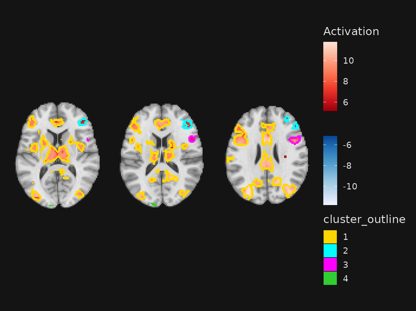
Key points:
-
definitionmatches the overlay you want to cluster; the base image must be added usingimages(). -
outline = TRUEadds ageom_outline()layer using the cluster IDs as categorical values. Provideoutline_scalefor a custom palette/legend, oroutline_color(single value) for a fixed outline. Setoutline_show_legendto force or suppress the outline legend.
Add brain overlay layers
Now that we have defined the images to read and the slices to render,
we need to map the numeric values in the slices to the points on the
plot. This is achieved by geom_brain(), which is
essentially an extension of geom_raster() from
ggplot2. The numeric values in the slices fill squares on
the plot, essentially forming ‘pixels’.
As with standard ggplot2 objects, the fill color of
these pixels is determined by a scale_fill_* scale,
allowing you to have fine control over the coloration.
Extending geom_raster(), the geom_brain()
layer supports the following standards:
-
interpolate: if TRUE,geom_rastersmooths the layer, rather than rendering discrete squares. -
alpha: A number between 0 and 1 controlling the alpha transparency of the layer -
show_legend: If TRUE (default), a legend mapping the numeric values to a color scale is included in the panel -
fill: A color to be used to fill all non-NA pixels. In ggplot2 terms, this is ‘setting’ the color of all pixels, as opposed to ‘mapping’ the color to the numeric value via a scale. -
mapping: The aesthetic mapping between the data and the raster layer. In general, the default ofaes(fill=value)should be retained for parametric layers (i.e., where the color of pixels should map to a continuous scale). But as detailed in a subsequent section, the fill can mapped to label columns in a categorical image (e.g., atlas).
Relative to standard ggplot2 conventions, the use of
geom_brain() requires that you specify details about the
fill color scale when the layer is added. This results from the fact
that ggbrain objects re-use the ‘fill’ geometry when layers
are overlaid. For example, if you have an anatomical underlay with a
grayscale fill and a statistical overlay with a color fill, each layer
needs to have its own fill scale (with a scale_fill_*
object). This is achieved internally using the ggnewscale
package.
The ‘take-home message’ is that you need to specify fill scale
information as part of the geom_brain() call. Here are the
key arguments:
-
limits: a two-element vector that if provided, sets the upper and lower bounds on the scale -
breaks: a function to draw the breaks on the scale. The default isinteger_breaks(), which draws a few integer-valued breaks (usually, 5) between the min and max of the scale. -
unify_scale: if TRUE (default), the color scale across panels (slices) will be equated. If FALSE, each panel will apply the color scale independently such that the min and max are slice-dependent. -
fill_scale: ascale_fill_*object use for mapping the numeric values in the data to the fill channel on the plot. Standard scales such asscale_fill_viridis_c()can be used for continuous layers. Note that the package also provides ascale_fill_bisided()option that, if added, creates separate color scales for the positive and negative pixels on the plot. This is a conventional approach in displays of fMRI activation maps where, for example, positive modulation is mapped to warm colors (reds) while negative modulation is mapped to cool colors (blues). Note thatscale_fill_bisided()has arguments ofneg_scaleandpos_scalethat allow the scales used for negative and positive values, respectively, to be specified directly.
Defining an image layer
The geom_brain() function includes an argument called
definition. This controls the numeric values that are
selected for display on the layer. The simplest definition is to name
the image to be displayed. Recall that when you use
images(), you provide names for the images. These are used
as a reference by ggbrain to interpret your layer
definitions.
For example, here I want to render the underlay and overlay layers with their numeric values:
# define a reusable object that has the same images and slices
gg_base <- ggbrain(bg_color = "gray80", text_color = "black") +
  images(c(underlay = underlay_2mm, overlay = echange_overlay_2mm)) +
  slices(c("x = 10", "y = 50", "z = 15"))
gg_obj <- gg_base +
  geom_brain(definition = "underlay", fill_scale = scale_fill_gradient(low = "grey8", high = "grey62"), show_legend = FALSE) +
  geom_brain(definition = "overlay", fill_scale = scale_fill_bisided(), show_legend = TRUE)
Now that we have geom_* layers in our
ggbrain object, we can finally plot our figure to see the
result.
plot(gg_obj)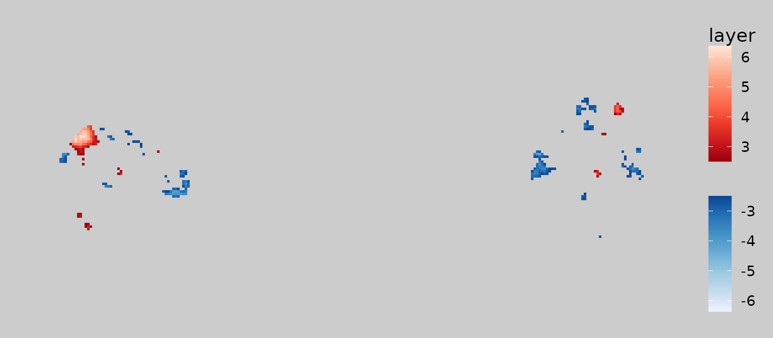
Defining subset layers
Oftentimes, we wish to modify the display by selecting a subset of
values to display. One of the most common applications is thresholding
of voxelwise statistics so that small/nonsignificant values are omitted.
To achieve this, geom_brain() supports standard subsetting
syntax used in R. Here is an example of thresholding the overlay layer
so that the absolute (z) statistic is above 2.5:
gg_obj <- gg_base +
  geom_brain(definition = "overlay[abs(overlay) > 2.5]", fill_scale = scale_fill_bisided(), show_legend = TRUE)

plot(gg_obj)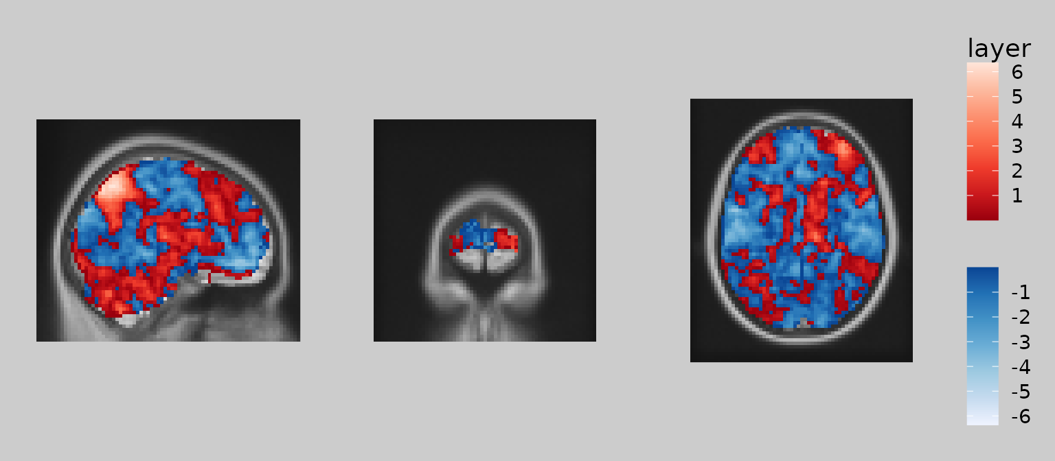
Note how ‘overlay’ is treated as an R object that is subset using square brackets. The subsetting expression inside the brackets uses standard R syntax and can reference other images currently in the ggbrain object. For example, you could display overlay values only where the underlay is greater than 10:
gg_obj <- gg_base +
  geom_brain(definition = "underlay") +
  geom_brain(definition = "overlay[underlay > 10]", fill_scale = scale_fill_bisided(), show_legend = TRUE)

plot(gg_obj)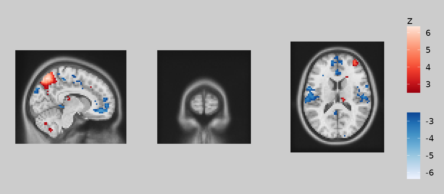
Finally, note that one can combine subsetting expressions using
logical operators & and | , as in standard
R syntax for vector operations. For example, here’s how you could
include pixels where abs(overlay) > 2.5 and
underlay > 20:
gg_obj <- gg_base +
  geom_brain(definition = "underlay") +
  geom_brain(
    definition = "overlay[abs(overlay) > 2.5 & underlay > 20]",
    fill_scale = scale_fill_bisided("z"), show_legend = TRUE
  )

plot(gg_obj)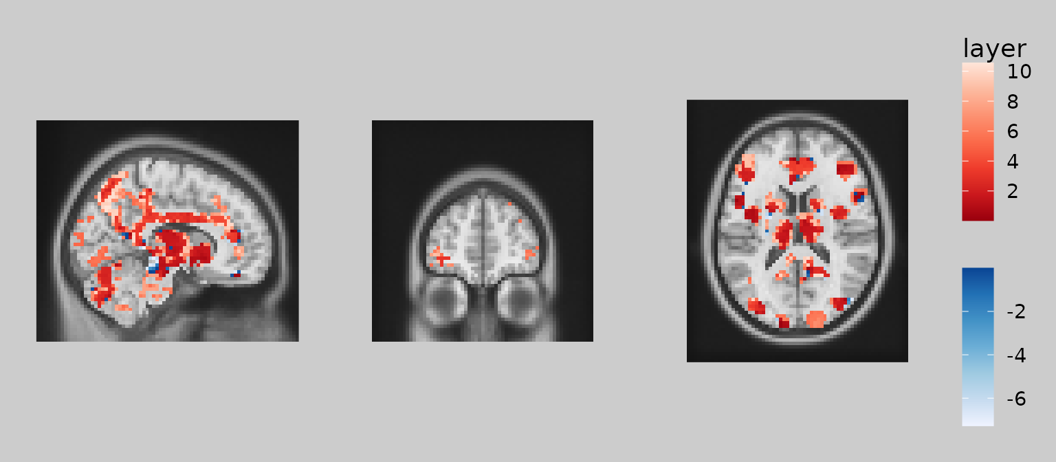
Defining a contrast layer
The ggbrain package also supports full contrasts in
which images can be added, subtracted, multiplied, or divided. For
example, one might wish to see the difference between one activation map
and another. Of course, many such contrasts can be computed in the GLM
estimation, but it is often useful to compute certain contrasts after
the fact.
For example, what if we have signed and absolute reward prediction error maps from a simple reinforcement learning paradigm? We might be interested to look at areas that are more strongly modulated by signed than absolute PEs.
These contrasts can either be defined inline within the
definition field of geom_brain or
geom_outline. Or, they can be added to the
ggbrain object in advance using the define()
function.
gg_obj <- ggbrain(bg_color = "gray80", text_color = "black") +
  images(c(underlay = underlay_2mm, pe = pe_overlay_2mm, abspe = abspe_overlay_2mm)) +
  slices(c("x = 10", "y = 50", "z = 15")) +
  define("diff := pe - abspe") +
  geom_brain(definition = "underlay") +
  geom_brain(definition = "diff", fill_scale = scale_fill_bisided(symmetric = FALSE), show_legend = TRUE)

plot(gg_obj)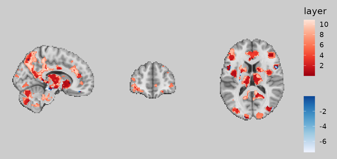
An equivalent plot would be achieved by including the definition inline:
gg_obj <- ggbrain(bg_color = "gray80", text_color = "black") +
  images(c(underlay = underlay_2mm, pe = pe_overlay_2mm, abspe = abspe_overlay_2mm)) +
  slices(c("x = 10", "y = 50", "z = 15")) +
  geom_brain(definition = "diff := pe - abspe", fill_scale = scale_fill_bisided(symmetric = FALSE), show_legend = TRUE)
The advantage of define() is that you can re-use and
modify contrasts in multiple layers. Here, we subset the difference to
only voxels where the PE - abs(PE) contrast is strongly in favor of
signed PEs (i.e., positive difference in the z-statistic > 3).
gg_obj <- ggbrain(bg_color = "gray80", text_color = "black") +
  images(c(underlay = underlay_2mm, pe = pe_overlay_2mm, abspe = abspe_overlay_2mm)) +
  slices(c("x = 10", "y = 50", "z = 15")) +
  define("diff := pe - abspe") +
  geom_brain(definition = "underlay") +
  geom_brain(definition = "diff[diff > 3]", fill_scale = scale_fill_distiller("PE > absPE", palette="Reds"), show_legend = TRUE)

plot(gg_obj)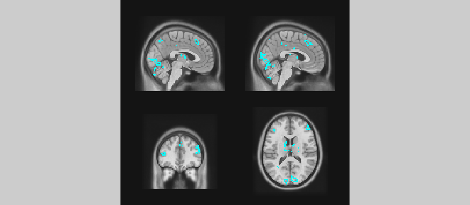
Add outlines
In addition to filling in regions with colors, brain plots often
benefit from being able to outline, rather than fill, regions. This is
accomplished using geom_outline(). This geometry finds the
boundaries of distinct clusters in the image/contrast and traces the
boundaries with a line of some thickness (controlled by
size).
For continuous images (e.g., z-statistics), one typically
sets the outline color using
geom_outline(outline="cyan") or whatever color is desired.
This draws the outlines for non-NA voxels in a single color. For
categorical images (e.g., anatomical or functional atlases), it may be
useful to map the color of the outlines to a categorical label such as
network or region. This is accomplished with
geom_outline(mapping=aes(outline=roi_name)) or whatever
column in the data corresponds to the categories one wishes to draw with
different colors.
Here, we might wish to outline voxels whose z-statistics exceed \(|z| > 3\) for the feedback onset regressor. These voxels represent areas that are sensitive to the onset of the feedback phase of the reinforcement learning trial.
gg_obj <- ggbrain() +
  slices(c("x = -2", "x=2", "y = 40", "z = 15")) +
  images(c(underlay = underlay_2mm, onset = feedback_onset_2mm)) +
  geom_brain(definition = "underlay") +
  geom_outline(definition = "onset[abs(onset) > 3]", size = 1, outline = "cyan")

plot(gg_obj)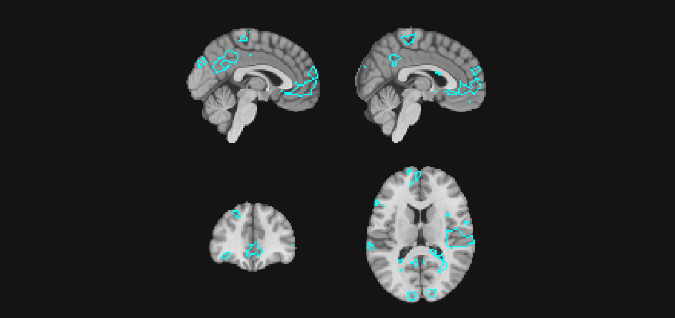
Clusterized categorical layers
If you want to clusterize an image (i.e., find clusters of contiguous
voxels) and display the clusters themselves as a categorical fill
(rather than a continuous overlay), use
geom_brain_clusterized(). It clusters a definition into the
top N clusters, adds a labeled image, and draws it as a categorical
layer; it does not add slices automatically (that is done with
cluster_slices(), as noted above)
gg <- ggbrain() +
  images(c(underlay = t1, overlay = overlay)) +
  slices("z=0") +
  geom_brain("underlay") +
  geom_brain_clusterized(
    definition     = "overlay[abs(overlay) > 3]",
    name           = "PE clusters",
    nclusters      = 3,
    min_clust_size = 40,
    fill_scale     = scale_fill_manual(values = c("1" = "red", "2" = "blue", "3" = "green")),
    cluster_info   = c("number", "voxels") # legend labels: e.g., "1: 1312 voxels"
  )
Tips:
- Combine with
slices()to choose where to view the clusters. -
cluster_infocontrols legend labels ("number","voxels","size"in mm^3). -
show_legendtoggles the cluster legend;fill_scalelets you set your own palette/limits.
Converting to a ggplot object and displaying the plot
For reasons that are somewhat boring (having to do with how R handles
S3 operators like +), the brain-related addition steps for
ggbrain object must come before generic
ggplot2 modifications of the plot. For your
ggbrain object to be a ggplot object, it must
be rendered using the render() function. This
function compiles the images, layers, and slices into the requested plot
and returns it as a patchwork object. The patchwork package
is extremely useful for combining ggplot objects in different layouts.
More details can be found here: https://patchwork.data-imaginist.com.
In ggbrain, each panel is ggplot object and
the panels are composited using wrap_plots in
patchwork.
The key message here is: place ggbrain-specific additions
before render() and ggplot-specific additions
afterwards.
# without a render step
gg_obj <- ggbrain() +
  slices(c("x = -2", "x=2", "y = 40", "z = 15")) +
  images(c(underlay = underlay_2mm, onset = feedback_onset_2mm)) +
  geom_brain(definition="underlay") +
  geom_outline(definition = "onset[abs(onset) > 3]", size=1, outline="cyan")

class(gg_obj)
## [1] "ggb" "R6"
# note the different class after render
gg_obj <- ggbrain() +
  slices(c("x = -2", "x=2", "y = 40", "z = 15")) +
  images(c(underlay = underlay_2mm, onset = feedback_onset_2mm)) +
  geom_brain(definition="underlay") +
  geom_outline(definition = "onset[abs(onset) > 3]", size=1, outline="cyan") +
  render()

class(gg_obj)
## [1] "ggbrain_patchwork" "patchwork" "ggplot2::ggplot"
## [4] "ggplot" "ggplot2::gg" "S7_object"
## [7] "gg"Using the general approach provided by patchwork, we can add
annotations and aesthetic modifications to the overall plot using the plot_annotation.
Likewise, you can modify the overall theme information using the
theme() function, as articulated here.
# add a different theme to all panels and add an overall title
gg_obj + plot_annotation(title="Overall title") & theme_minimal()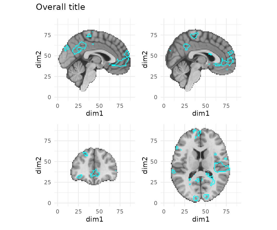
Note that you don’t necessarily need to use render() at
all. When you call plot() on a ggbrain object, the render
happens automatically behind the scenes, as you’ve seen above. But if
you want to modify the plot using ggplot or patchwork functions such as
plot_annotation or theme, you need to first
render() the plot so that the object is converted to a
patchwork.
brain_plot <- ggbrain() +
  slices(c("x = -2", "x=2", "y = 40", "z = 15")) +
  images(c(underlay = underlay_2mm, onset = feedback_onset_2mm)) +
  geom_brain(definition="underlay") +
  geom_outline(definition = "onset[abs(onset) > 3]", size=1, outline="cyan")

# display the rendered plot with an overall title
render(brain_plot) + plot_annotation(title = "Overall")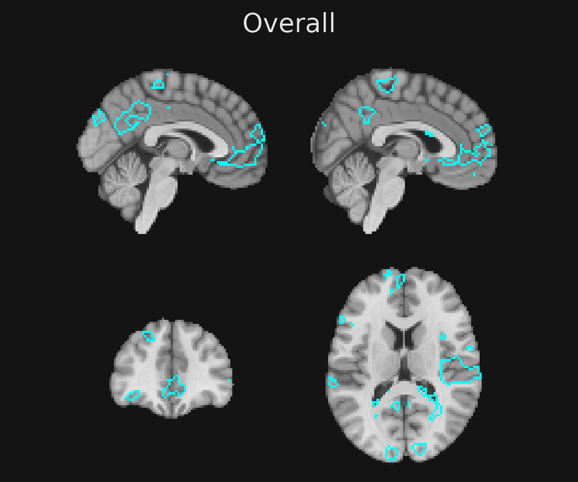
# or you can also simply store the rendered plot into a separate object
rendered_gg <- render(brain_plot) + plot_annotation(title = "Overall")
Another point is that by keeping your plots as ggbrain
objects – that is not adding render() – you can continue to
add brain-related calls like geom_brain() or
annotate_coordinates() to them. Thus, you may wish to use
the render(brain_plot) + [ggplot2 stuff here] approach
above so that the ggbrain object remains in its original
form and can be modified prior to display.
Saving ggbrain plots to file
After you see your brain plot on the screen, you may soon wish to
have it as an image file for publications or presentation. As with
standard ggplot objects, you can use ggsave() or the usual
graphics device (e.g., pdf) and dev.off()
approach from base R.
Note that if you pass a ggbrain object directly to
ggsave, it will complain that the plot is not a ggplot
object. We can just pass a rendered version like so:
td <- tempdir()
ggsave(filename=file.path(td, "my_brain_plot.pdf"), render(brain_plot), width=15, height=10)
pdf(file.path(td, "my_brain_plot_2.pdf"), width=10, height=10)
plot(brain_plot)
invisible(dev.off())
At present, the overall size of the plot may be different from the
size of the graphical output device. For example, if you specify a size
such as 9 x 6 inches, but the plot has an aspect ratio closer to 1:1,
you’ll have a lot of ‘white space’ around the plot. Intuitively, the
bg_color argument to the overall ggbrain call
should capture this, but for boring technical reasons that are not
directly related to ggbrain, it is not so simple. At
present, to ensure that the entire background of your plot uses the same
color as the ggplot object, add the bg
argument to your output device, or use the ggsave command
(as above), which automatically uses the background color of the plot to
extend to the output device/file.
pdf(file.path(td, "my_brain_plot_2.pdf"), width=10, height=10, bg="gray80")
plot(gg_obj)
invisible(dev.off())
Like with standard ggplot, one of the beautiful aspects
of saving files in vector formats such as PDF is that you can open and
edit the elements of the plot using vector editors like Adobe
Illustrator or Inkscape!
One small note: some PDF viewers will automatically interpolate the
‘raster’ parts of a PDF, leading the image to look blurry even though it
isn’t really so. I have seen this in recent version of Apple Preview
(which is otherwise a nice piece of software). Thus, if you want to see
precisely how your PDFs look coming out of ggbrain, I would
suggest opening them in Adobe Acrobat Viewer.
Next steps
Now that you understand the basics of ggbrain plots, I
encourage you to read the ggbrain
aesthetics vignette, which provides more detailed guidance about how
to clean up the appearance of brain displays and to add more complex
annotations.